Orientation for new residents of the city of Zurich
Every year, many people move to or within the city of Zurich. For this reason, we have created the welcome website zhmobil.ch in collaboration with VBZ, which helps all new residents to familiarize themselves quickly and easily with their new neighbourhood.
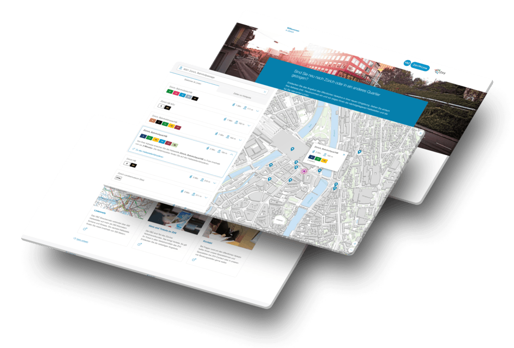
Together with Zürcher Verkehrsbetriebe, we designed and implemented a website for new residents. The homepage contains a user-friendly tool to quickly and easily find the nearest public transport stop and display travel times to hotspots. Technically, the website runs on a WordPress multisite, which is connected to other VBZ websites such as VBZ Online, VBZ TrafficMedia and VBZ Extrafahrten.
Technically, the website runs via a WordPress multisite, which is thus connected to the other VBZ websites such as VBZ Online, VBZ TrafficMedia and VBZ Extrafahrten.
Route planning tool
The heart of the zhmobil.ch website is the online timetable tool shown above. On the homepage, users can enter their zip code and immediately receive information on the nearest public transport stations as well as the fastest connection to the most important destinations in Zurich. This tool provides a clear overview of how well connected the new home is by public transport.
In addition, users will find links to further information about the route network, travelcards & tickets, stop timetables, the fare zone system, the night network and travel times. The welcome website encourages Zurich residents to use public transport by clearly presenting the most important information.
The data on stops and hotspots comes directly via the interface. Also the colors of the lines. This guarantees that the line colors are also identical to those at the stops on site and at their digital contact points.
Initial situation
Every year, thousands of people move to the city of Zurich, while many more move within the city limits. As the leading transport company in Zurich, VBZ aims to support these life transitions by demonstrating the possibilities of public transport.
Until now, newcomers to Zurich were referred by the city authorities to the website www.stadt-zuerich.ch/vbz, which primarily presented the timetable, the company and an in-depth understanding of public transport in Zurich.
VBZ wanted to develop a new welcome page that would provide smooth access to Zurich’s public transport network. The aim was to provide people who are either unfamiliar or barely familiar with public transport in Zurich with simple and understandable information that will enable them to make full use of public transport in Zurich.
With the new welcome website, VBZ addresses people before and after their move and familiarizes them with the first-class public transport services in their new residential area. Public transport is promoted, travel routes can be easily planned and a smooth onboarding process makes it easier to switch to public transport. Change is seen as an opportunity to improve the quality of life in the new residential area and at the same time make a contribution to environmental protection.
Zurich hotspots at a glance
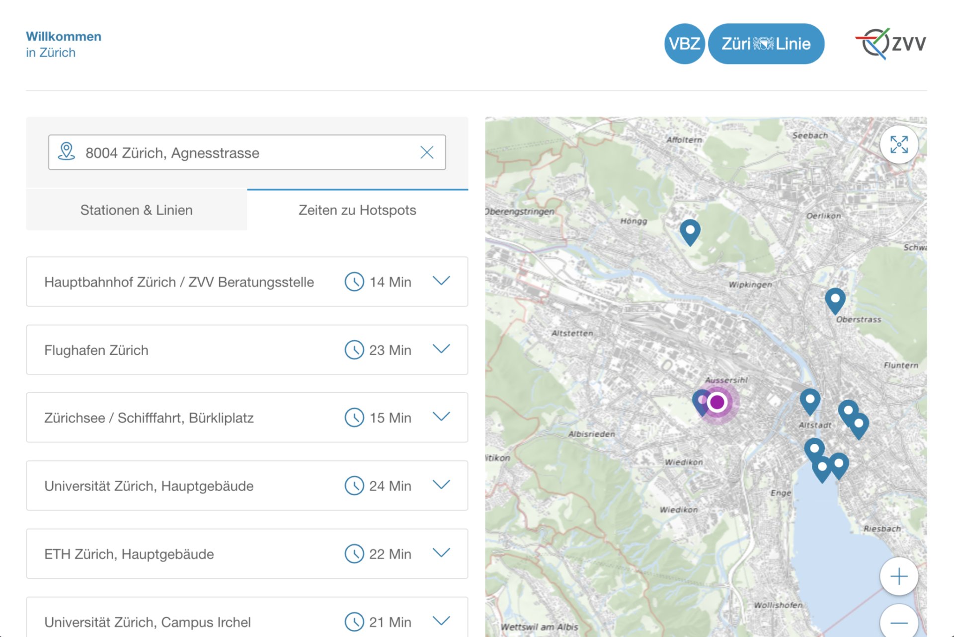
At a glance, users can identify the most important public transport hotspots and see how long it takes to get there from your current home or future accommodation. This quick overview helps you to assess the transport connections in your area and better organize your daily commute and future plans.
Customize hotspots
Hotspots are flexibly adaptable. A good example of this is seasonal adaptation. In the summer months, for example, Zurich residents could define “Letten” as their hotspot, as many people like to spend time there on the riverbank. But as soon as winter arrives, users can easily define “Christmas Market” as their new hotspot, as this attracts their focus and interests during the cold season.
This adaptability makes it possible to determine the preferred locations according to current circumstances and interests, and thus make the most of the public transport network.
Time visualization for optimal route planning
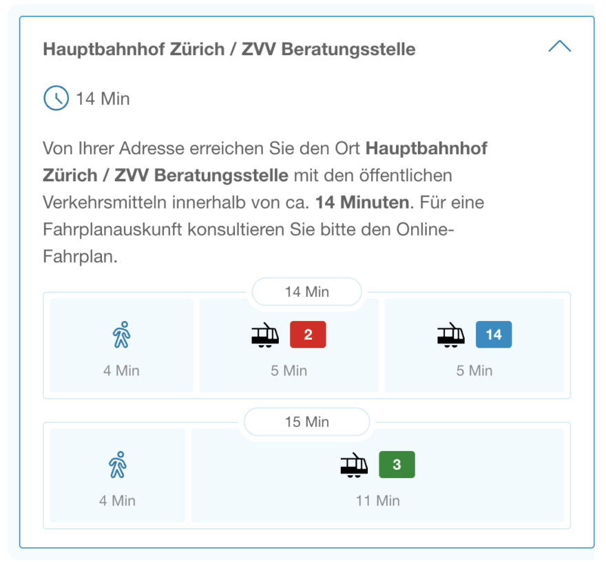
The different routes clearly show the duration of each section in relation to the other parts of the route.
This allows users to see at a glance which sections of their journey will take more time.
Full screen and individual layout
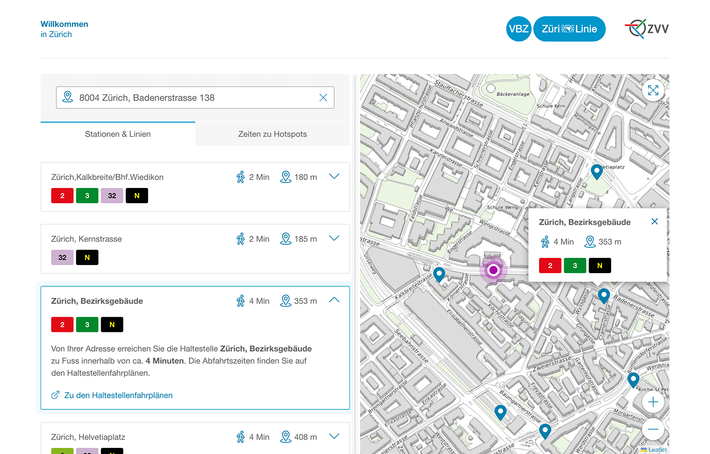
By dragging the axis, users can switch back and forth between the map and the list to view the information in their preferred view. This ensures that they always have the best possible overview and can customize the display according to their wishes.
Result adjustment to map section
The results are automatically adapted to the selected map section. Whether you zoom in on the map to see more detail or zoom out to get a broader overview, the results displayed will adjust accordingly. This ensures a user-friendly experience where users always get the relevant information that is relevant to the current map section.

Responsive design and mobile-first approach
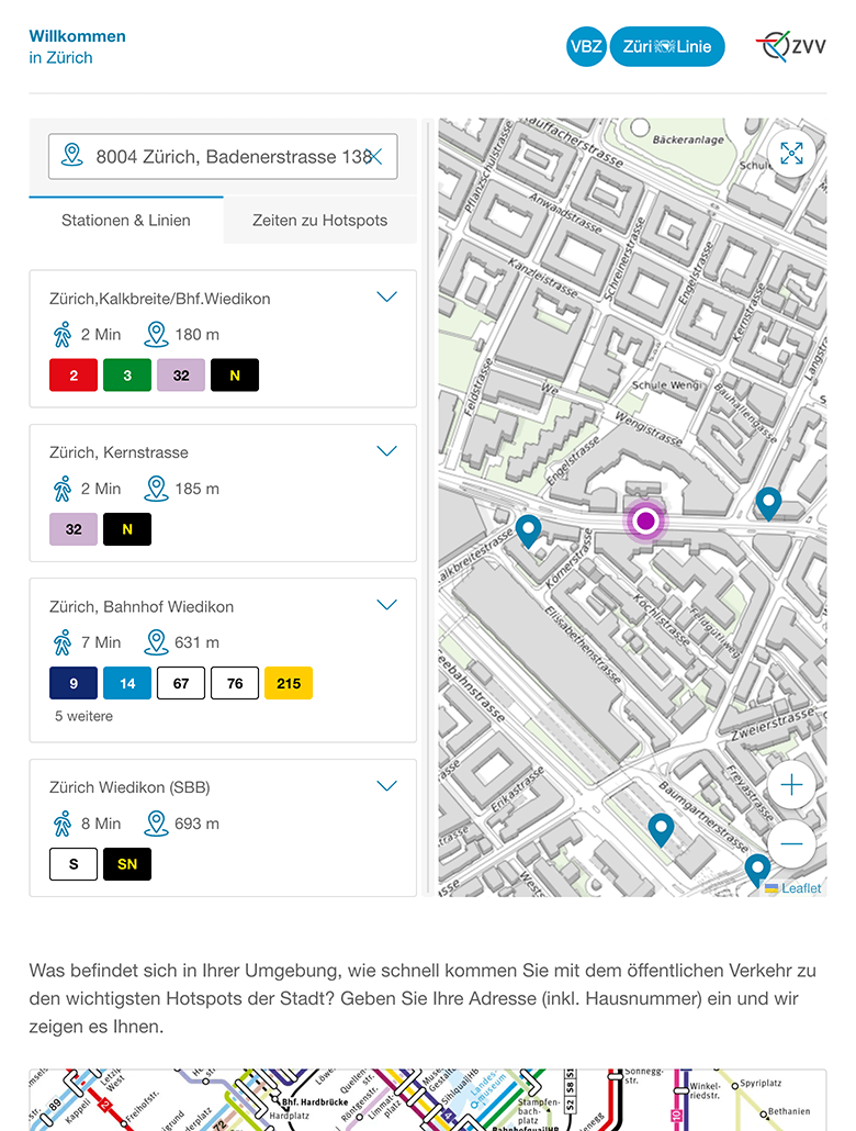
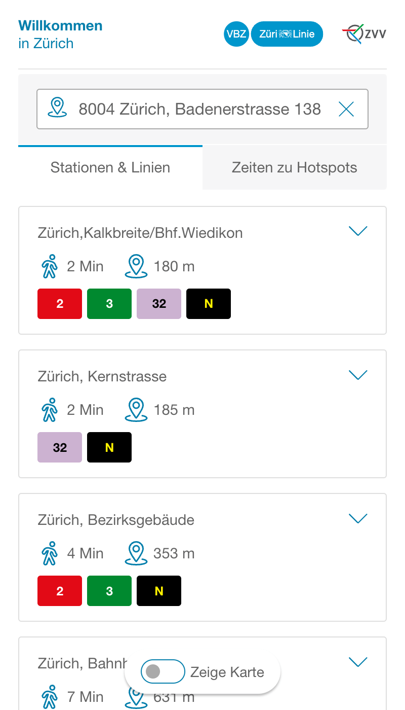
In today’s digital era, users access content from different devices, screen sizes and platforms. To ensure that websites and applications work smoothly on all devices and provide an optimal user experience, responsive design and the mobile-first approach to web development are crucial.

Approach
Initial workshop
At the beginning, a workshop was crucial to clarify the requirements and objectives of the project and to precisely define the design and functions of the website.
Customer journey analysis
Verkehrsbetriebe Zürich created user stories to ensure that the needs and expectations of the target group were met.
Development
We used the versatile WordPress platform to develop the website. This allowed us to efficiently manage and update the content.
By using a multisite structure, we were able to adapt the content specifically to different parts of the city and districts.
To increase user-friendliness, we saved temporarily entered address data in local storage. This allows for a seamless and convenient experience without users having to re-enter their address each time they visit.
Technologies

WordPress Development
Customized WordPress development offers the opportunity to create highly user-friendly websites that not only have individual functions, but also impress with an aesthetically pleasing design.

Interfaces
The information on the stops and hotspots is provided directly via an interface, as are the colors of the lines. This ensures that the line colors on the website match those at the actual stops and other digital interfaces on site.

Local Storage
To increase user-friendliness, we store temporarily entered address data in local storage. This enables a seamless and convenient experience without users having to re-enter their address each time they visit.
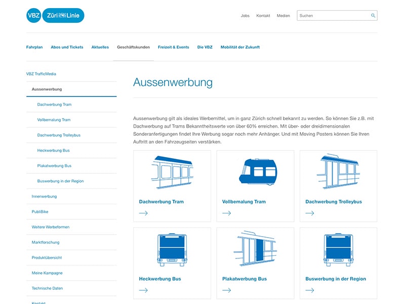
Further projects for VBZ
Online calculator for the advertising industry
We have designed and developed an online calculator for advertising on streetcars and buses so that advertising customers of the Zurich Transport Authority (VBZ) can plan their advertising campaigns easily and online.
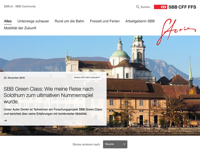
City magazine for an improved online experience
VBZonline is a magazine that tells informative stories about everyday life in Zurich’s public transport system and its players. It is dedicated to topics such as a sustainable lifestyle, urban living, mobility and much more.
Next Case Study
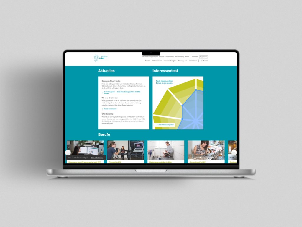
Career Choice Portal
Our team revolutionized career choice in the canton of Zurich by developing a user-friendly portal with interactive elements, personalized content and “headless” architecture.
The web application provides pupils, parents, teachers and careers advisors with easy access to information and thus provides optimal support in choosing a career.
Other Projects
A couple more of our client projects.
-
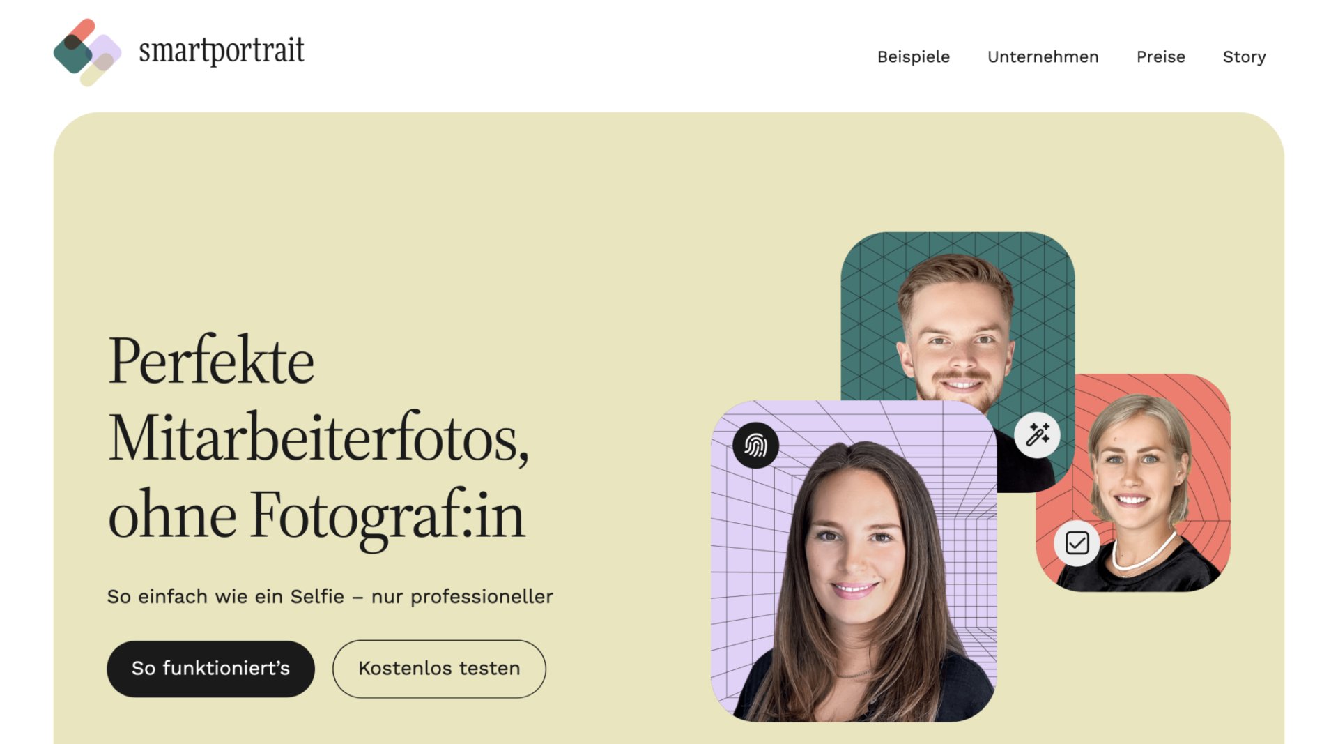 Read more: High quality portraits without photographer
High quality portraits without photographer
smartportrait.io is a platform for high-quality and consistent employee portraits. An experienced photo editing team transforms cell phone photos into impressive studio quality
