New Design for the Nahrin Online store
For the Swiss family business Nahrin, we redesigned the online store, focusing on a simple and intuitive shopping experience.
Nahrin’s website is a crucial pillar for the sale of their naturally produced bouillons, spices, and dietary supplements.
The requirements for the redesign were that it becomes easier for users to find and purchase the right Nahrin products, the shop works flawlessly on all devices, integrates the new corporate design, prominently places customer advisors, and is technically prepared for future adjustments.
What did we do?
After the pitch, Nahrin chose us as their strategy and design partner. We organized an online workshop in which we got to know the brand and its sales processes, generated ideas together, researched the target group, and defined general goals. After that, the project team was defined, the design timeline was agreed upon, and a survey was launched among Nahrin buyers. With this information, we then developed user journeys and created a visual design for the new website.
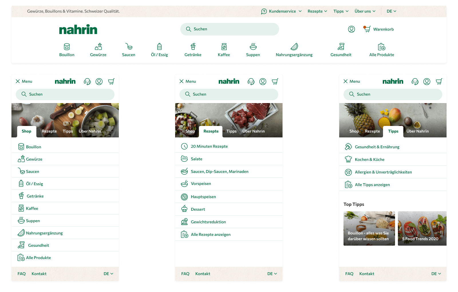
On the old website, it seemed on the homepage that Nahrin was exclusively compiling fine recipes, and visitors had to actively select the shop tab. With the redesign, the entire shop is brought to the forefront, and the various food product groups are clearly displayed in the navigation.
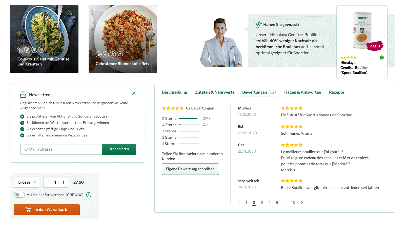
On the homepage, individual products such as bestsellers and new products stand out with a clear distinction and fresh design. Recipes now differentiate themselves with large, tasty images from the rest of the homepage. Thanks to a practical filter, products can be easily found, and the clear presentation of a product quickly clarifies what it is about.
Quick Facts
- Workshops with all project participants
- Website concept
- New User Experience
- User Interface Design
Do you also have a project that suits us?
Contact us! We are always interested in new challenges.
Other Projects
A couple more of our client projects.
-
 Read more: Mobile First Content & Design for intependent journalism
Mobile First Content & Design for intependent journalism
Together with Adrian Zumbrunnen, we supported the TagesWoche team with the redesign of the news platform tageswoche.ch in terms of concept design.