Our new website, with finishing touches in 3 cities
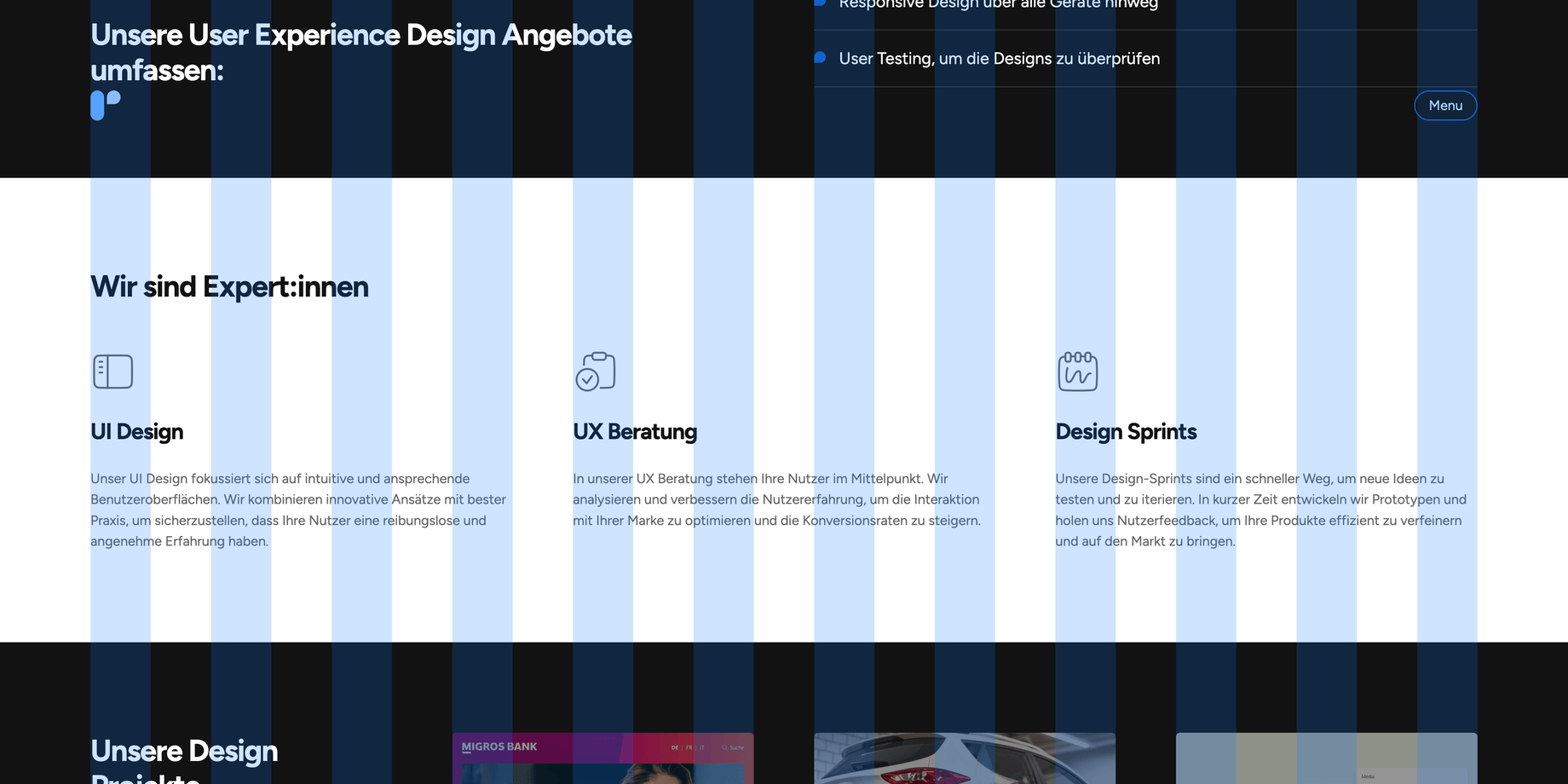
In a world where digital presence goes far beyond the function of a simple business card, we realized it was time to redesign our website from the ground up. The original version of our site, developed in late 2016, has seen continual minor updates over the years, but now we were aiming for a complete overhaul.
This renewal, inspired by the core ideas and values of our portfolio that we brought to life at the last XMAS retreat in Lucerne, sheds a new light on our website. With this redesign, we not only want to reflect our own development and growth, but also set new standards in terms of design, technology and accessibility.
Design
Colors
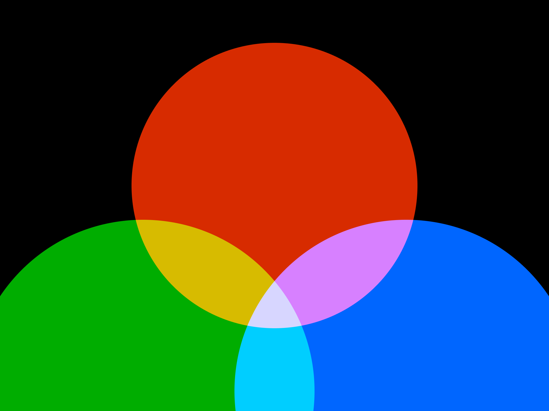
In the course of redesigning our logo, we also defined new colors. At that time, we decided not to focus on a single color, but to define a set of several colors and shades.
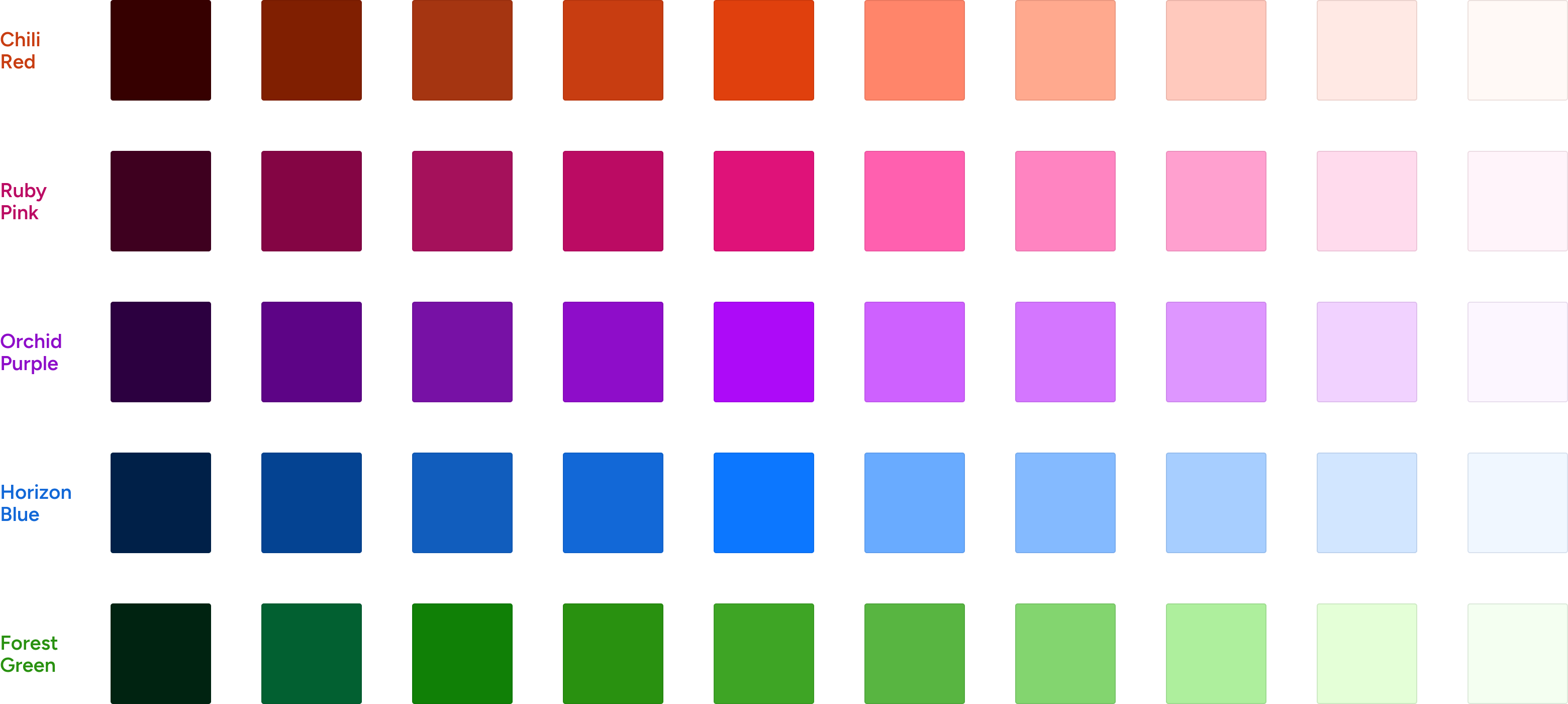
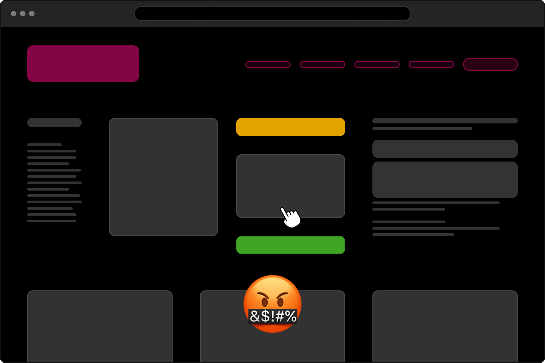
When designing the website, we were faced with the decision of how to handle these colors. We were allowed to use a lot of color, but the combination of several or all of them together became a bit too much. This also made the concept more difficult for visitors to understand.
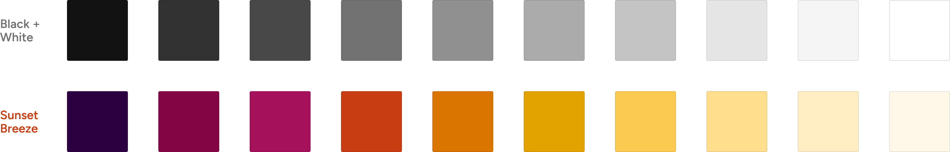
A monochromatic color scheme is always active, which is selected at random. Visitors can use the site menu to decide for themselves which color scheme they would like to use. There are also two color schemes that are not included in the random selection and can only be selected on explicit request: Black/White and the “Sunset Breeze” scheme.
Typography
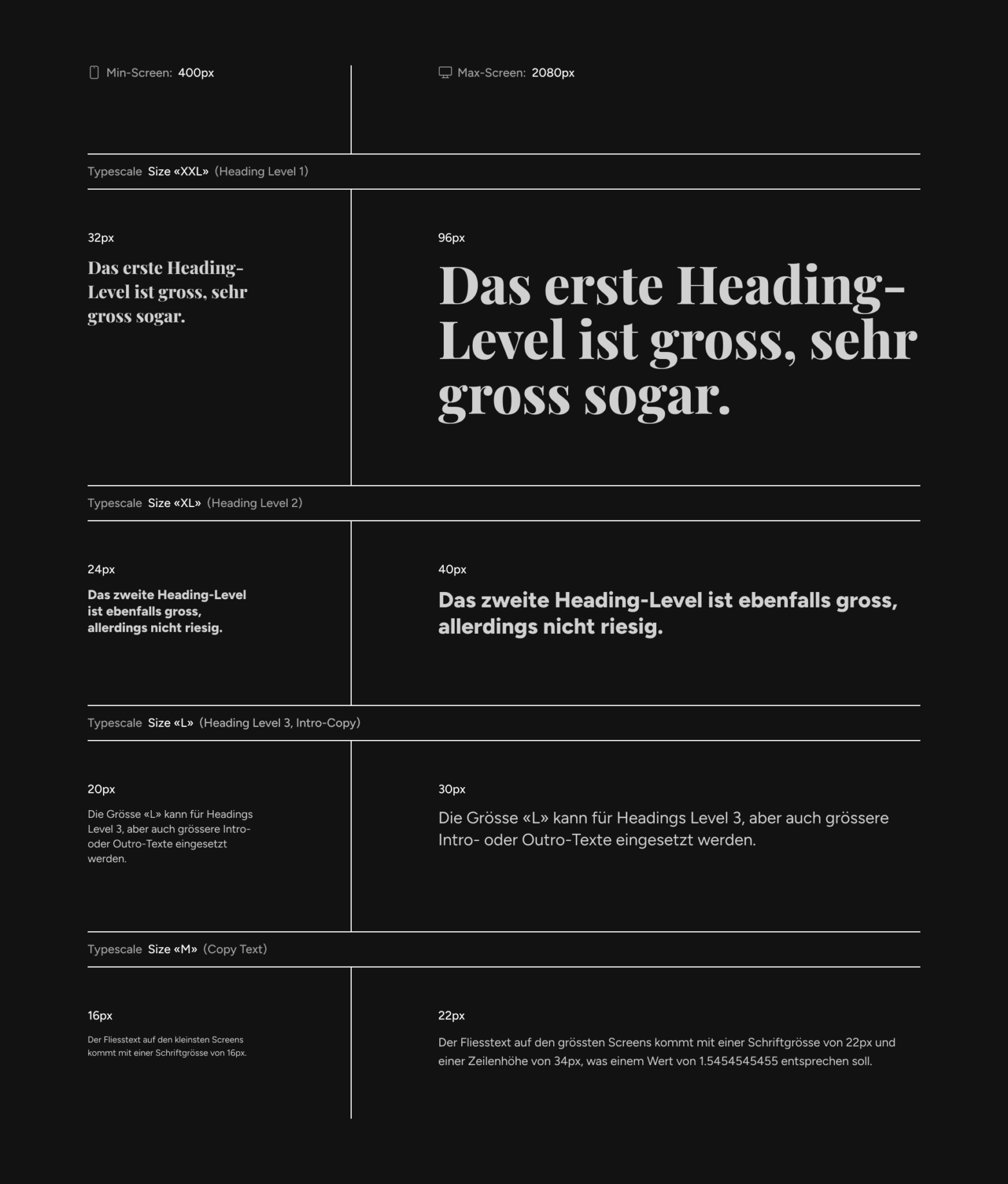
We have been using the Figtree font for a while now. This has the advantage that it covers many characters and special characters and can therefore also display words with non-Latin characters correctly. Playfair Display is used as a contrast for large headlines.
The font sizes are based on the size of the browser window in order to achieve better responsive behavior. One size is defined for the smallest screens and one for the largest screens. In between, there is a dynamic font size which is automatically calculated on the basis of these two values and thus adapts to the browser window.
We used our own small web app to define these dynamic values: Fluidity
Responsive and grid
The website is designed for responsive design and runs very wide on large screens so that the space is better utilized instead of creating an imbalance with content that is too narrow.
Of course, all content is based on a grid for which we have developed our own column definitions.
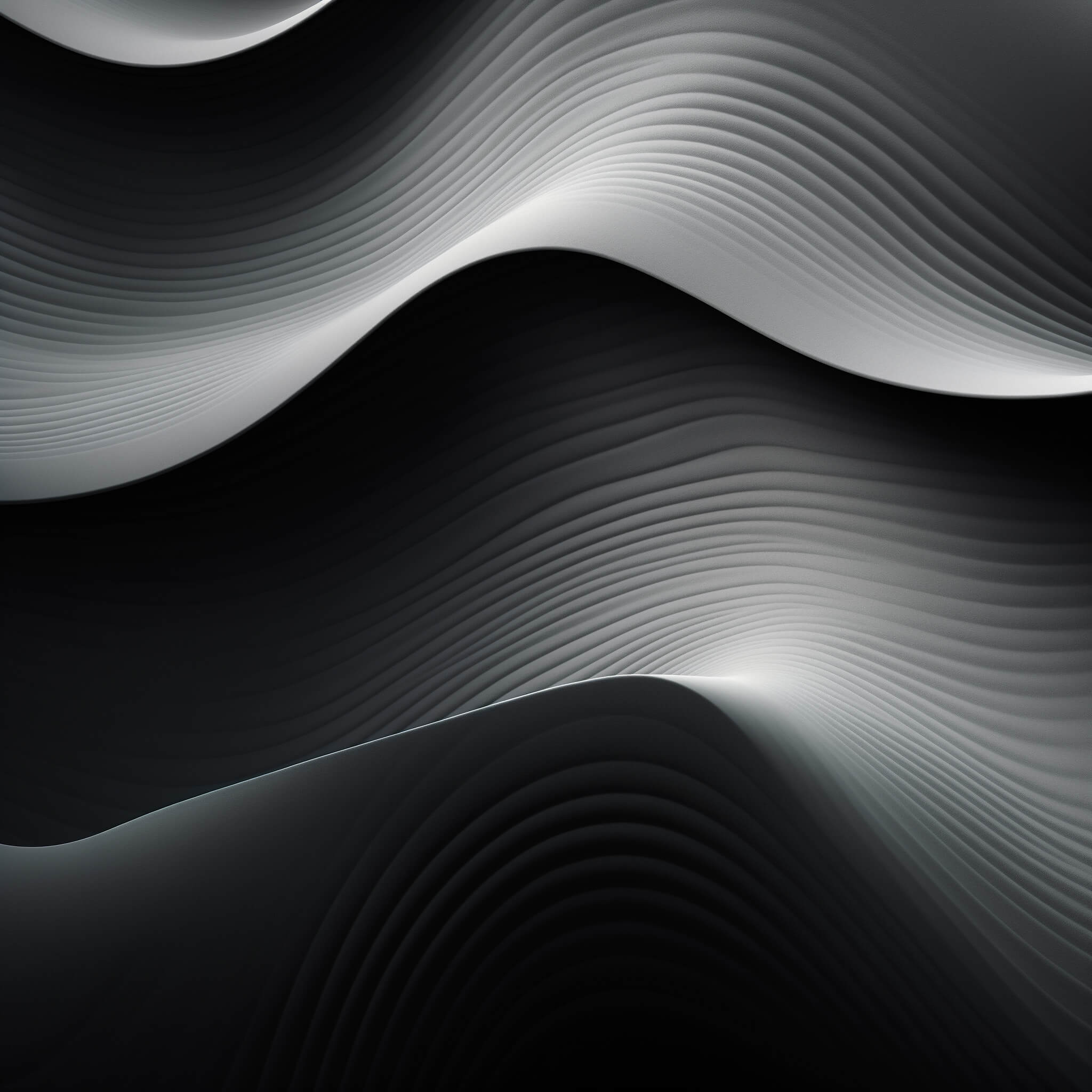
Effects
The website also features effects that react to the user’s mouse position.
This is how we create exciting and playful animations on teaser elements, which shift in perspective when the mouse is moved over them. The whole thing is not just a gimmick, but the element that is currently being hovered over is always clearly emphasized. Everything else on the website is darkened in the same way.
Accessibility
The accessibility and accessibility of our own website was extremely important to us because we want to lead by example and show that technical added value and appealing design can go hand in hand. By using color combinations with sufficient contrast, keyboard operability and correct markup for screen readers, we not only improve SEO, but also ensure that our website is accessible to all types of visitors without discriminating against anyone. With our website, we hope to debunk the preconception that accessible websites are boring and prove that inclusivity and aesthetics are not mutually exclusive.
Coordination in Zurich
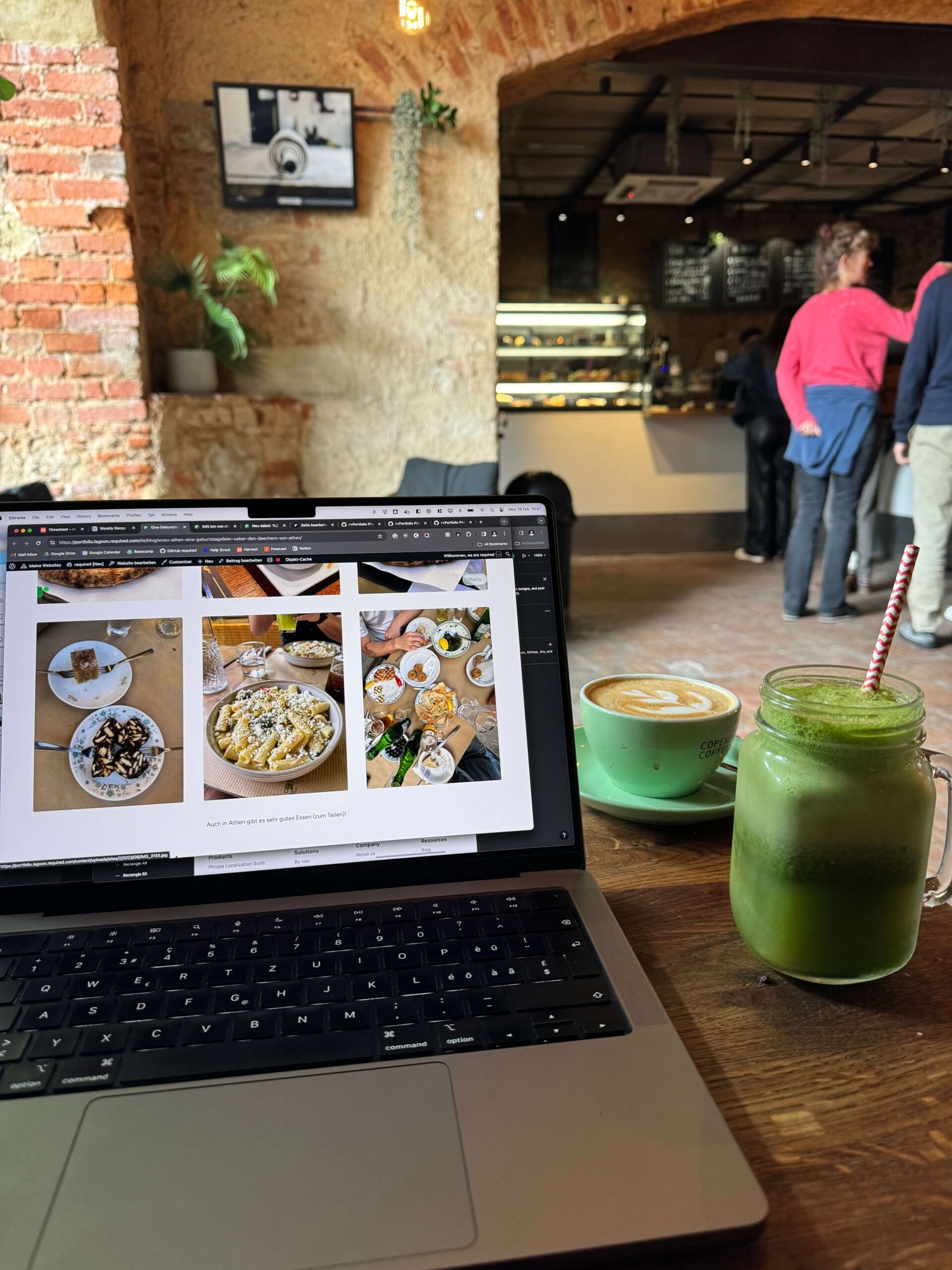
In Zurich, I took over the project management and was responsible for the content strategy together with Velthy. I coordinated the team and ensured that the deadlines were met. At the same time, worked on the content and adapted the content that had already been migrated to the new layout.
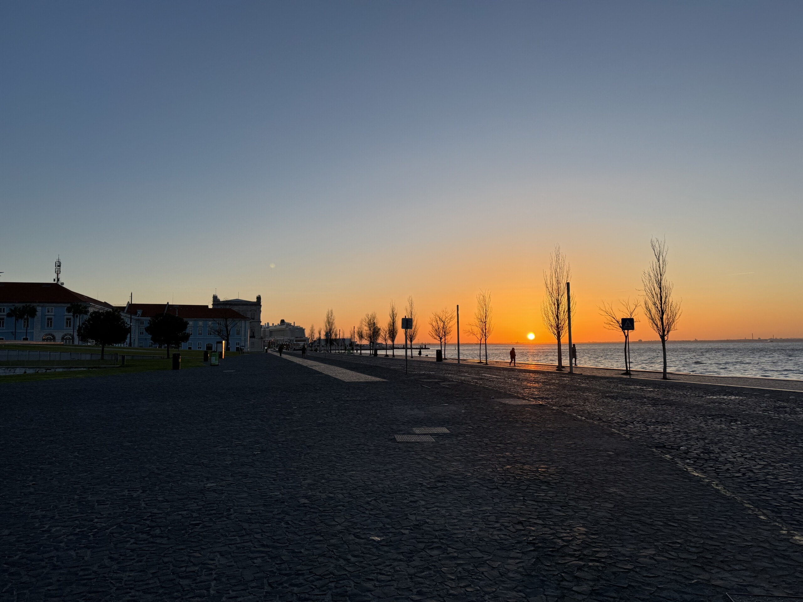
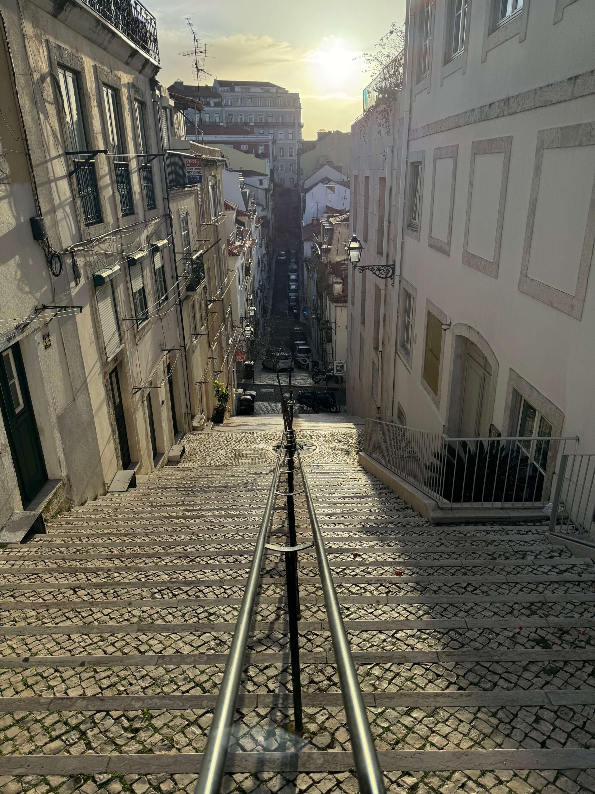
Visual in Lisbon
In Lisbon, Velthy dived deep into the design and content of the website, taking a fresh and innovative approach. His creative work reflected the vibrant atmosphere of Lisbon and brought new perspectives and ideas to the project. He also ensured that the content was accurate and engaging.
Technical in Nuremberg
Jeff was responsible for the technical implementation in Nuremberg: This included migrating content from the old website, implementing accessibility features and final testing. His technical expertise and meticulous approach ensured that the website is not only visually appealing, but also technically up to date and accessible for all users.
A website is never really “finished”. We keep at it and continuously develop our presence to meet the needs of our users and improve the technology on an ongoing basis.
Feedback? Please let us know!