Promoting Customer Interactions with an Online Magazine
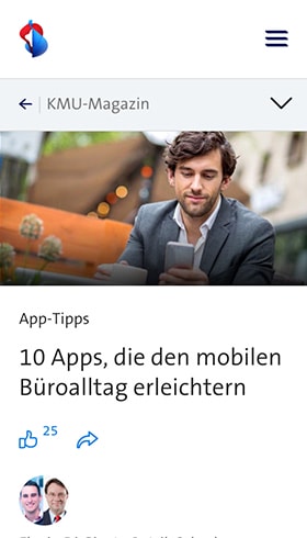
We have been managing the Swisscom Magazine for several years now, and through regular development of new features, we continually provide fresh inputs – for both the editorial team and the readership.

Initial Situation
Our collaboration with Swisscom began in 2016. Swisscom approached us with the desire to redesign and implement the magazine known as “SME Business World.”
At that time, the magazine was exclusively aimed at small and medium-sized enterprises in Switzerland, offering articles on management, technology, marketing, and finance.
Our Services
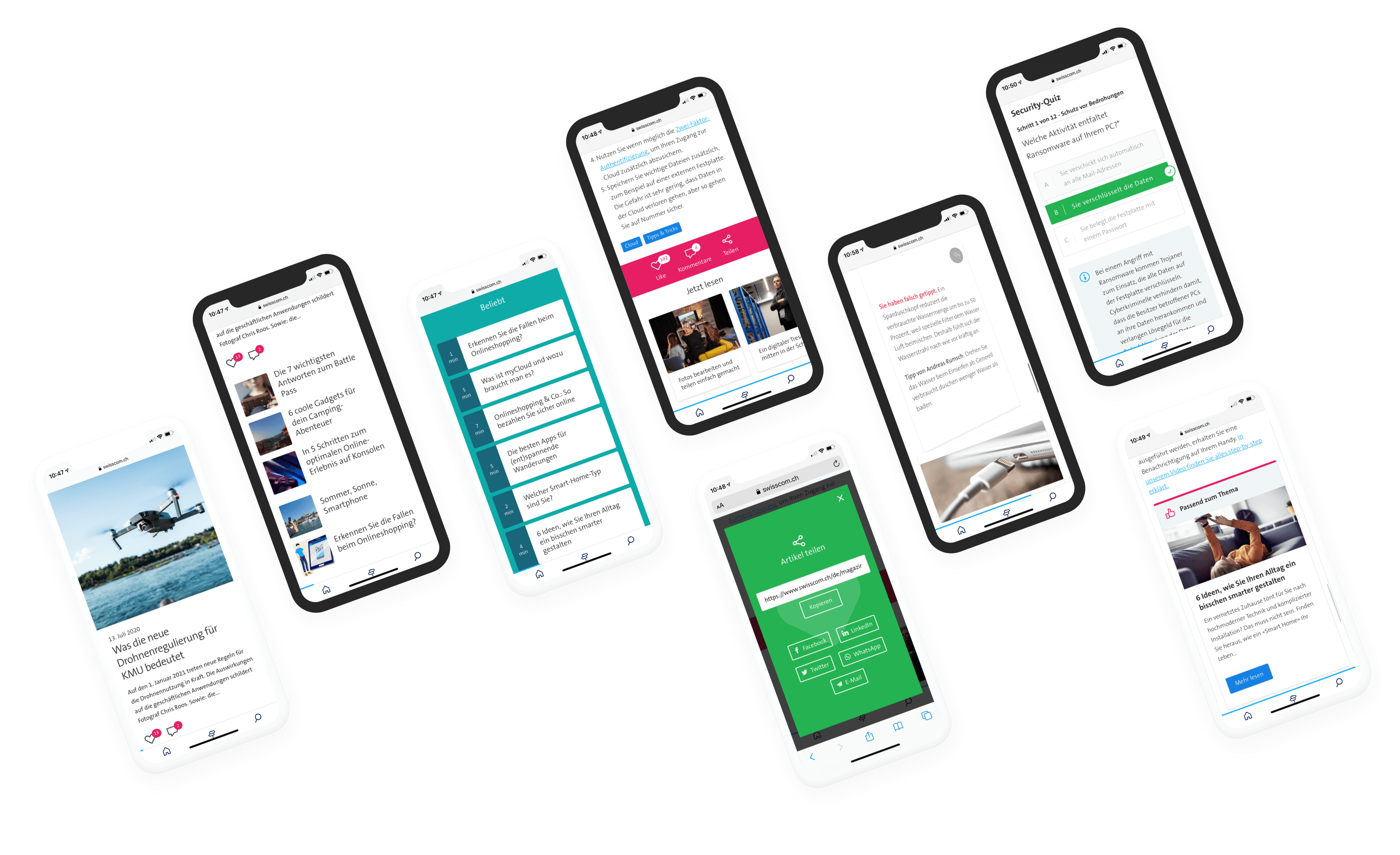
Over the past few years, we have worked with Swisscom on several interesting projects, such as two redesigns or realigns, new campaigns, and many new opportunities for readers and the editorial team. We were always responsible for the design work, the implementation of the frontend, and the development of all special features. Here is an overview of how we were able to specifically support the Swisscom team.
Content Migrations
To relaunch “SME Business World,” the first step was to migrate the complete multilingual content from the Drupal 7 based website to WordPress. WordPress is very suitable as a platform for a magazine, and thus the publishing process for the editorial team was simplified. In addition to the new design, which we created based on the new Swisscom design language, we transferred all existing content and media data from the existing Content Management System (CMS) to the new WordPress installation. This was done with the help of a migration tool (Drupal to WordPress) that we specifically created for Swisscom.
From this point onwards, the magazine was then simply called “SME Magazine.”
However, the name changed again when another migration was pending: The “Swisscom Stories,” which at that time were maintained via Adobe’s CMS and targeted Swisscom’s private customers, were also to be integrated into WordPress. Here too, we wrote special functions for the migration of all content and media, which automated the import and thus freed up time for the editorial team. With the combination of SME topics and private customer content, a new orientation was needed, which is why we completely redesigned the magazine. Since then, the publication has been simply called “Swisscom Magazine” and continues to be managed by us, being continuously expanded with meaningful features.
Workshops, Concepts, Surveys, and User Tests
With the reorientation of the magazine and new target groups, a new concept was necessary. To develop this, we first organized various workshops and conducted surveys to gather the readers’ needs. With the initial concept ideas, we created a clickable prototype, which we tested directly with the target group in user tests. The results of these tests were then incorporated into a second iteration, which we again verified with the potential target groups.

Do you also have a project with similar complexity?
Velthy is your point of contact.
Get in touch with us! We are always interested in new challenges.

Dynamic Homepage
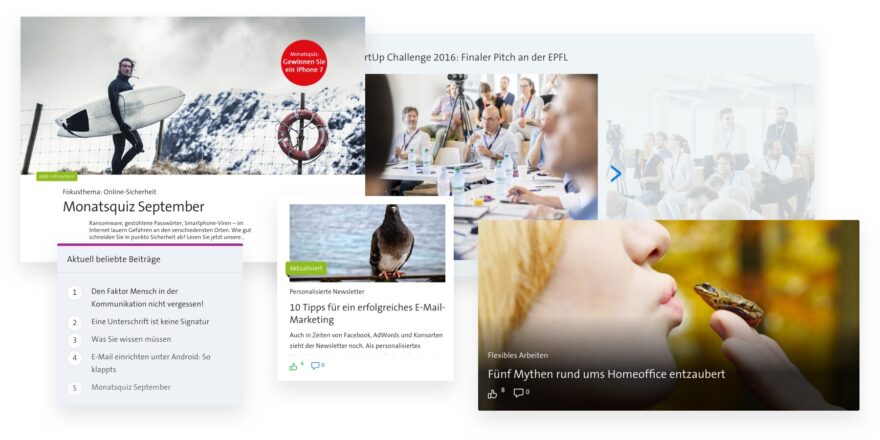
Initially, the homepage – in typical WordPress default fashion – displayed the newest posts first.
However, to make individual posts visibly featured on the homepage, we developed a customized solution. The simplest step would have been to use the native WordPress feature “stick to the top” to place a post at the beginning. However, this feature did not meet all the customer’s needs, so we customized the homepage accordingly. Now, a special article or a form can be placed at any desired position. If nothing is defined, articles are automatically displayed sorted by date.
User Engagement
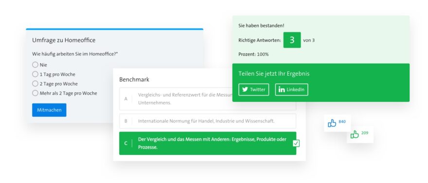
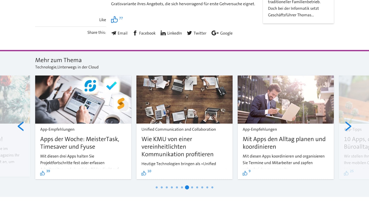
In addition to statistics, another way to measure the popularity of an article is to allow visitors to “like” individual articles. This gives the editorial team direct feedback on which content is more popular. Since a magazine is not just about consuming content, visitors are also encouraged to participate in surveys and quizzes. This allows them to test their knowledge from the magazine in a playful way. And by participating in the monthly quizzes, users can even win something.
Interactive Elements
Through so-called flip-cards and flip-quizzes, readers can interact with the content and thus demonstrate their knowledge in a playful manner. These elements are based on the block editor and were custom-made for Swisscom by our developers.
Central Advertising and Information Management
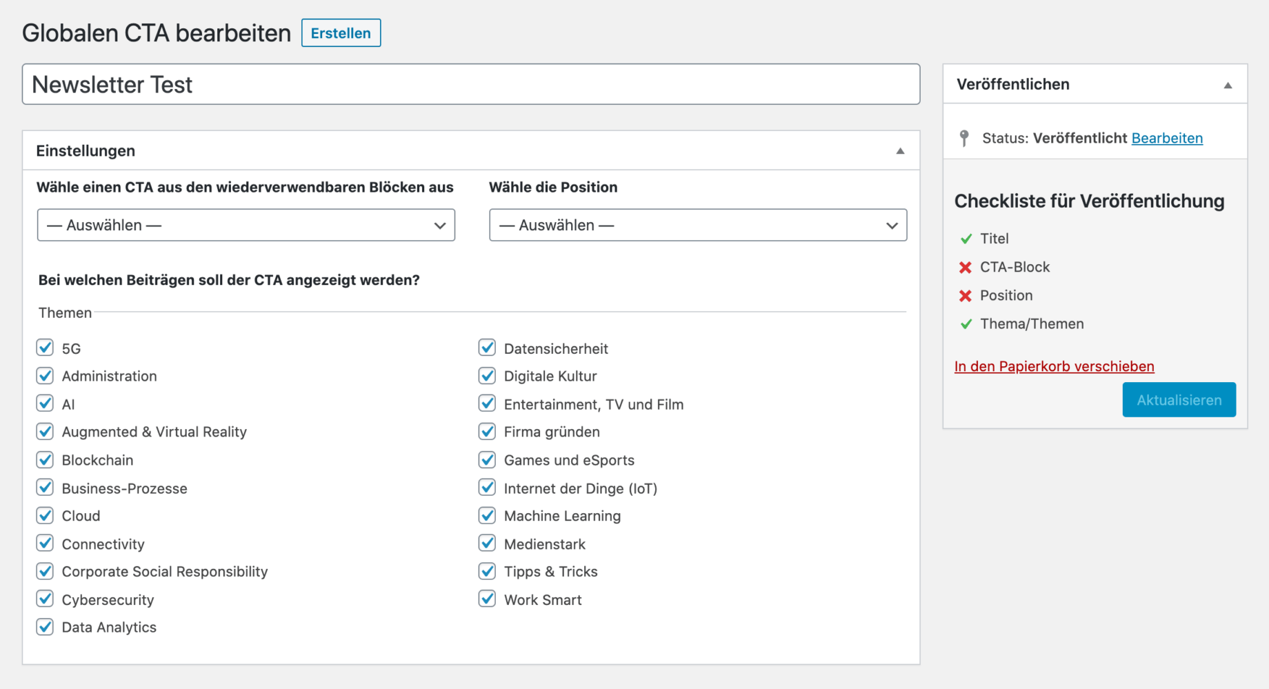
There are individual elements that Swisscom can use across several articles at the same time. These are usually offers or studies that are being promoted. To ensure that such offers do not have to be inserted individually in each article and thus potentially forgotten, we designed a central place for these “Call to Actions” (CTA). The desired offer is selected, and then the editorial team only has to decide where this CTA should be displayed.
Campaigns
While we were managing the magazine, two campaigns were added, which we implemented for Swisscom. Both campaigns involved readers submitting ideas, for which everyone could then vote. In the first campaign, one could win a telephone booth, and in the second, there was a real Picasso to take home for a day.

Type
Magazine, Campaigns
Client
Swisscom
Services
Visual Design, Responsive Design, Frontend, WordPress-Development
Timeframe
2017–today
Other Projects
A couple more of our client projects.
-
 Read more: Onboarding and support website for HIN
Onboarding and support website for HIN
We support HIN on an ongoing basis as a digital agency with user experience, user interface design as well as programming work for their support…

