Takeover & modernization of the Pro Senectute website
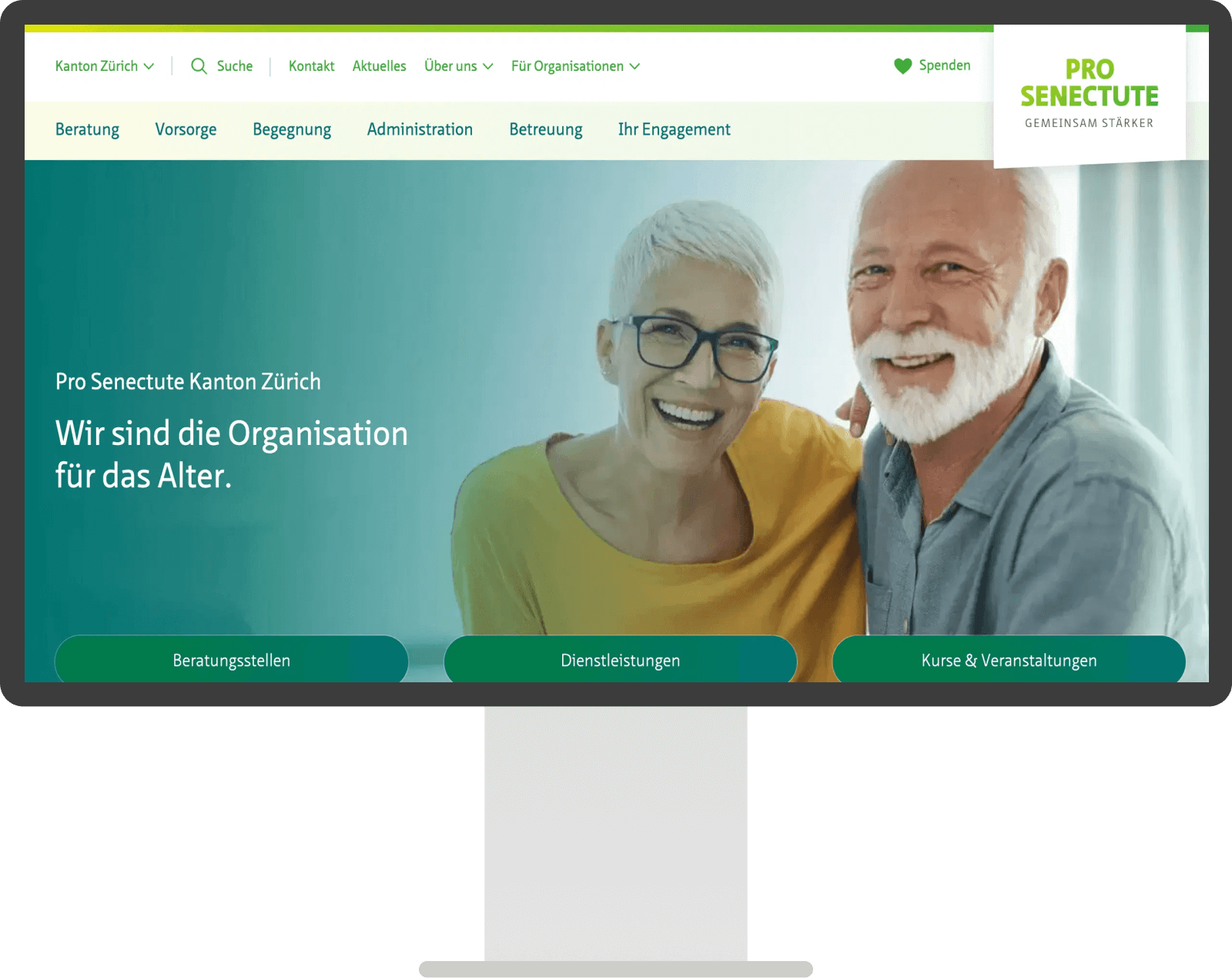
The takeover and comprehensive modernization of the WordPress website pszh.ch is a prime example of how an existing online presence can be transformed and equipped for the future.
Like most web agencies, we like to build websites from scratch. However, there are also situations in which a complete relaunch is not the right approach and something existing can be improved instead.
Here we show you how a takeover and gradual renewal can also achieve great results: Through strategic planning, technical expertise and ongoing support, we have not only made the website more visually appealing, but also significantly improved its functionality and accessibility, both for visitors and the editorial team.
Takeover of the WordPress website
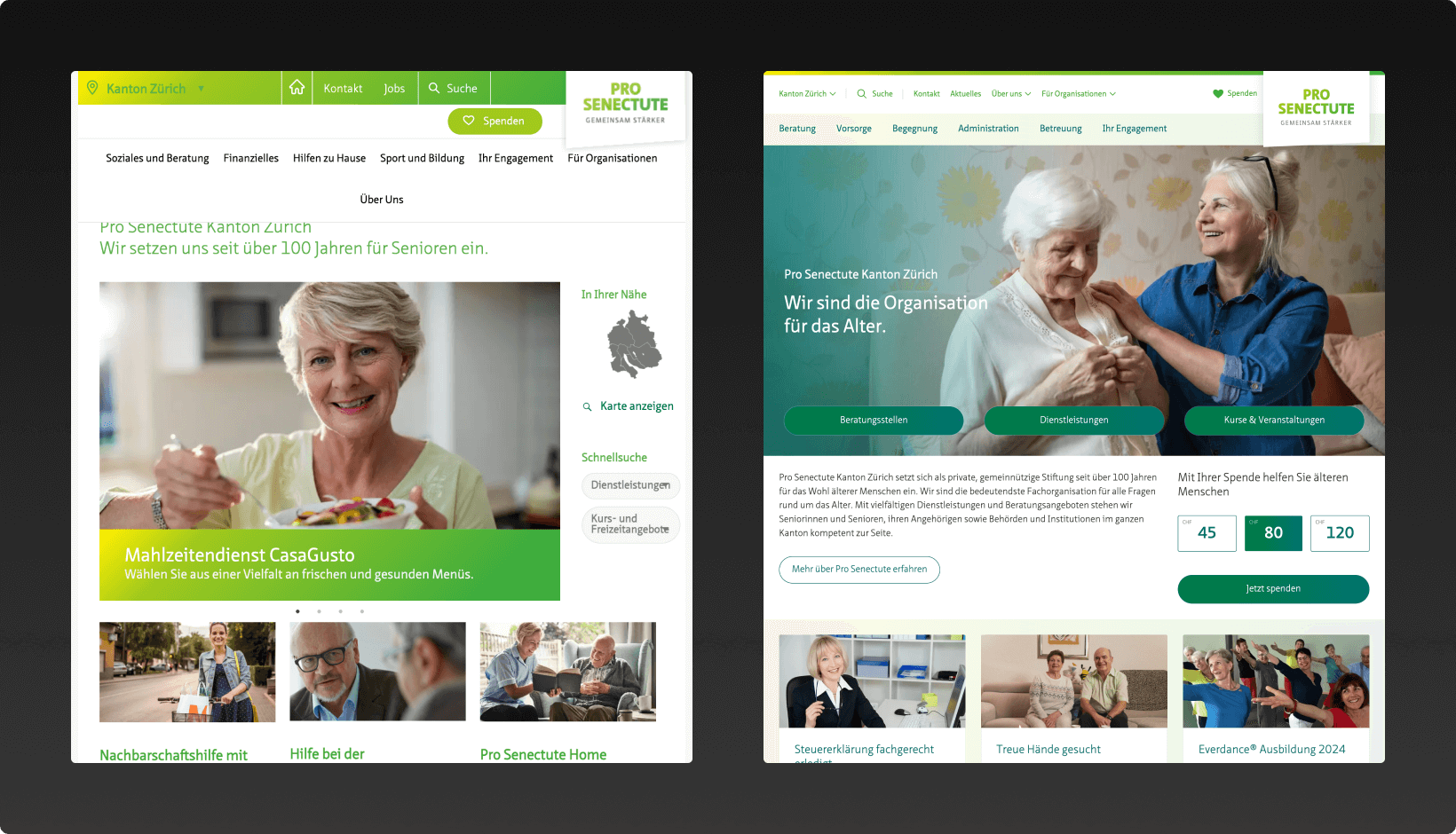
When we took on the project, we were faced with a website that was getting on in years. Both the design and the structure no longer met today’s requirements for a modern, user-friendly website.
Our first step was therefore a comprehensive analysis of the existing infrastructure and content. Our objective was not only to modernize the website, but to build it in such a way that it could also meet future requirements.
Our approach to the takeover of WordPress websites

Analysis & Audits
First of all, we get an overview. Which parts of the website need updating, where are the technical problems and what should be retained?

Planning & prioritization
Based on the audits, we decide together with the customer what to tackle first, also taking into account the schedule and budget.
We draw up a schedule and plan our resources.

Realization
We take over the current installation and bring it into our modern setup. With the defined priorities, we start with the first and most important adjustments.
Whether web development or WordPress development

Exchange & Controlling
We remain in close contact with the customer to discuss progress, incorporate feedback and monitor further planning.
Website modernization in several phases
The revitalization of the website took place in several phases. After the initial workshops, we worked with the client to develop a plan as to which topics we wanted to tackle and implemented these in several phases.
Performance
During the takeover, the website suffered somewhat from slow speed and a poor layout structure, which leads to so-called “layout shifts”. This is a value used to calculate how often the elements of a website shift when loading, resulting in an unsatisfactory experience. We were able to significantly improve these values through various measures.
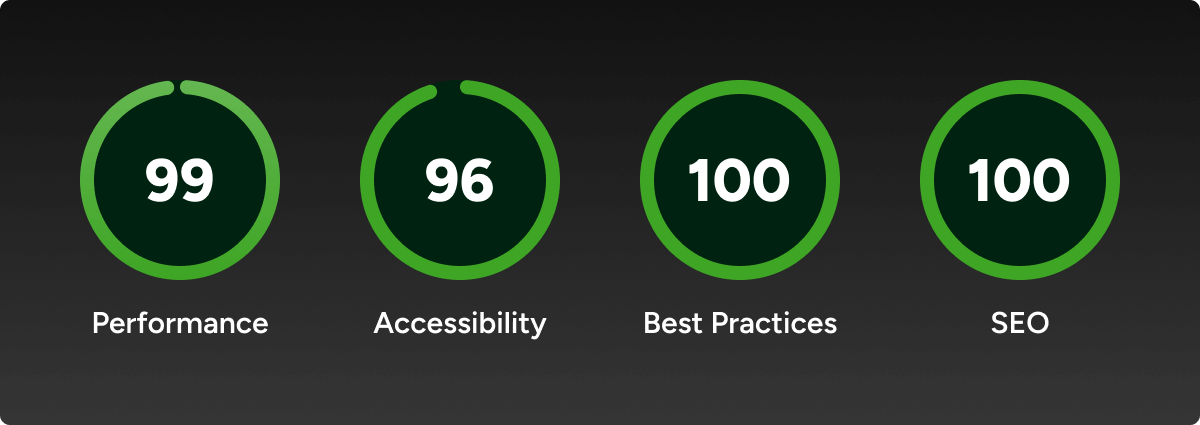
Another major area was updating the PHP version on the hosting. Due to old plugins, an update was not possible during the takeover. We removed these plugins and replaced them with new ones or our own solutions, which created the basis for using the latest PHP version. This not only made the website more secure, but also faster.
Accessibility
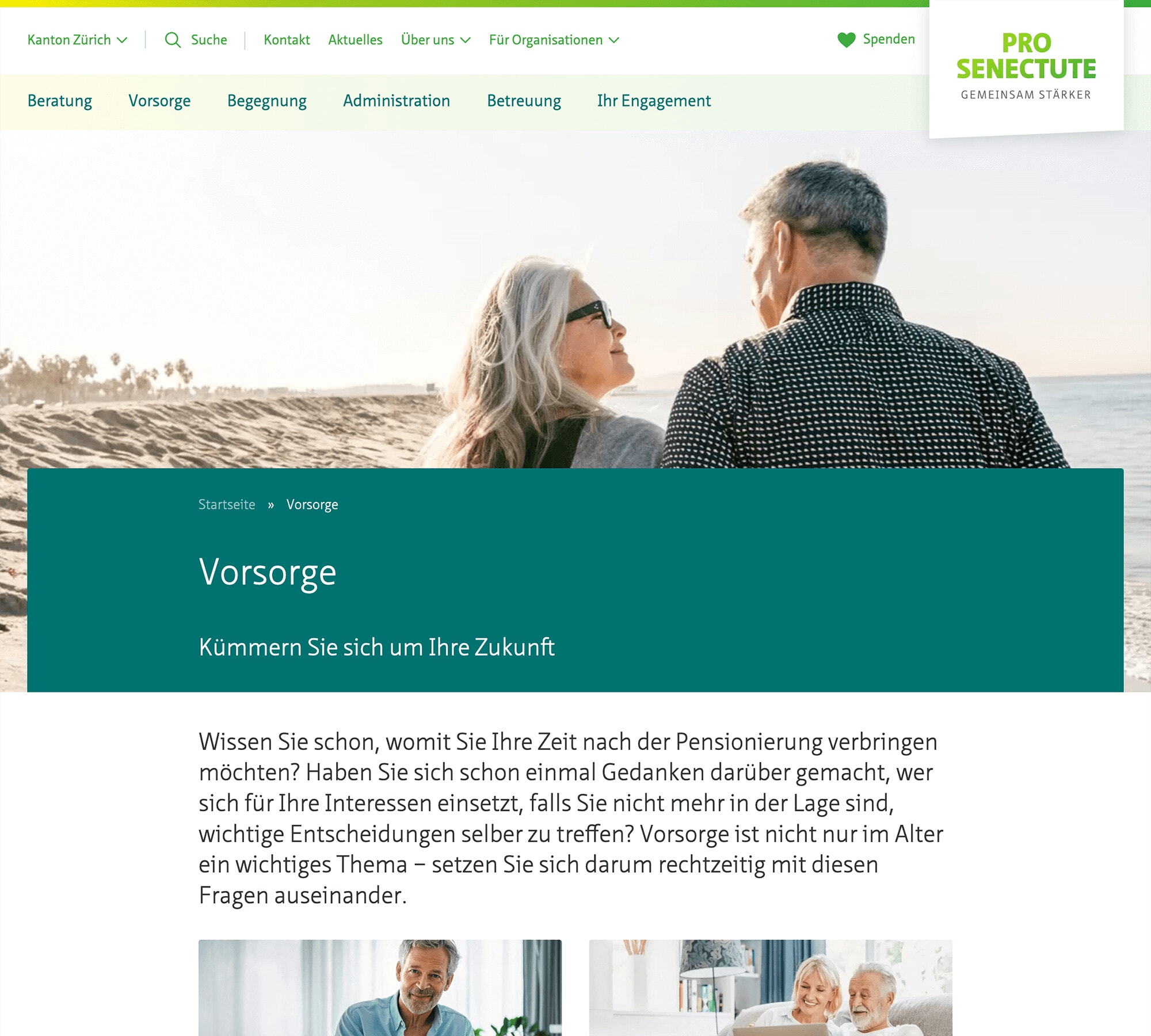
We have placed great emphasis on improving accessibility. By adjusting color contrasts, improving keyboard navigation and introducing screen reader support, we have made the website more accessible for all users.

Modernization Design
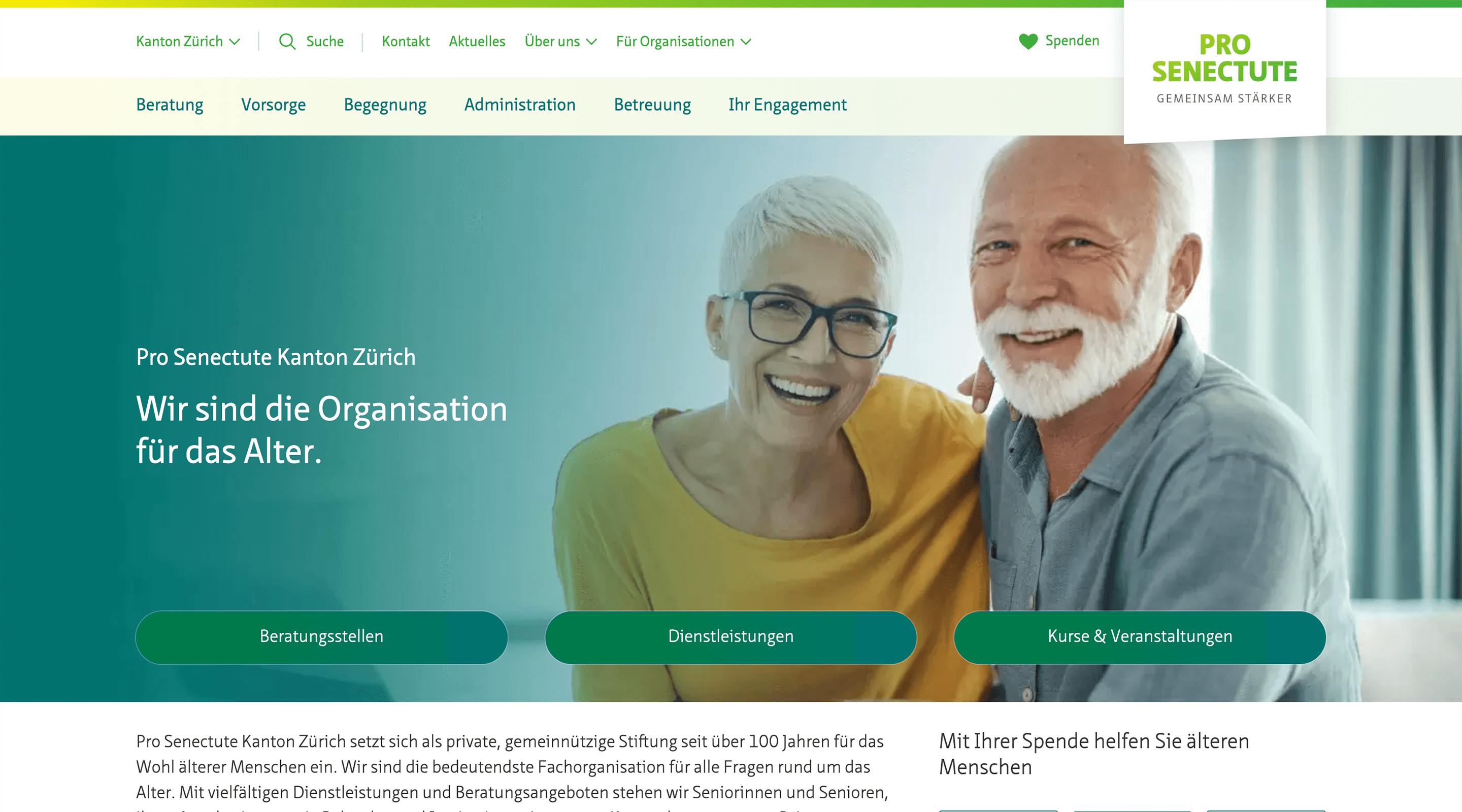
We knew we had to change something in the design. But the contrast adjustments weren’t the only thing we improved. During a design inventory, we collected all the elements in use and defined uniform elements and styles. This gives the website a calmer, clearer and tidier look.

Introduction Block Editor in WordPress
A core part of the modernization was the implementation of the WordPress block editor. This allows content to be created and edited more quickly and easily, and there are even more options than was previously the case.
For example, the editorial team can create modern and attractive pages for job advertisements that promote employer branding and appeal to more jobseekers than was previously the case with PDFs.
Integration Donation option via RaiseNow
An organization like Pro Senectute is dependent on donations, which is why it is extremely important that online donations can also be accepted.
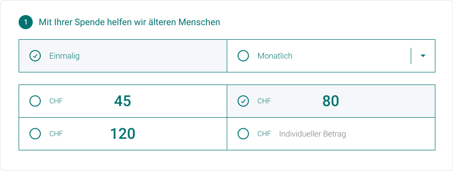
To this end, we rely on the integration of RaiseNow, with which both individual donations and recurring donations can be implemented.
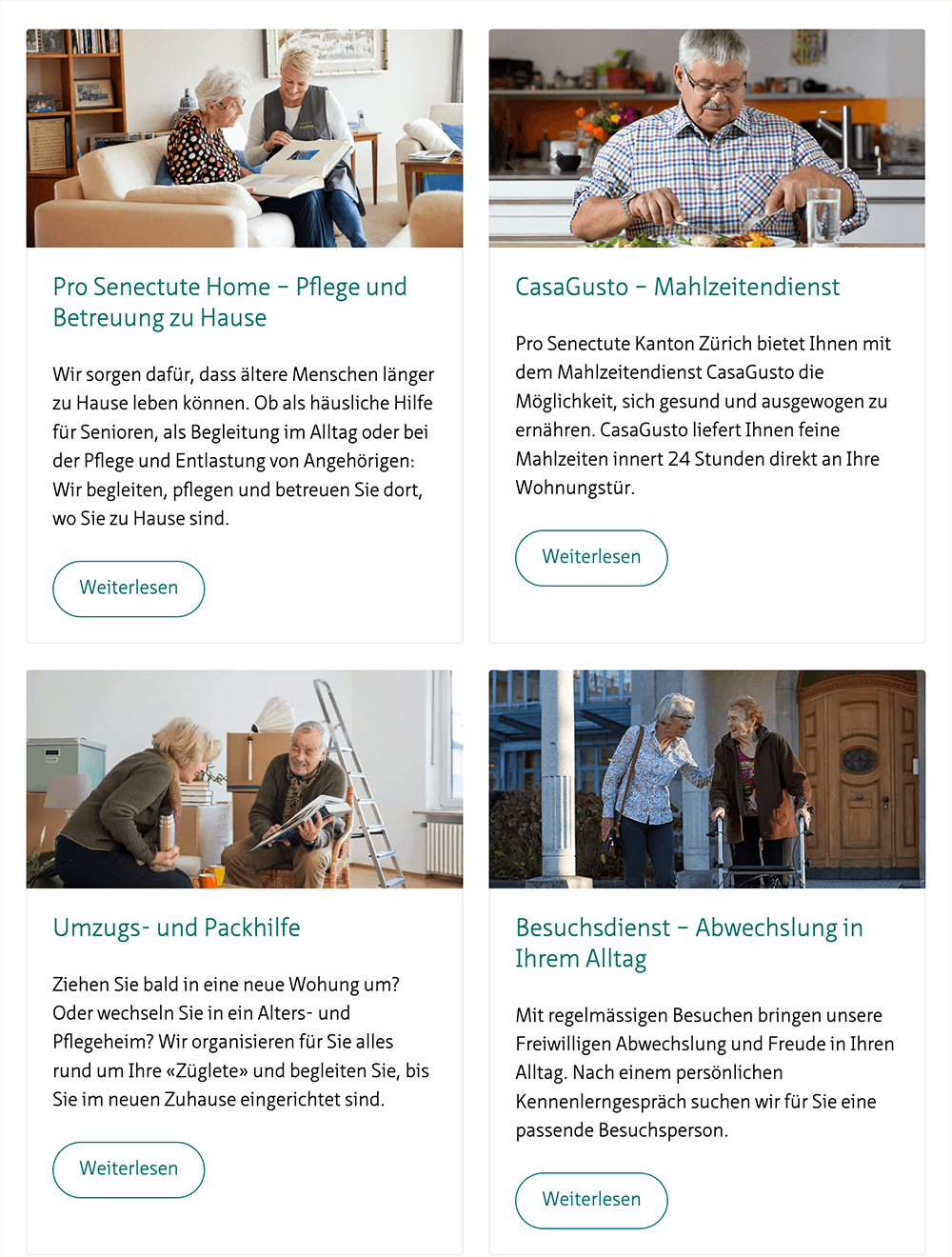
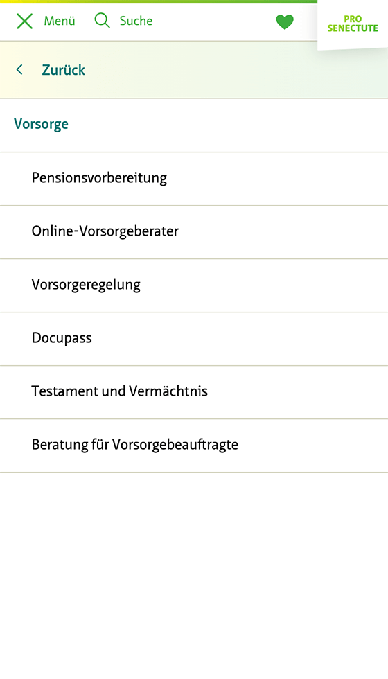

Kind
Website
Customer
Pro Senectute Canton Zurich
Services
Design, Frontend, WordPress
Website
Period
2021-today
Interface to CRM: always up-to-date course data
An existing feature of the WordPress website is the interface to a CRM system. This enables course data to be updated automatically. This means that the information displayed on the website is always up to date, which represents enormous added value for users. We have taken over the maintenance and further development of the interface and are in contact with the providers of the CRM software.
Continuous support & further developments
The web is constantly evolving, and a one-off website redesign is just the beginning. Our commitment doesn’t end with the relaunch. We provide ongoing support and plan regular updates for WordPress, plugins and all interfaces to ensure that the website continues to meet the latest technical standards and fulfill the needs of users.
Do you also have a project that suits us?
Contact us! We are always interested in new challenges.
Other Projects
A couple more of our client projects.
-
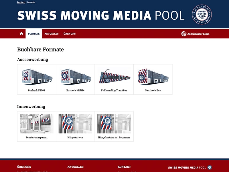 Read more: Swiss Moving Media Pool
Swiss Moving Media Pool
To deliver their advertising clients a whole new experience in booking ads, we built a WordPress based web application.
