New Websites with a fresh design for autotechnik
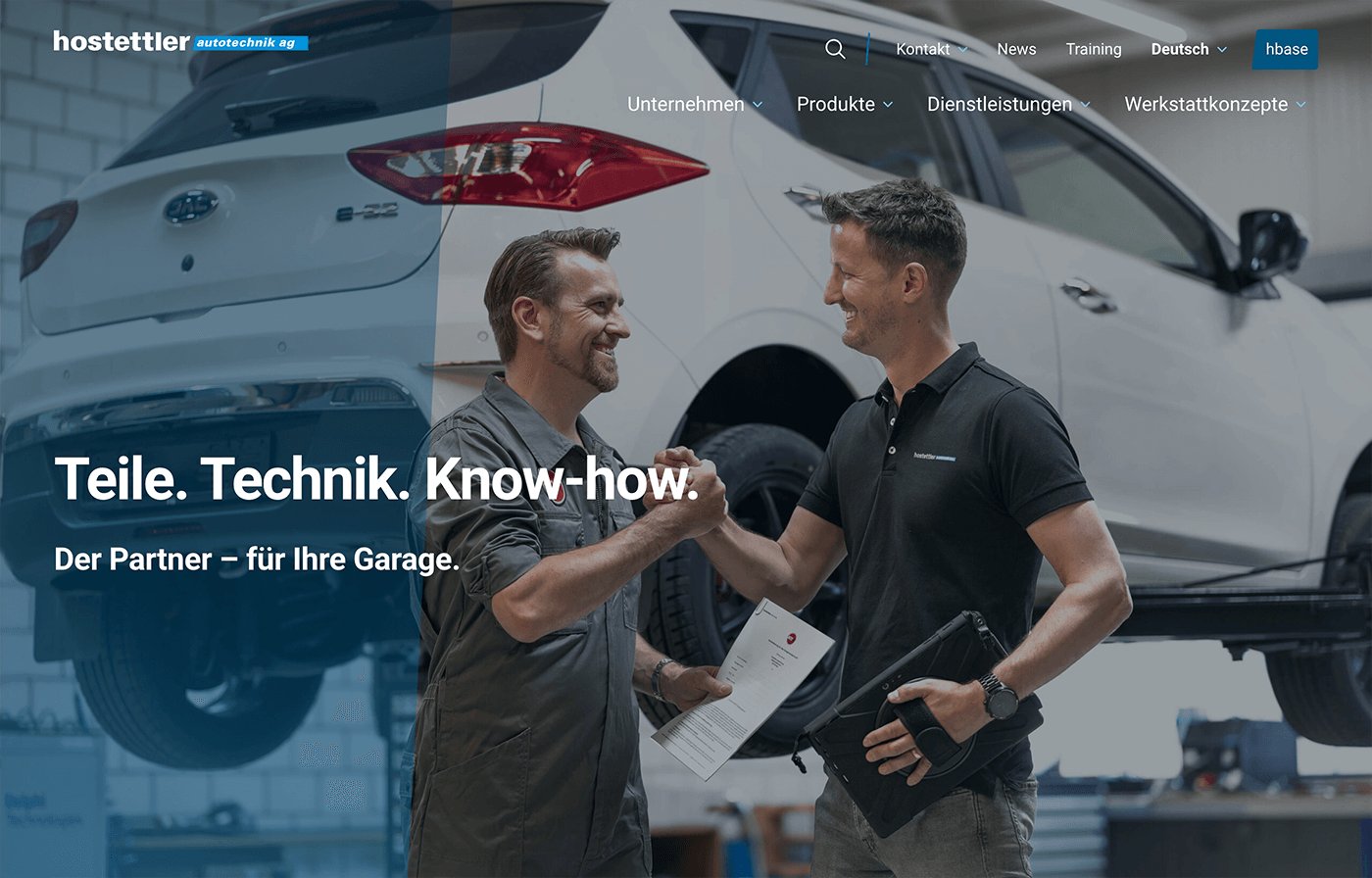
We have been counting hostettler autotechnik ag among our clients for some time now. In 2023, the new main website autotechnik.ch was launched, which impresses with a fresh, modern design and presents the offerings in a clear, structured manner.
Situation
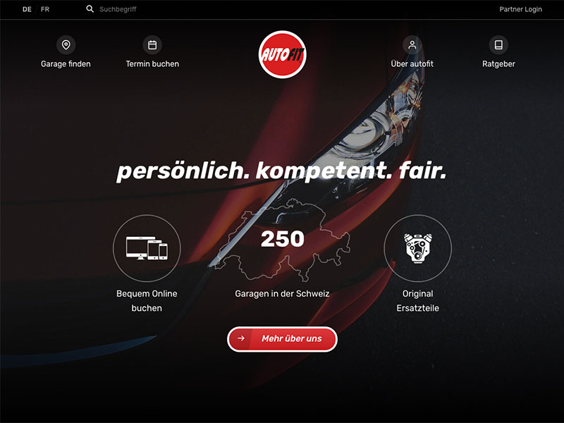
We have been working for hostettler autotechnik for several years, during which we have implemented the websites autofit.ch, autopro.ch, and egarage.ch and set them up in a WordPress Multisite.
autotechnik.ch and autotechnikdays.ch were still in a separate installation and were based on the same design as the hostettler group’s website. However, there was a desire for these to have a distinct presence.
Putting people at the center
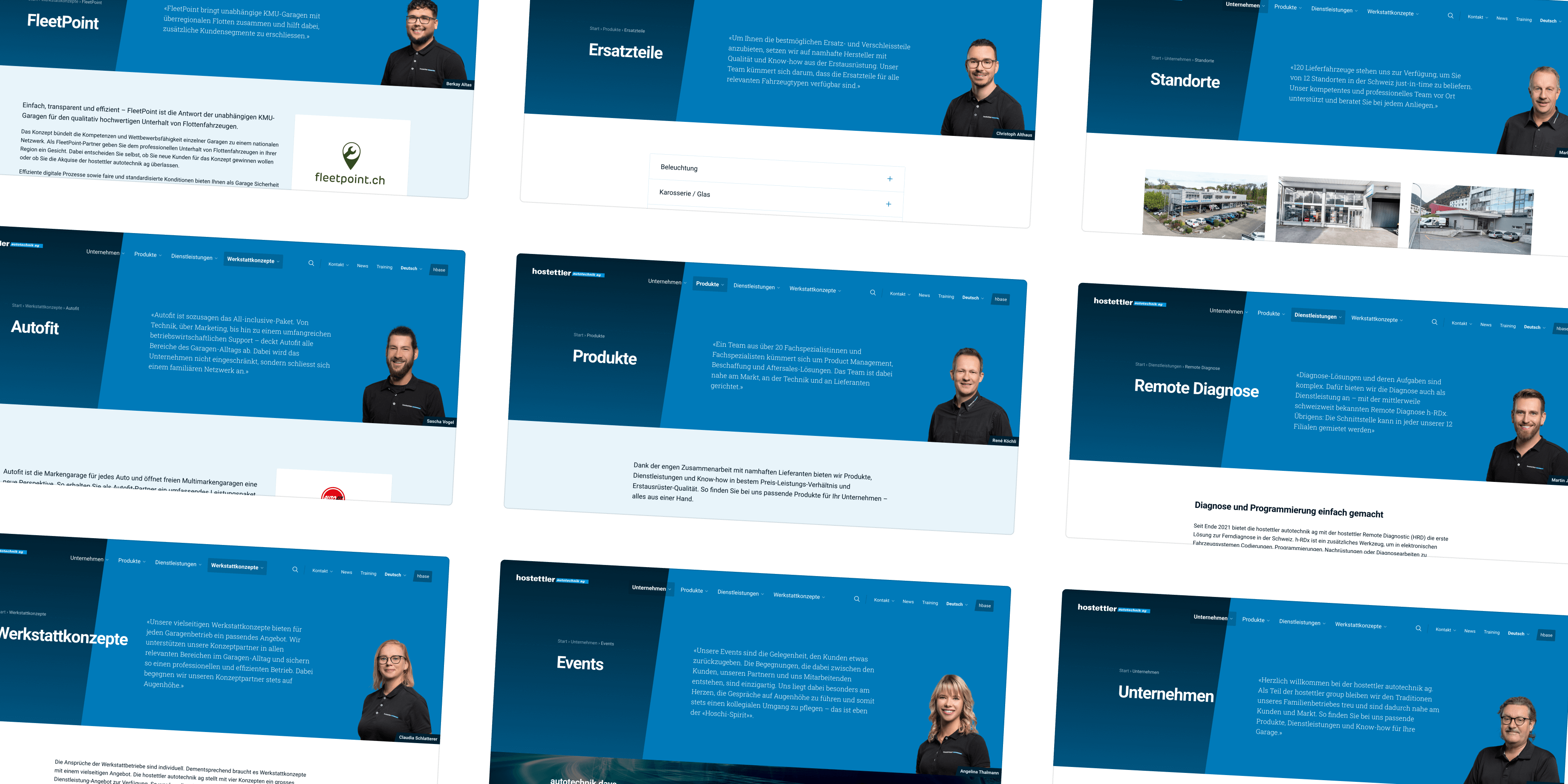
It was important, among other things, that the people at autotechnik become more approachable and present themselves to potential partners. We knew that new portraits for the employees were being created and that they would provide statements that should be communicated.
We had the idea to present these elements on a large stage, which would accompany visitors across most of the pages and content. This idea was extremely well received, so we implemented it as such. As a result, the people behind autotechnik appear approachable and accessible, and visitors also have direct access to contact information.

Type
Websites
Client
hostettler autotechnik.ch
Website
Timeframe
2023–today
Clear overview with good content elements
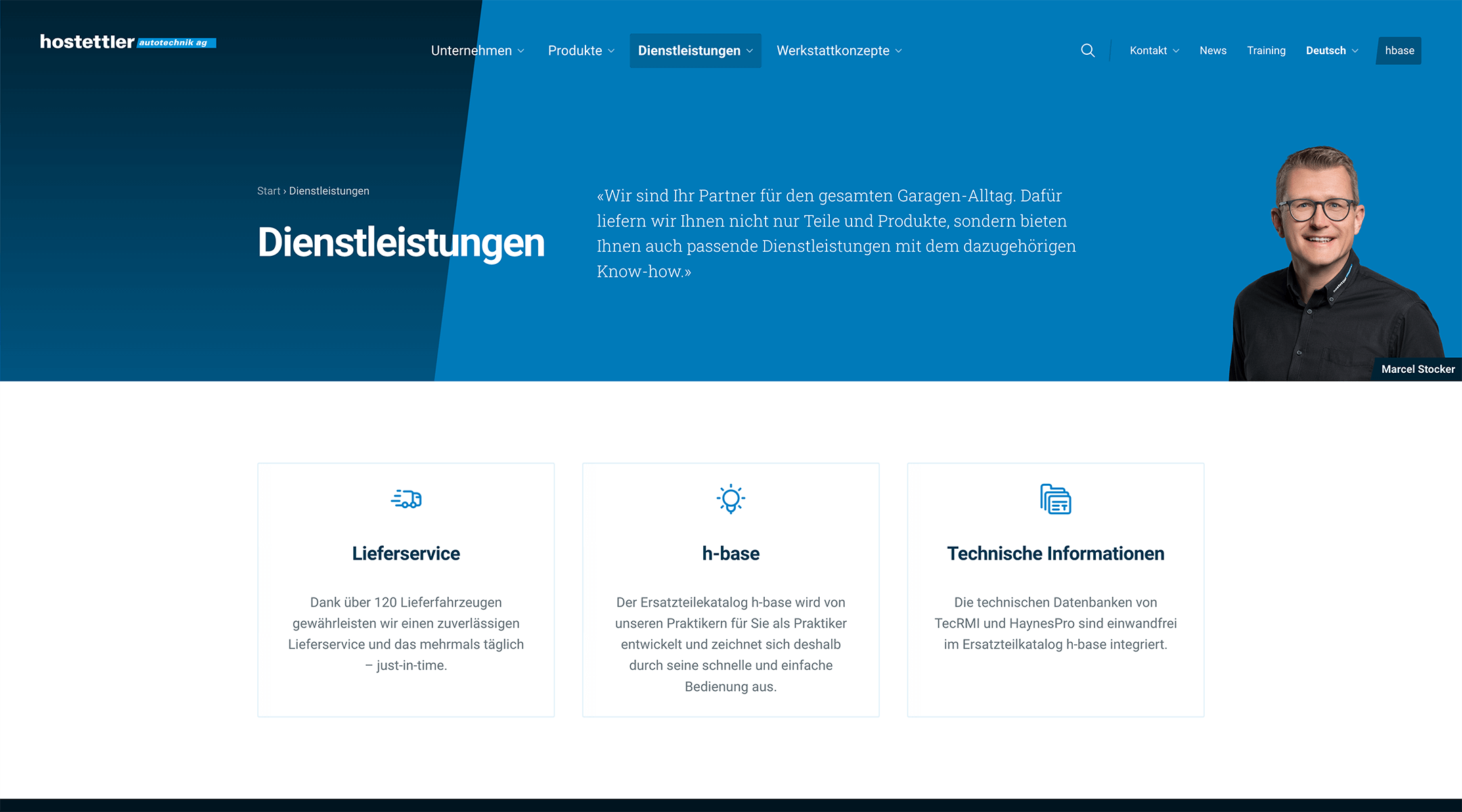
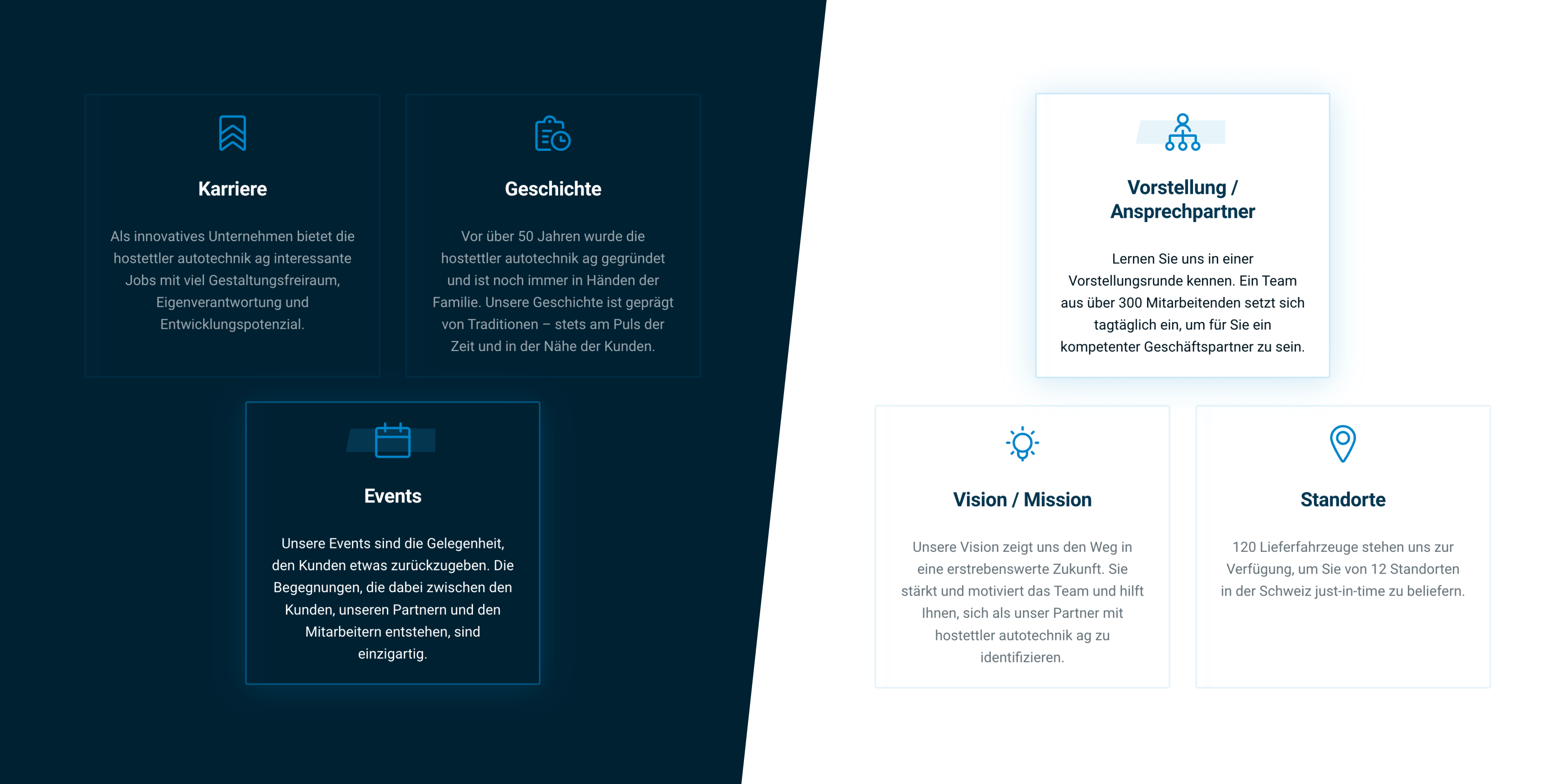
The information architecture was designed so that the main menu items – even if they have subpages – are clickable and thus have their own page. Therefore, a concept for these overview pages was needed, which is clearly understandable for the visitors and does not generate too much effort for the web editorial team to maintain.
The solution are compact teaser boxes, with which one can directly access the subpage with a click, and through the title and short description, already know what it is about. This is complemented by suitable icons, which are consistent across the entire website and in the same style. The teaser boxes work both on a light background and the elegant dark blue, enhancing the experience with an exciting effect when hovered over with the mouse.
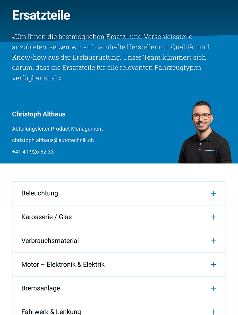
Additionally, Accordions are also used. With them, extensive content can be presented more compact and clearly than if it were always fully visible.

Custom Embeds
Now, to get a bit more technical. For displaying the many courses that garages can book via autotechnik.ch, the Swiss online software Calenso is used. However, the native WordPress integration with Calenso’s widgets was not sufficient to meet the needs. Therefore, a custom solution was necessary.
Technically, an iframe is embedded. To avoid our clients having to manually insert any HTML code, or if they have any apprehension about doing so, we developed a way for everything to happen fully automatically. Clients only need to insert the appropriate link, and the rest is taken care of by our so-called “Custom Embed Handler.” The width and height are automatically and dynamically calculated, and the iframe is inserted in the appropriate place. Anyone familiar with WordPress knows this from inserting YouTube videos in the Block Editor. You just need to insert a link, and the rest happens automatically. We built this, but specifically for Calenso, something that didn’t exist before.
Do you also have a project that suits us?
Contact us! We are always interested in new challenges.
Other Projects
A couple more of our client projects.
-
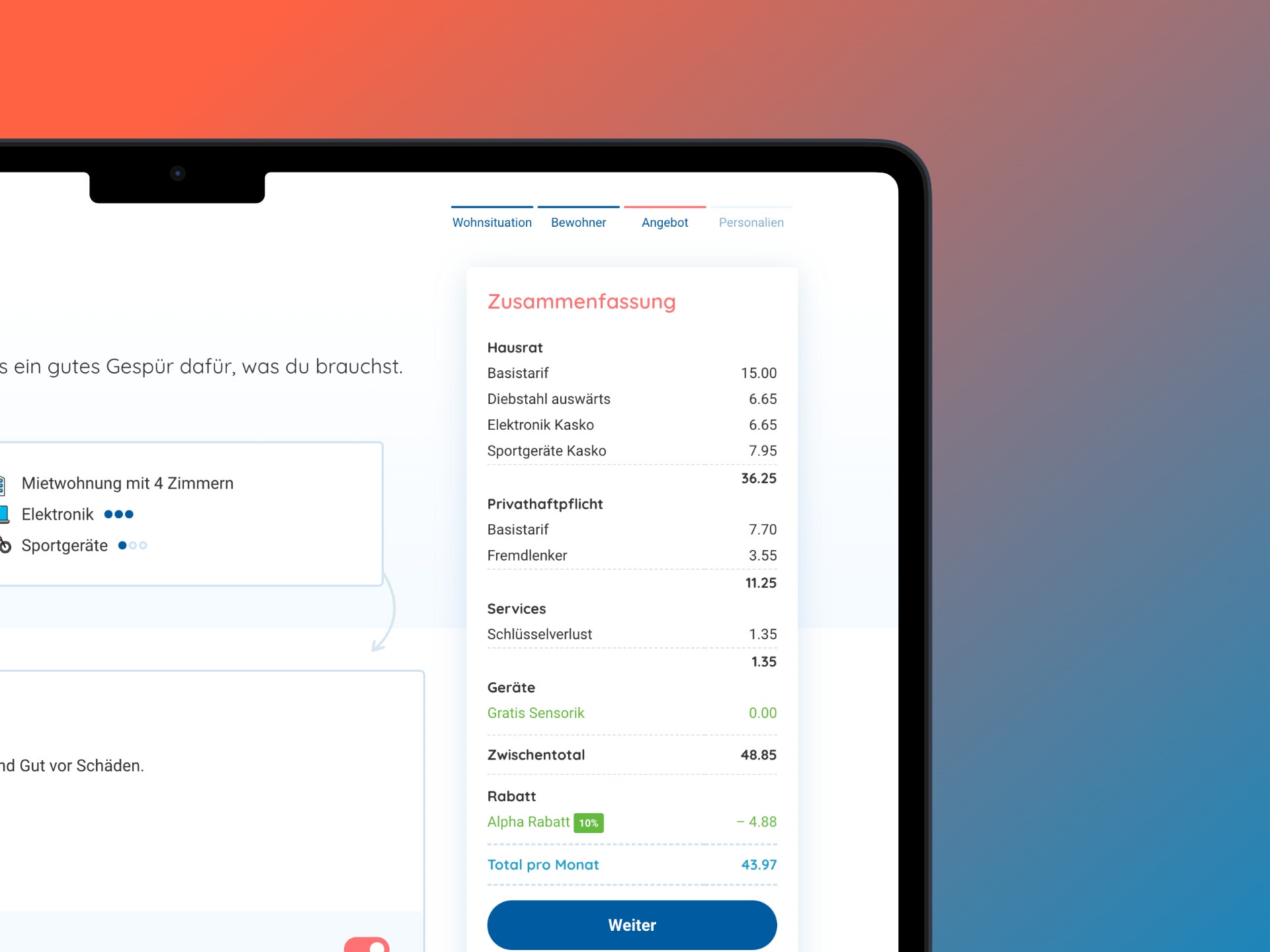 Read more: Workshops and prototype for an insurance premium calculator
Workshops and prototype for an insurance premium calculator
We conducted workshops for an insurance start-up and implemented an interactive prototype of a premium calculator in a design sprint.

