Relaunch with a new design system
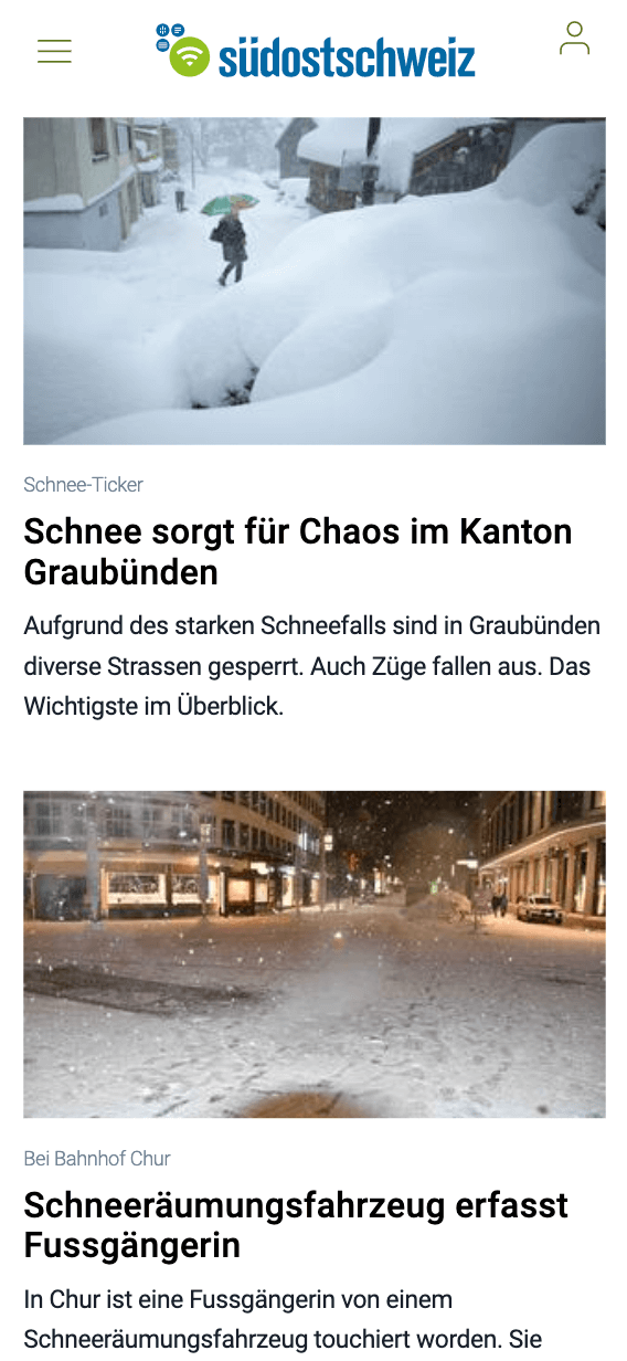
For a news portal, it is particularly important that readers can inform themselves across various screen sizes.
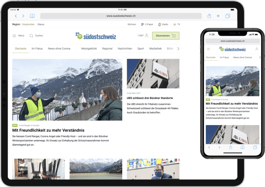
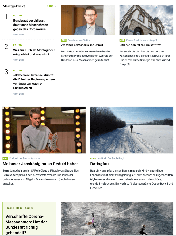
Clear reduced design, good readability, as well as great user flow across various devices are the focus. This was the second time that we had the opportunity to contribute to the relaunch of the regional news portal of the media house Somedia in Chur.
New look with improved readability
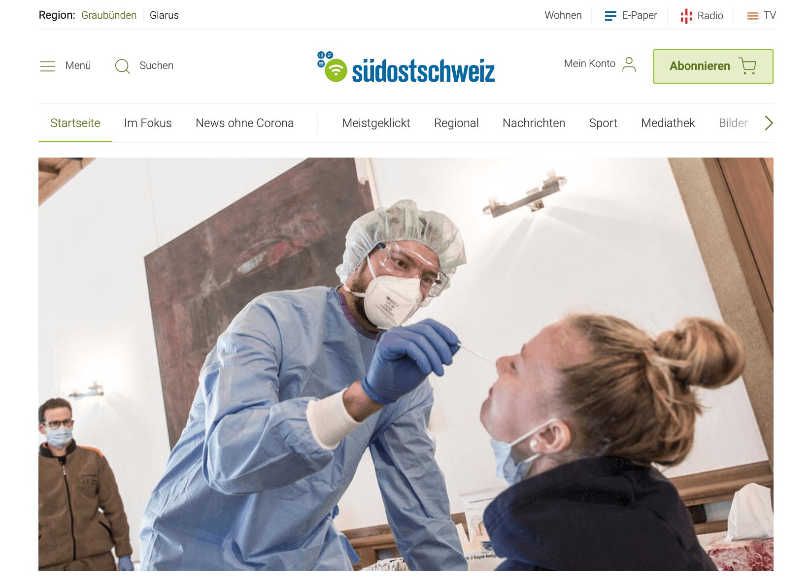
Since 2016, we have been able to support the media house with our expertise in UX design. In 2017, the platform redesign went online with a completely new concept and visual look. The main focus was on the structure of the homepage and accessibility on various screen sizes (Responsive Design). Almost 4 years later, suedostschweiz.ch is once again getting a fresh, modern new look. Thanks to the optimized presentation, the portal has become even more reader-friendly and offers readers more space and focus for even better orientation.
One design system for all contributors
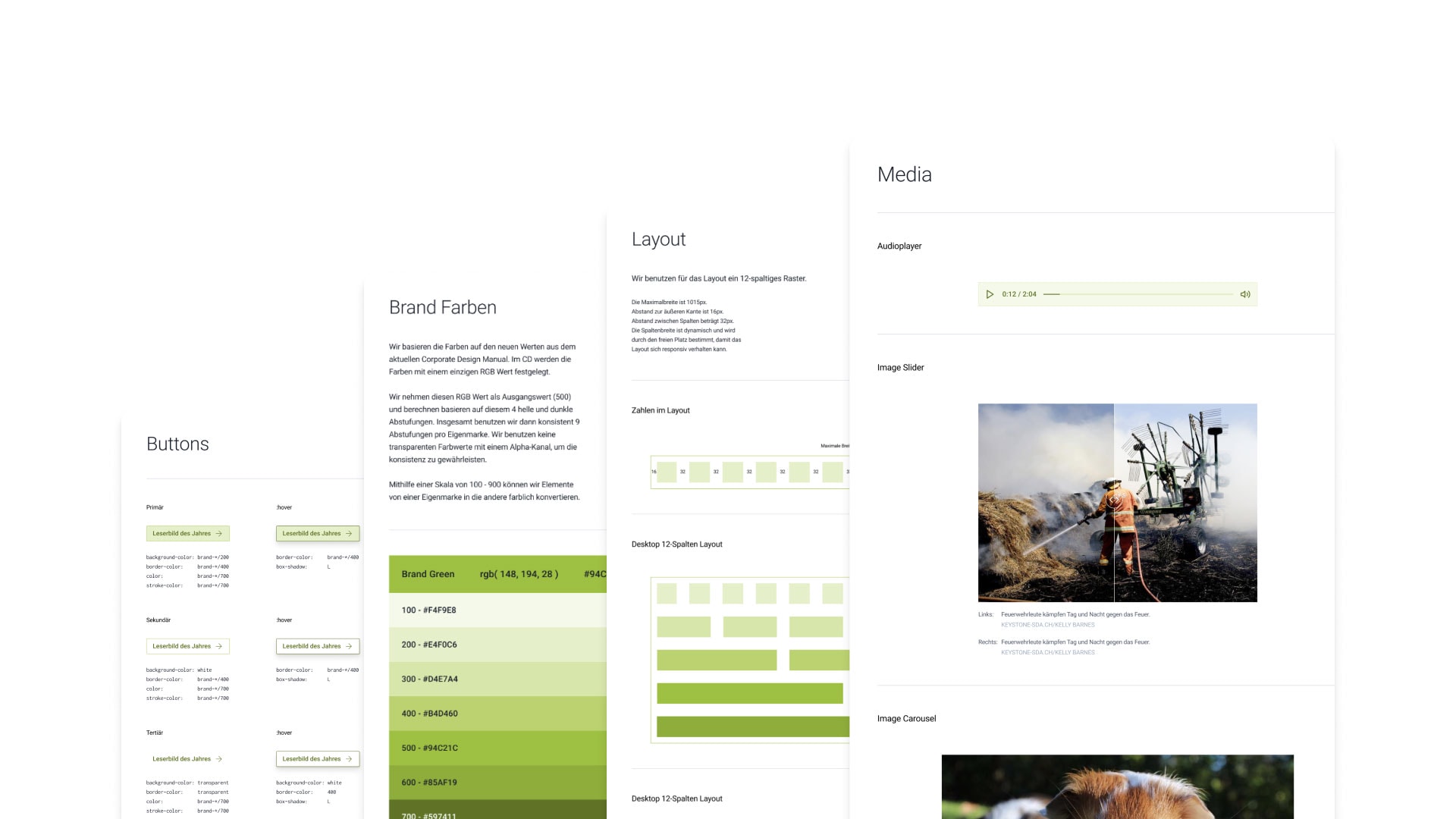
For the relaunch, we not only created a new user experience design, but also developed a complete design system. With the modular design system, the entire concept is organized and future-proof. All elements are documented and can be used as reference by every contributor.
What is a design system?
Instead of corporate design manuals, design systems are used today because they are much more flexible. A design system is a collection of reusable components with clear rules, principles and constraints for a company’s design development. In addition to generally valid principles, this also includes code and UI components. The result is fixed specifications for the design and the possibility to reuse various design elements.
Why a design system?
- It increases the quality and consistency of the brand
- Smooth handover to designers and developers
- Saves time and resources during implementation
New User Journey for Subscription Users
Paid-Article
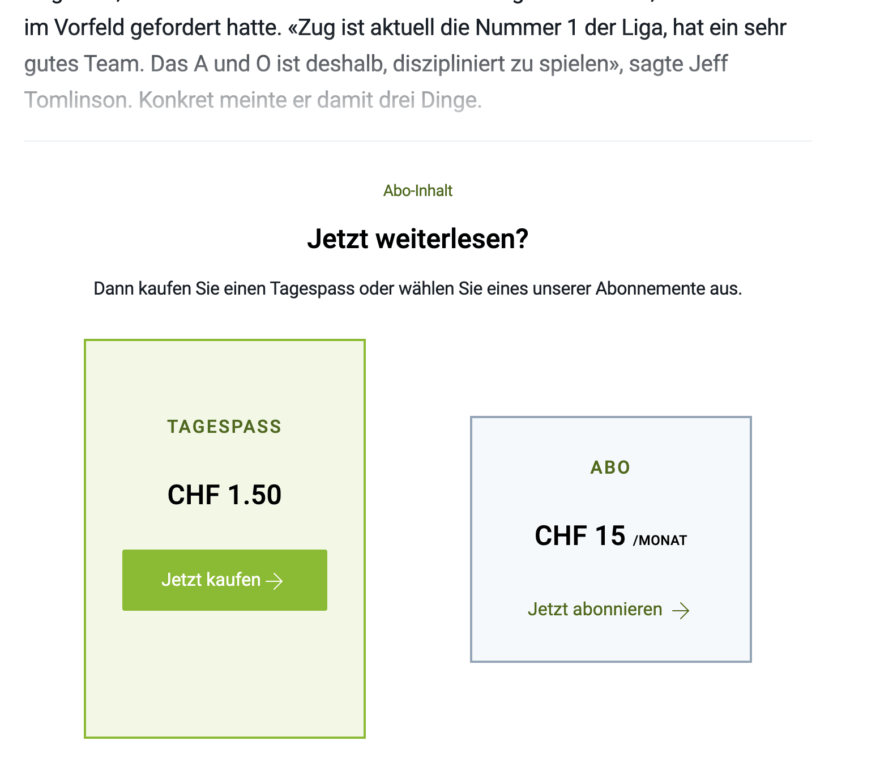
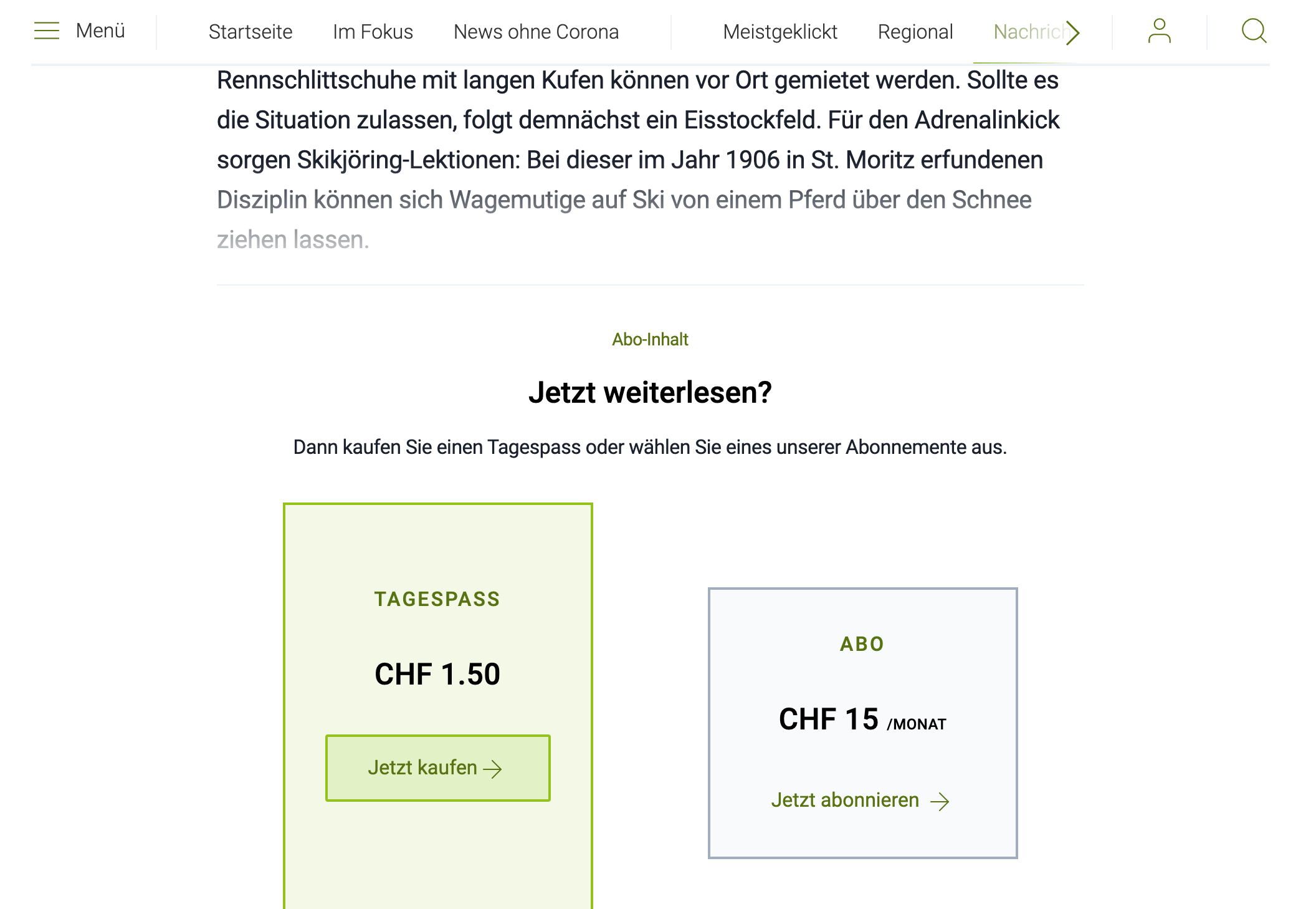
Another topic that we were able to address together with Südostschweiz Medien was the visitor flow for articles behind the paywall (paid articles). Readers should be able to buy a subscription article directly and within a few steps via their login. This should happen separate from the standard subscription store process, so that paying for an article does not interrupt the reading flow too much. With two clicks, readers can now pay for articles and continue reading.
Better conversion in the subscription store
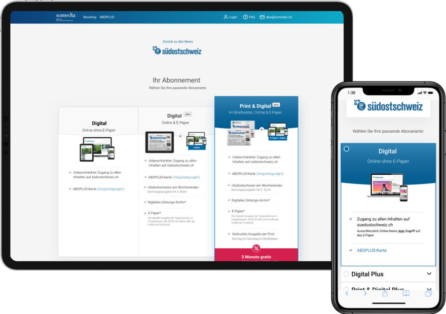
Another major project was the redesign of Somedia’s subscription store in 2019, where we designed the entire process of purchasing a subscription to the various formats; digital, e-paper and print edition. Our focus was to guide readers efficiently through the subscription store, thus reducing support requests and increasing sales. Today, a visitor can compare the different offers and content side by side and order the appropriate one more efficiently due to fewer steps in the process.

Type
News Portal
Client
SOMEDIA Press AG
Services
Concept & UX Design
Website
Period
Redesign #1: 2016
Redesign #2: 2021
Do you also have a project that suits us?
Contact us! We are always interested in new challenges.
Other Projects
A couple more of our client projects.
-
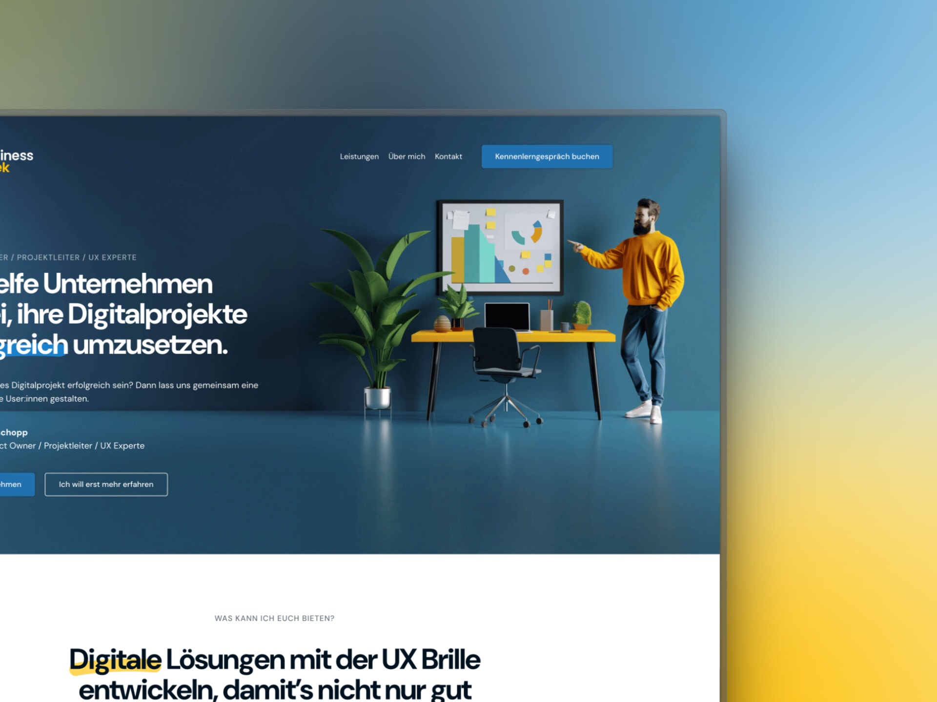 Read more: Business Geek SME website
Business Geek SME website
We designed and developed the website for our office colleague Business Geek in Lucerne and also relied on Generative AI.
