
NZZ: A new concept for the front-page
Starting point
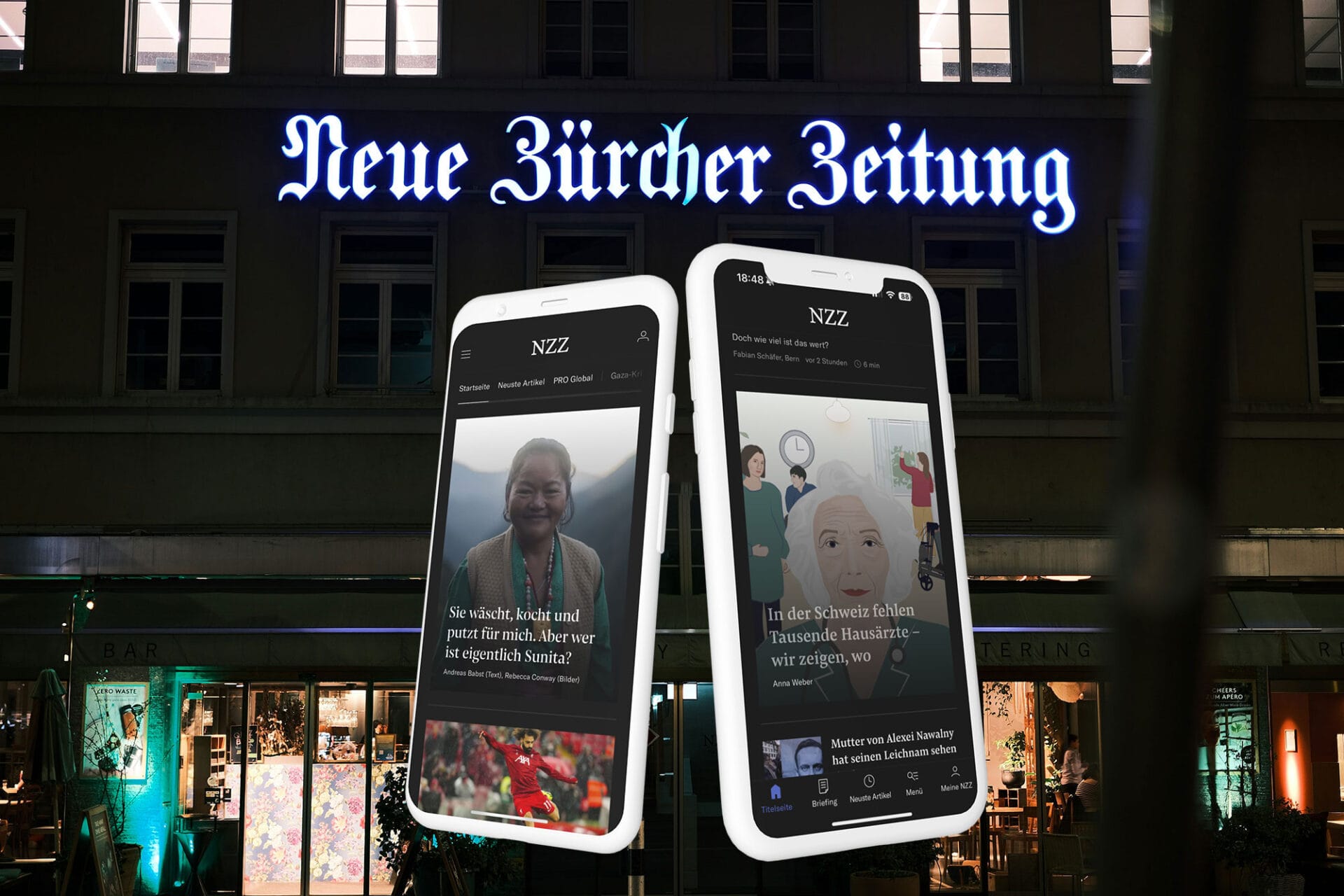
The news portal “Neue Zürcher Zeitung” commissioned us to redesign its front-page nzz.ch. In close cooperation with the editorial team, we identified needs, developed ideas and realised a mobile-first approach for the newsroom.
Our selection as agency was based on the fact that we were able to successfully integrate ourselves into the NZZ team and at the same time work closely with the various departments and stakeholders as project managers for the project.
Procedure in brief
Mobile First – Desktop Second for readers and newsroom employees.
Research & analyse user feedback
To prepare the procedure, we were in close consultation with the internal Research/UX team and analysed the research reports of the last five years.
Ideation workshop
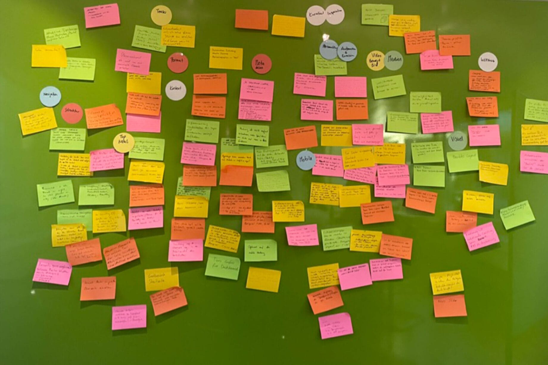
First of all, we held an ideation workshop with the editorial team, where wishes and ideas were recorded, clustered and prioritised. Various stakeholders from the entire NZZ organisation took part:
- Editorial team (text & image)
- Data analysts
- Head of Technology
- Product Manager
It was decided to pursue a mobile-first approach. Not only should the design of the front-page follow this principle, but the entire newsroom should apply a mobile-first approach to display and maintain news on the front.
Mobile-First prototyping workshop
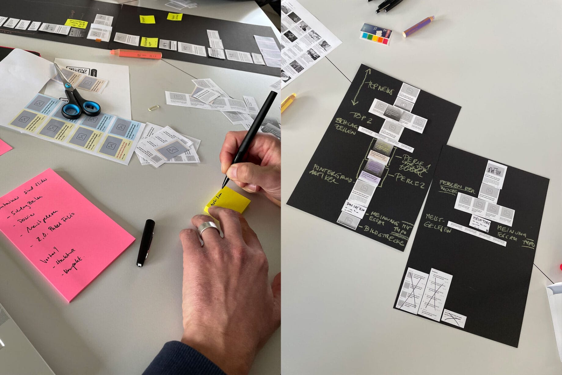
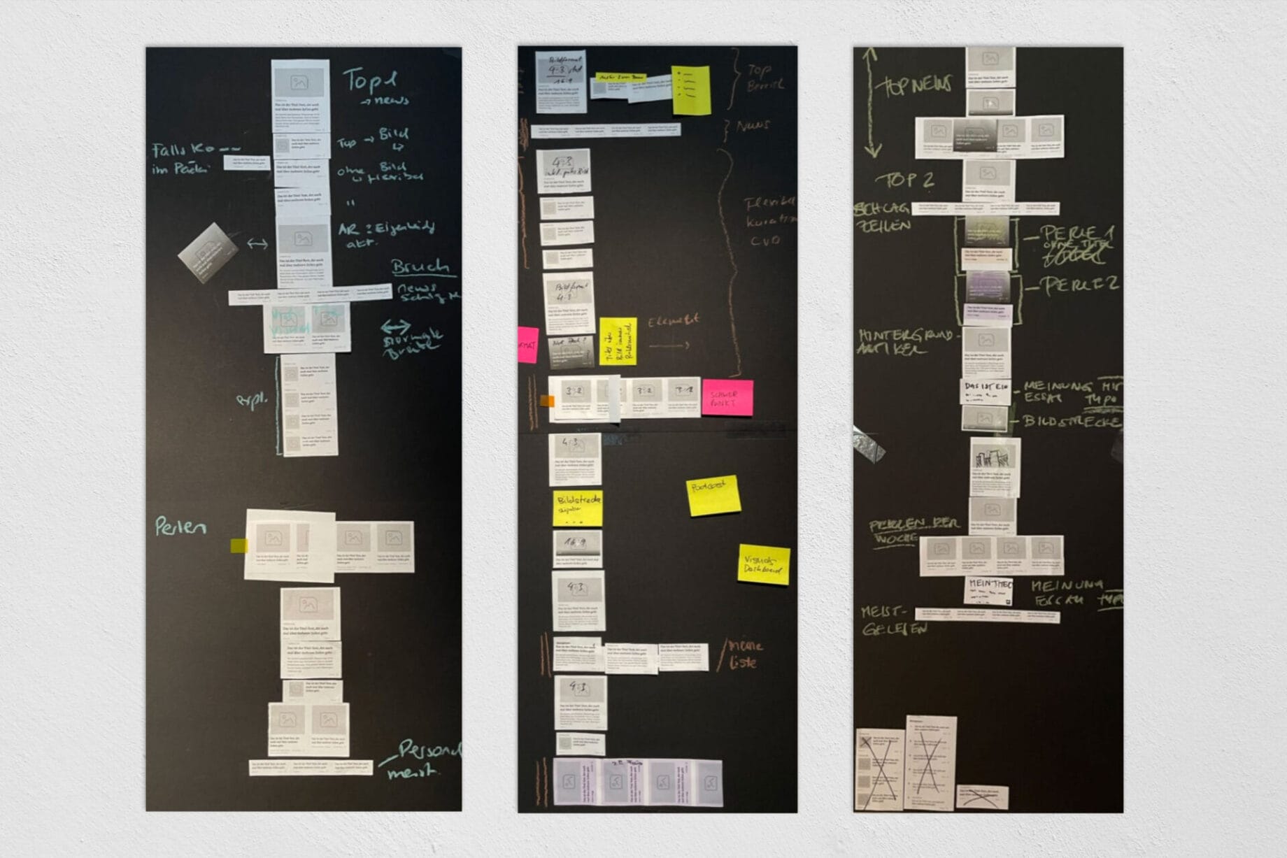
In another workshop, we printed out the new ideas as “wireframe teasers” to create paper prototypes. We formed four groups, each of which was tasked with designing a front page. Each group consisted of a balanced mix of professionals who brought their respective perspectives to the prototypes and designs. This allowed us to achieve valuable and diverse results, which we then discussed.
The challenges
The wide variety of perspectives and requirements of the stakeholders presented us with a particular challenge, as we had to fulfil the wishes of the various divisions and departments without losing sight of our main target group – the readers of the NZZ.
We were also faced with the challenge of not only fulfilling the needs of the readership, but also taking into account the requirements of the newsroom and editorial staff, who have to work with the new approach on a daily basis.
Solution
New teaser formats:
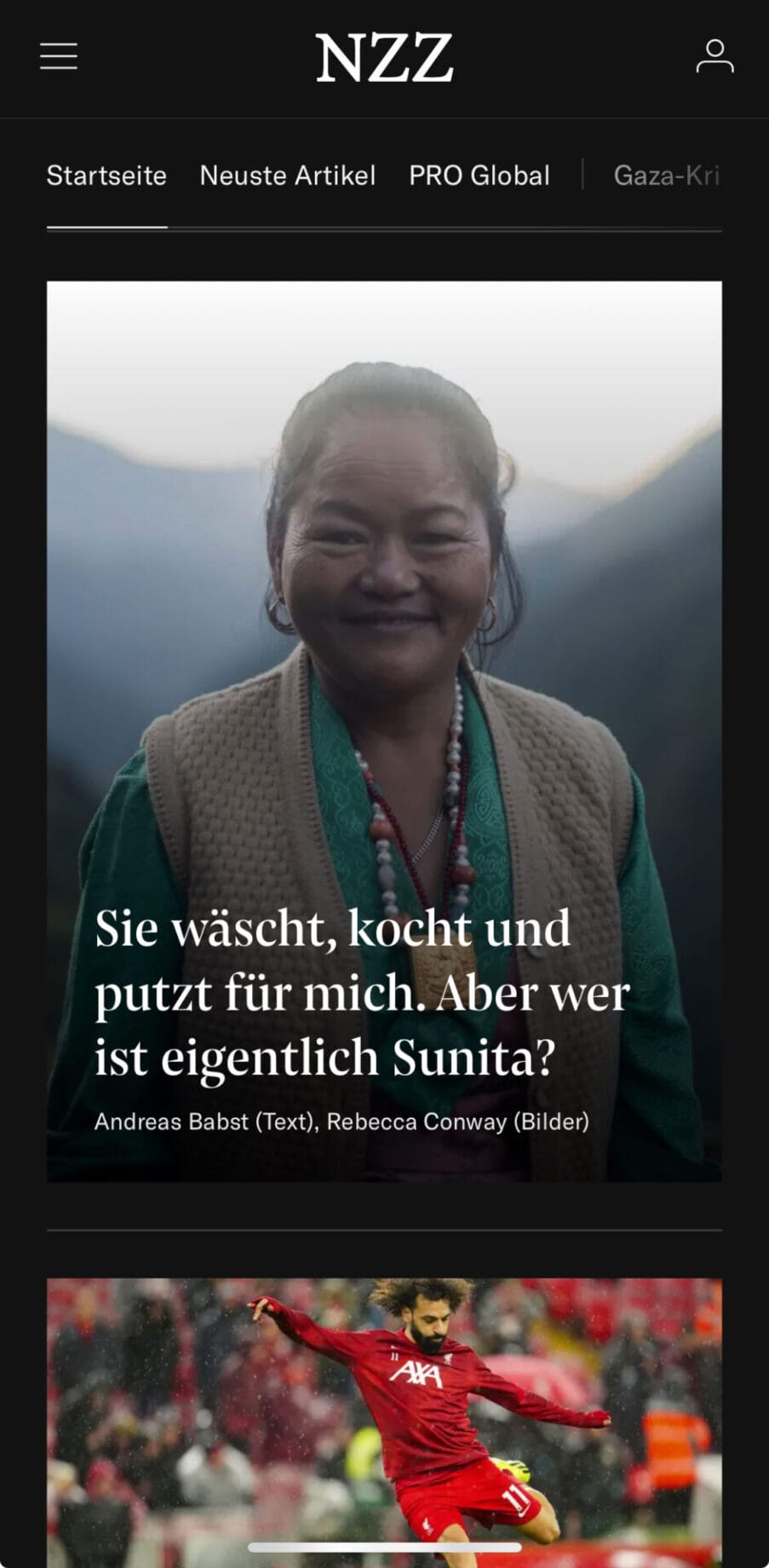
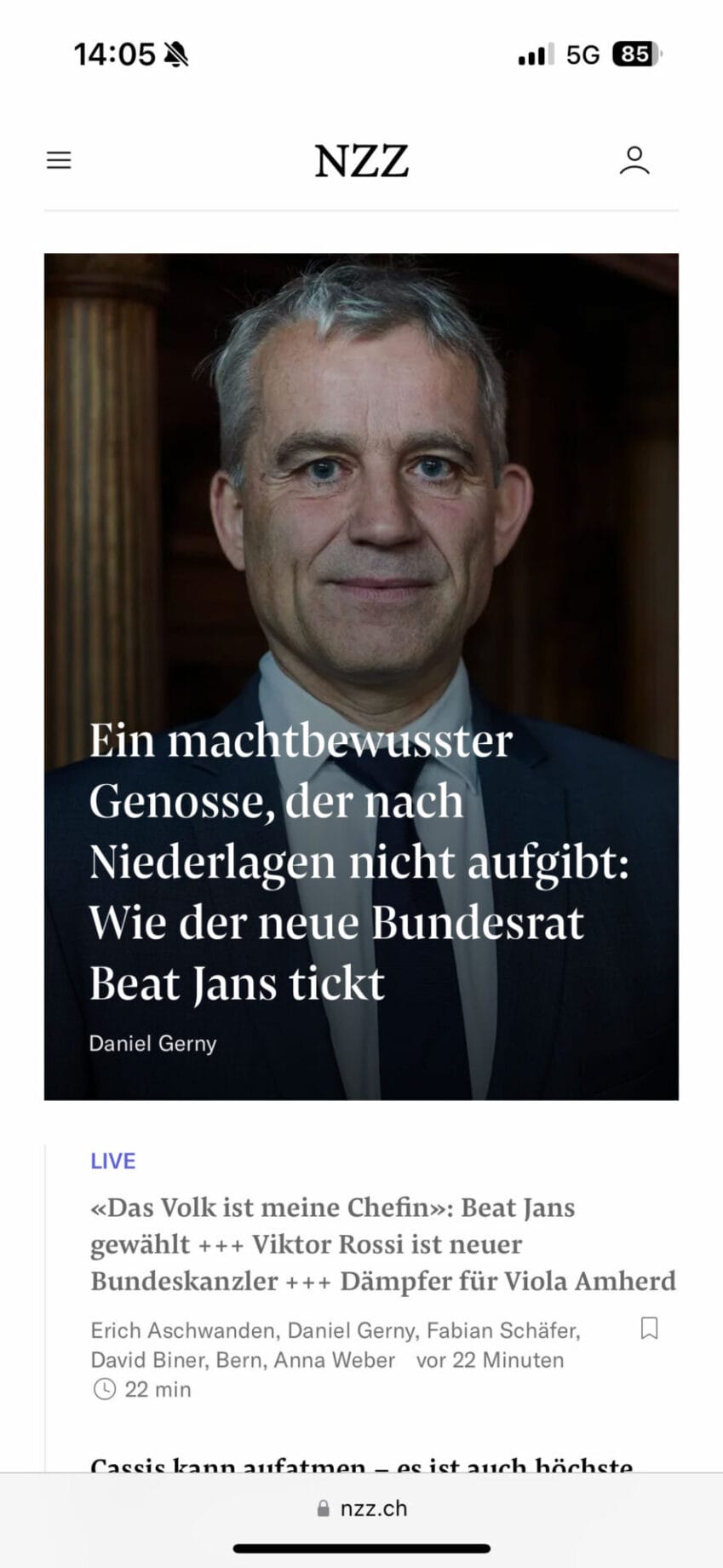
In order to visually emphasise the importance of the news on mobile devices, new teaser formats have been introduced with which the newsroom can add visual weight to the articles. Current events can be emphasised with a large teaser, while less demanding articles are presented with smaller teasers. This provides orientation and guidance for readers and improves the overview, as the smaller teasers take up less space on mobile devices.
Container for timeless articles:
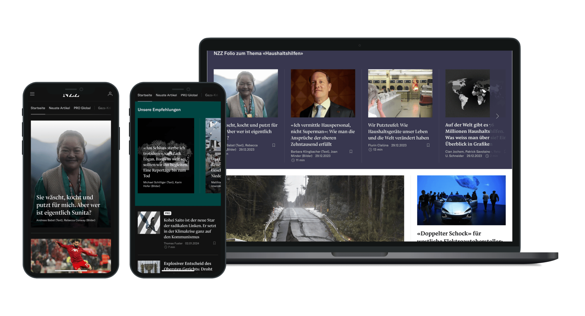
A new function has been introduced for so-called long-form articles, which are characterised by timeless topics and comprehensive research: they can now be placed between the daily news in containers that can be navigated using slider gestures. This gives readers access to the daily news in a vertical direction and to the timeless articles in a horizontal direction.
Impressions from the front-page concept-workshops
New teaser format
For long-form articles, there are now so-called full-screen teasers, which are shown below in “dark mode” in the mobile app and in light mode in the web app.
Desktop Second
As the focus of the newsroom is now entirely on the mobile-first approach, the desktop version is compiled automatically. We have developed a concept that makes it possible to generate the desktop version technically without major layout effort.
As a “best default”, we rely on an optimal standard configuration so that, ideally, no special customisation is necessary for the desktop version. For special events, however, it is still possible to customise the desktop layout using special templates and bundles.


«With required, we reimagined our homepage from the ground up, seamlessly integrating the needs of all stakeholders. The result is a solution that perfectly balances the expectations of both our editorial team and our readership.»
Tom Schneider – NZZ

Art
news portal
Kunde
Neue Zürcher Zeitung
Leistungen
Strategy, Design & Prototyping
Website
Zeitraum
2023
The design team
Get in touch:


