What is Cumulative Layout Shift (CLS)? Brief explanation and tips
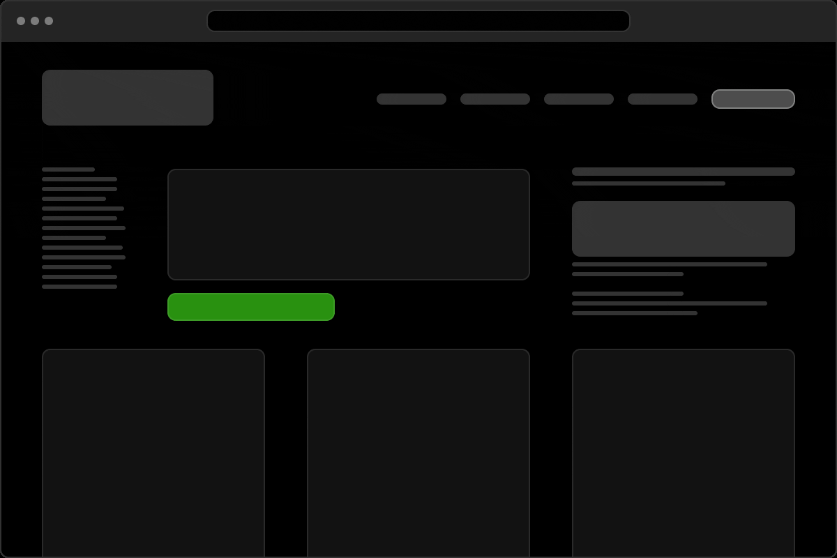
Does this ring a bell? You are on a website, about to press a button… and poof, the whole content jumps away. You hit the wrong button, have to scroll again or, in the worst case, lose the overview completely. Welcome to the world of Cumulative Layout Shift. In short: CLS.
Find out more in this article:
- What exactly Cumulative Layout Shift is and why it is important
- How the Cumulative Layout Shift score is calculated and what a good value is
- Which typical problems are responsible for this
- And how to solve them elegantly
At the end, we’ll give you a few tips on when it makes sense to go deeper – or simply get in touch with us.
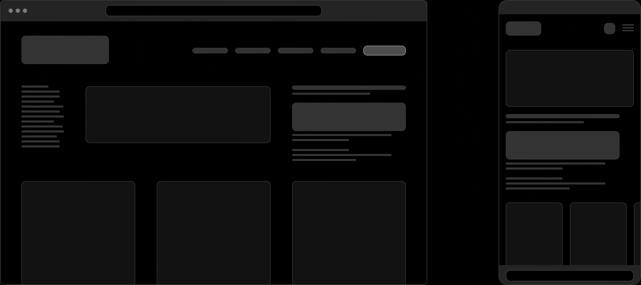
What is Cumulative Layout Shift?
Cumulative Layout Shift (CLS) measures how much content on a website shifts unexpectedly while it is loading or changing. Google calls it visual stability – and it is a central element of the so-called Core Web Vitals, the very important key figures for the user experience on the web.
Cumulative layout shift particularly affects the so-called “above the fold” – i.e. the visible area when the page is first loaded. If elements suddenly pop up, reload or shift there, the page appears unstable – which is not only annoying, but can also lead to misclicks.
Why is Cumulative Layout Shift so common?
CLS is usually not caused by malicious intent, but by incomplete planning or a lack of technical measures. This happens particularly frequently:
- for images or videos without a defined size,
- for advertising that is dynamically reloaded,
- for web fonts that lead to a so-called Flash of Unstyled Text,
- or for iframes, forms and interactive widgets.
A poor CLS value is particularly noticeable on mobile devices, where space is limited and charging takes longer.
The CLS score
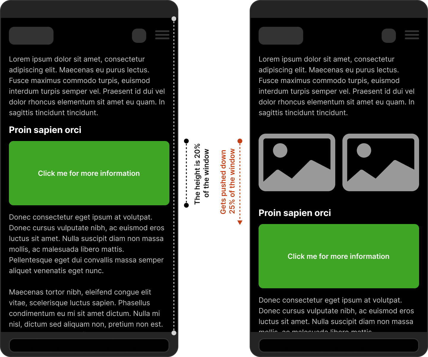
How do you measure layout shifts?
The CLS score is a number between 0 and 1, with lower being better. It is made up of two factors:
- Impact fraction: how much space does the slipped element take up?
- Distance Fraction: how far has the element moved?
Example: A button takes up 20 % of the screen height and jumps down by 25 %. The impact is 0.2, the distance is 0.25 → the CLS score of this shift is 0.125 (0.5 × 0.25).
A single shift is often not the problem – the score adds up all the layout shifts that happen during loading.
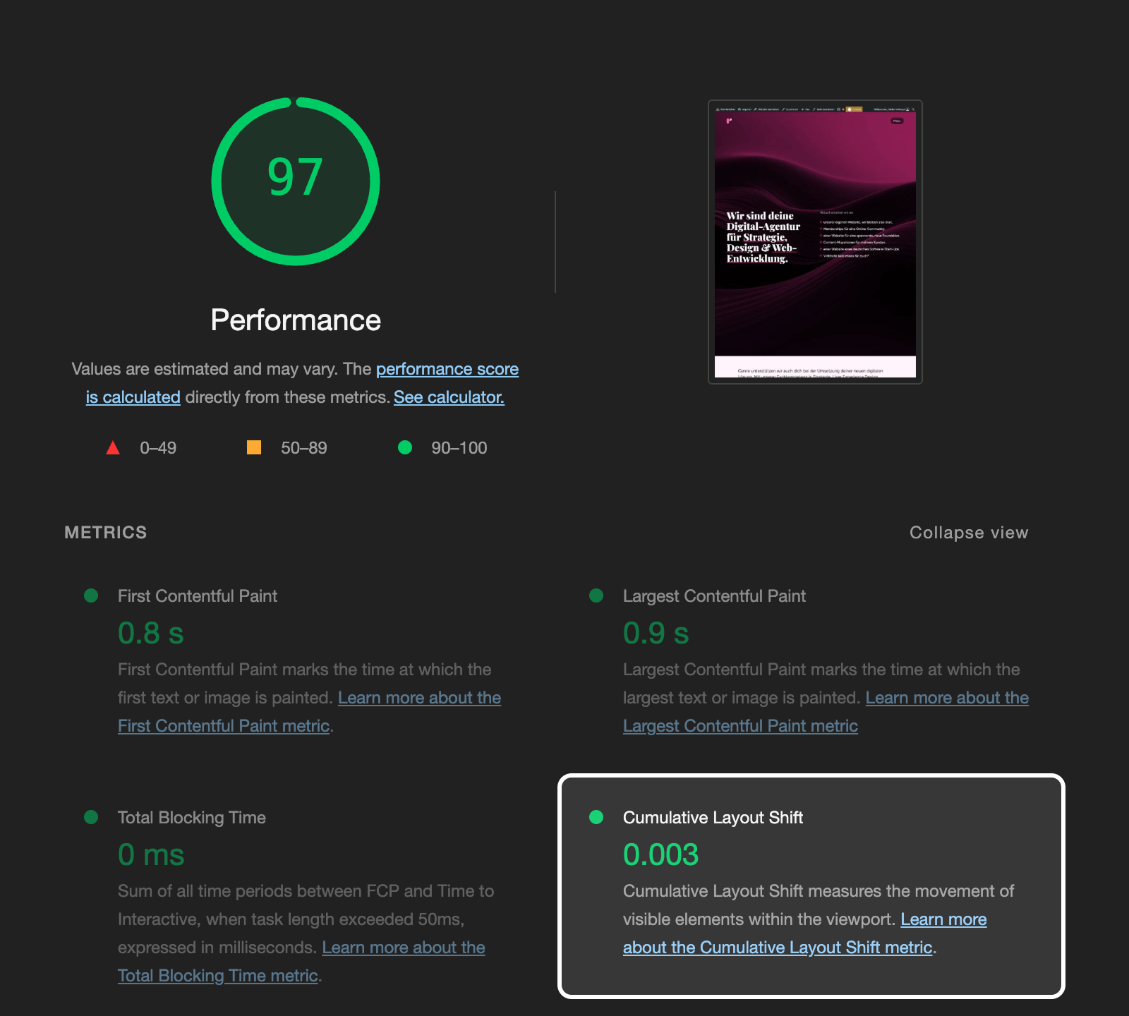
What is a good Cumulative Layout Shift value?
Google gives the following recommendations:
| CLS score | Meaning |
|---|---|
| 0.1 or less | Good – users don’t notice anything |
| 0.1 – 0.25 | Improvement necessary |
| over 0.25 | Critical – user experience suffers |
Most modern page speed tools such as PageSpeed Insights or Lighthouse display the CLS score directly – including information on causes.
Typical causes
And how to fix the cumulative layout shifts
1. missing size for images and videos
Problem: An image is loaded, but the space for it is not reserved – as a result, the content jumps during reloading and is pushed to the bottom.
<img src="example.jpg" width="800" height="400" alt="Example">
Solution:
Always use width and height in the aspect-ratio attribute if the aspect ratio is known.
2. dynamically reloaded advertising or banners
Problem: Ads or cookie banners push content down as soon as they appear.
Solution:
Reserve the space for such elements right from the start – even if the content comes later. There are special ad slots for ads that remain static even if no ads appear.
3. forms or components that push content
Problem: A newsletter form loads late, a cookie notice appears at the top, and the visible content jumps.
Solution:
Define container heights or reserve the space expected to be used from the start. Alternative: Use so-called progressive disclosure: Interactive elements appear through smooth transitions, without shifting the layout.
4. lazy loading without placeholder
Problem: Images or components are loaded first (lazy loading), but without reserved space. As a result, the page jumps as soon as the content is there.
Solution:
Set placeholders (skeletons) of the same size or use techniques such as min-height to ensure layout stability.
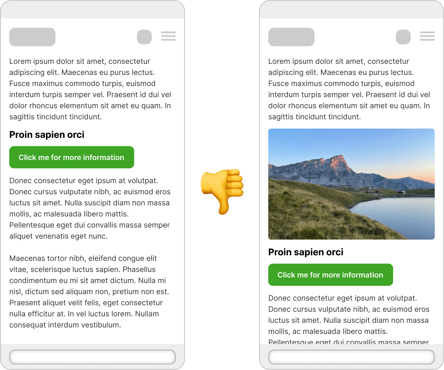
5. web fonts and Flash of Unstyled Text (FOUT)
Problem: If a web font is loaded first and the browser displays a fallback font beforehand, the text may shift later. Especially if the fallback font has a different width or spacing.
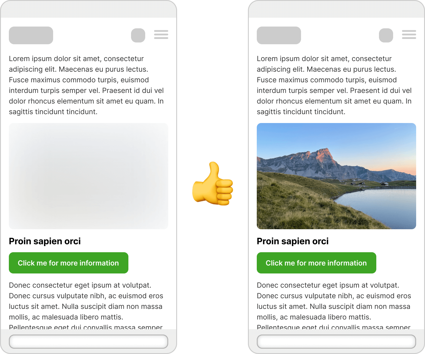
In this example, the font “PT Sans Narrow” is used for the title and the introductory text. Because this font is very narrow, the texts will take up less space once the font has been loaded.
This can mean that a title or paragraph requires fewer lines and is therefore less high.
Solution:
Use font-display: swap; deliberately – it ensures that the text is immediately visible, which is a big plus from a performance point of view. However, make sure that the fallback font has similar dimensions to the web font (e.g. for line breaks or character width) in order to avoid layout jumps.
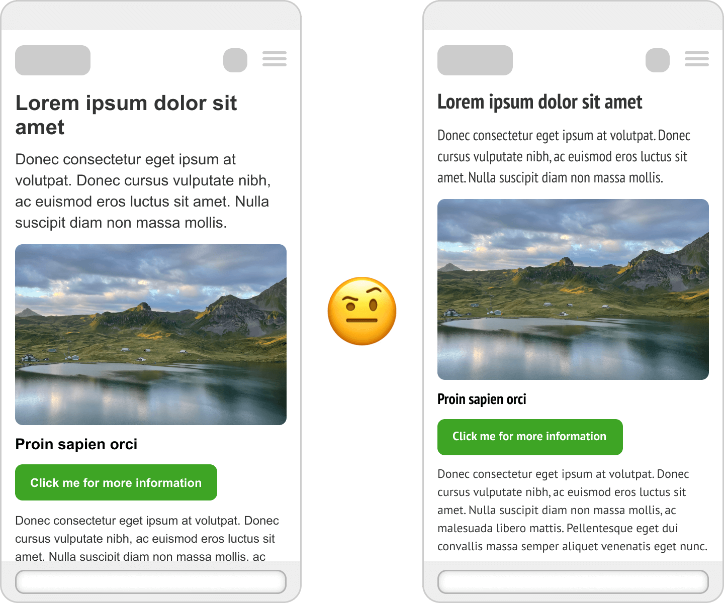
Here we also use the font “PT Sans Narrow” for the titles and the introductory text.
As a replacement font, however, we use “Arial Narrow” here, which is similarly narrow as the web font used. This prevents the website from bouncing.
If this is not possible, font-display: optional or targeted preloading of the web fonts (e.g. via link rel="preload") can also help to minimize the CLS effects.
How can I test Cumulative Layout Shift?
Here are a few tools and methods:
- PageSpeed Insights (Google): provides CLS values and specific recommendations
- Lighthouse in Chrome DevTools: local tests with metrics and waterfall
- GTmetrix: additional insights, especially for mobile devices
- required Checkup: Our own tool, which uses the PageSpeed API, but also provides many other valuable inputs. Or will do so when we put it live.
How does WordPress behave with regard to Cumulative Layout Shift?
TL;DR: If you know what you’re doing: very good.
WordPress is the world’s most widely used CMS and inherently offers some solid foundations to ensure visual stability. At the same time, a lot depends on the specific implementation in the theme or plugin. If you use WordPress correctly, you have a good basis for a low CLS score. However, if you work carelessly, you can quickly cause problems.
The advantages of WordPress with regard to Cumulative Layout Shift
1. automatically generated image sizes and width/height attributes
Since WordPress 5.5, the width and height attributes are automatically added to images in the editor. This is a great advantage because it immediately shows how much space the image will take up in the layout when it is loaded – without any jumping.
Tip: If you use the WordPress Block Editor (Gutenberg), these attributes are usually set automatically – provided you use the image function correctly and do not load any arbitrarily embedded
2. core optimizations for performance and accessibility
The WordPress core comes with increasing performance improvements: Lazy loading of images is activated by default(loading="lazy"), themes can specifically influence the layout with theme.json, and modern image formats such as WebP are supported – all things that can positively influence CLS.
The disadvantages of WordPress with regard to CLS
As helpful as WordPress is, not all themes and plugins are automatically CLS-friendly. Many layout shifts are caused by:
- Themes that do not specify fixed sizes or aspect ratios for images, banners or components. Particularly problematic: sliders, hero sections or dynamic headers without clear height specifications.
- Plugins that insert content subsequently – such as cookie banners, forms or pop-ups – without reserving space or using smooth transitions.
- External scripts that are integrated via plugins and can change the layout unpredictably.
This is precisely why we always develop our WordPress themes completely in-house – tailor-made, with maximum control over the behavior in the frontend. And we also apply strict quality controls to plugins: Only what is stable, performant and visually reliable is allowed in. In this way, we ensure that not only does the content look good – but that it stays where it belongs. Without jumping. Without frustration. With a measurably better experience.
Conclusion: Visual stability is not a luxury
CLS is more than just a technical metric – it’s about the user experience. A website where nothing bounces feels fast, stable and professional. If, on the other hand, you struggle with jerky content, you will not only drive away visitors, but also potential customers.
TL;DR – The most important tips against Cumulative Layout Shift
- Always insert images and videos at a fixed size
- Reserve space for banners, forms and widgets
- Lazy loading, yes: but please with placeholder or fixed container
- Check cumulative layout shift regularly with tools
- Combine web fonts with suitable fallbacks
More complex cases? We are happy to help
Of course, there are also more complex causes for a poor CLS score: JavaScript-driven layouts, reactive frameworks or third-party scripts with unpredictable behavior.
If you have the feeling that your site is visually unstable – or you simply want to check how stable your layout is – please get in touch with us. We help to measurably improve the user experience.
Get in touch with us! We are always interested in new challenges.
FAQ: Cumulative Layout Shift (CLS)
Cumulative Layout Shift (CLS) measures how much content on a web page shifts unexpectedly during loading. It is an important metric for user experience and is part of Google’s Core Web Vitals.
Cumulative Layout Shift has a significant impact on user experience. Jumping content leads to misclicks, frustration and can even lower Google rankings. A stable website looks more professional and keeps visitors on the site longer.
A Cumulative Layout Shift value of 0.1 or less is very good. Values between 0.1 and 0.25 should be improved. Anything above 0.25 is critical and severely harms the user experience.
The most common causes are images without a defined size, ads or banners that are loaded later, web fonts that load later, forms or pop-ups without reserved space and lazy loading without placeholders.
Always set width and height attributes for images. This reserves the space in the layout, even if the image is still loading. Alternatively, you can use CSS with aspect-ratio for responsive images.
Reserve space for advertising banners right from the start, even if they only load later. Use fixed container sizes or ad slots with defined dimensions so that nothing slips.
Choose fallback fonts that have similar dimensions to your web fonts. Use font-display: swap and preloade important fonts to speed up loading.
WordPress offers automatic width/height attributes for images and integrated lazy loading since version 5.5. However, cumulative layout shift performance depends heavily on the theme and plugins used.
Use placeholders or set min-height for containers. This keeps the space reserved, even if content loads later. This prevents the website from jumping.
Cookie banners without reserved space, slider plugins without fixed heights, social media widgets and forms that are integrated later are often problematic.
Mobile devices are particularly susceptible to cumulative layout shift. Pay attention to responsive images with correct sizing, touch-optimized button sizes and avoid too many dynamic elements.
Yes, Cumulative Layout Shift has been an official Google ranking factor since 2021. Websites with poor Cumulative Layout Shift values can be penalized in search results, especially for mobile search queries.
Test Cumulative Layout Shift regularly, especially after theme or plugin updates, when adding new content or after design changes. Monthly tests are sufficient for most websites.