From the Classic- to the Block-Editor
– why it is worth switching now
Since the creation of the WordPress Block Editor in 2018, we have been equipping all our customer projects with the new editor. In this article we show the advantages of the new editor and why a change makes sense.
What is the Block Editor?
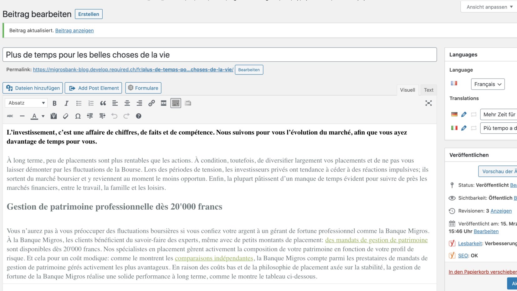
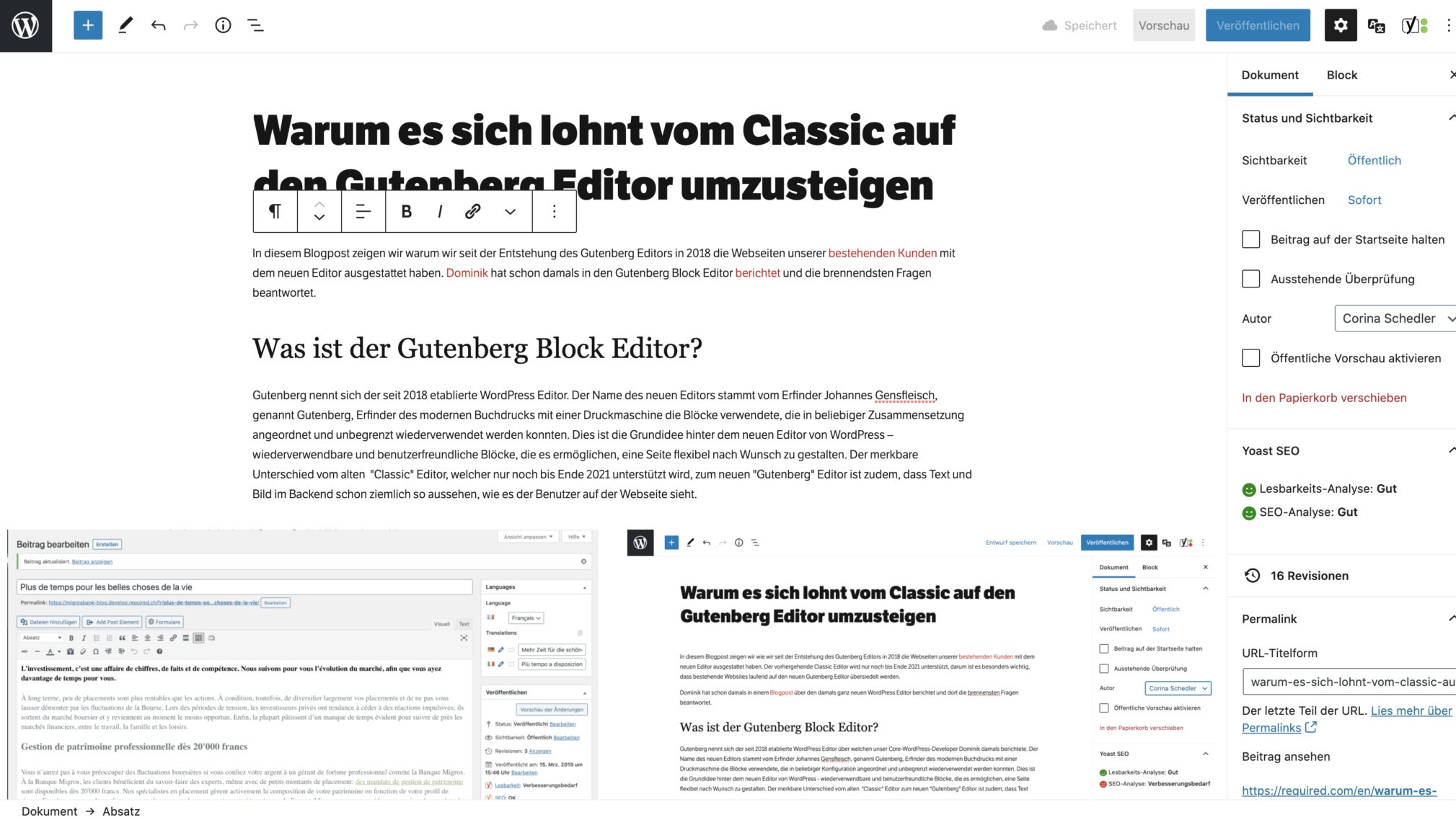
The WordPress Block Editor was established in 2018 as part of the “Gutenberg” project. The project name derives from the inventor Johannes Gensfleisch, called Gutenberg, inventor of modern letterpress printing with a printing machine that used blocks that could be arranged in any composition and reused indefinitely. This is the basic idea behind the new editor of WordPress – reusable and user-friendly blocks that allow a page to be arranged flexibly as desired. The noticeable difference between the old “Classic Editor” and the new “Block Editor” is also that text and images in the editing mode (backend) already look pretty much like what users see on the website.
Advantages of the block editor
Easily manage the content
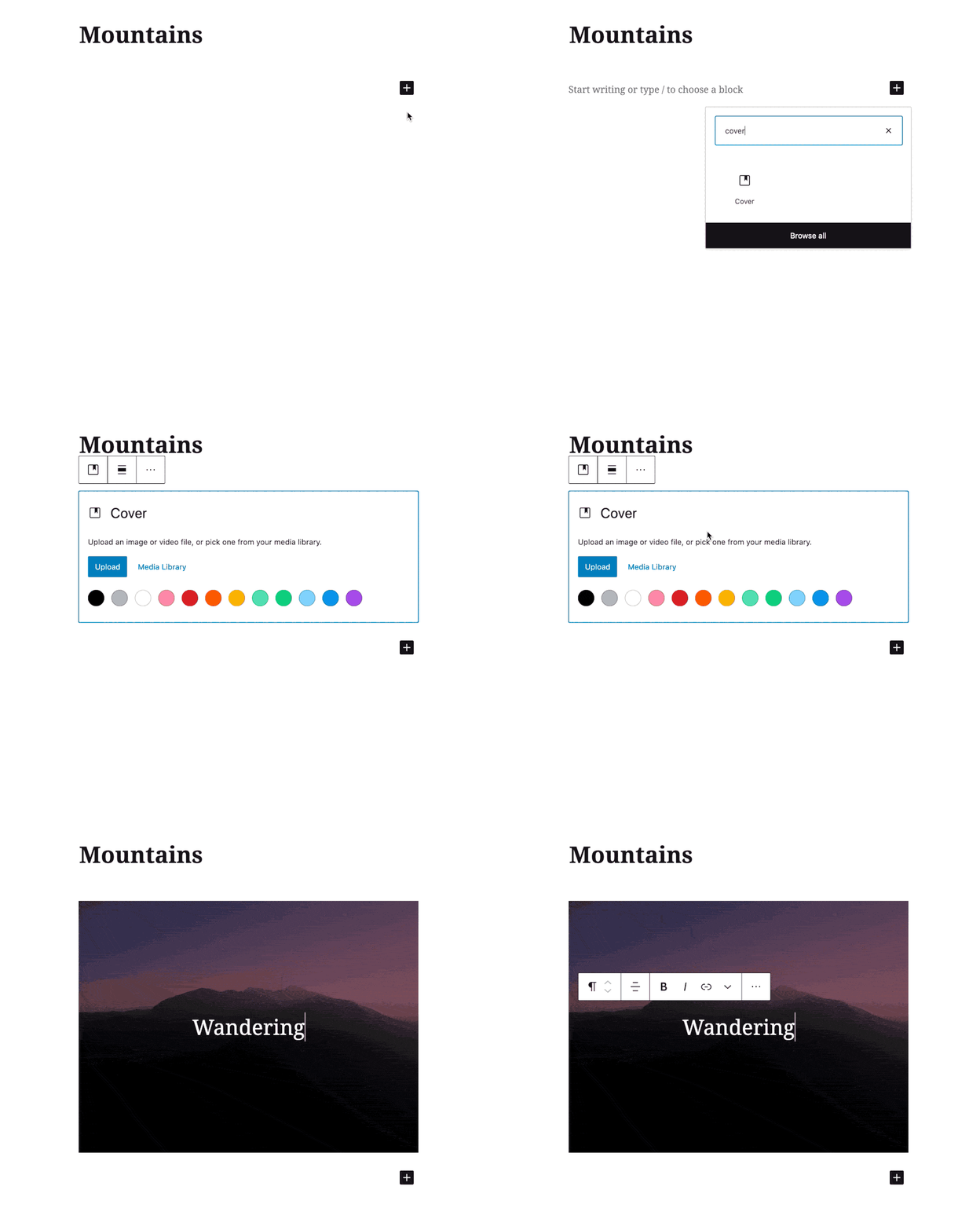
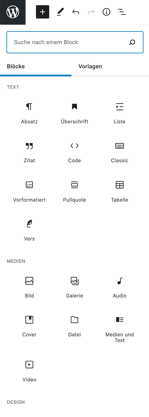
The new user interface is very user-friendly and has a reduced design. In order to focus on content creation, functions and tools are only displayed to users when they are needed. For example, as soon as users want to format text or add more blocks. In UX terminology, this is called minimising the cognitive load, and by reducing the load, the focus is on the essential – content creation. The blocks to be included are also divided into categories and can thus be found with a keyword. Furthermore, it is now possible to copy and paste content from MS Word or Google Docs. The editor does the rest.
Freedom of design
Simple, beautiful layouts are easy to design since the new block editor. Whether columns, texts, images in full width, left- or right-aligned, the block editor gives users full creative freedom. The block editor offers 36 block types. Among other things, content from social media channels can be embedded. In addition, our developers are happy to code customised blocks for your individual needs.
Block patterns
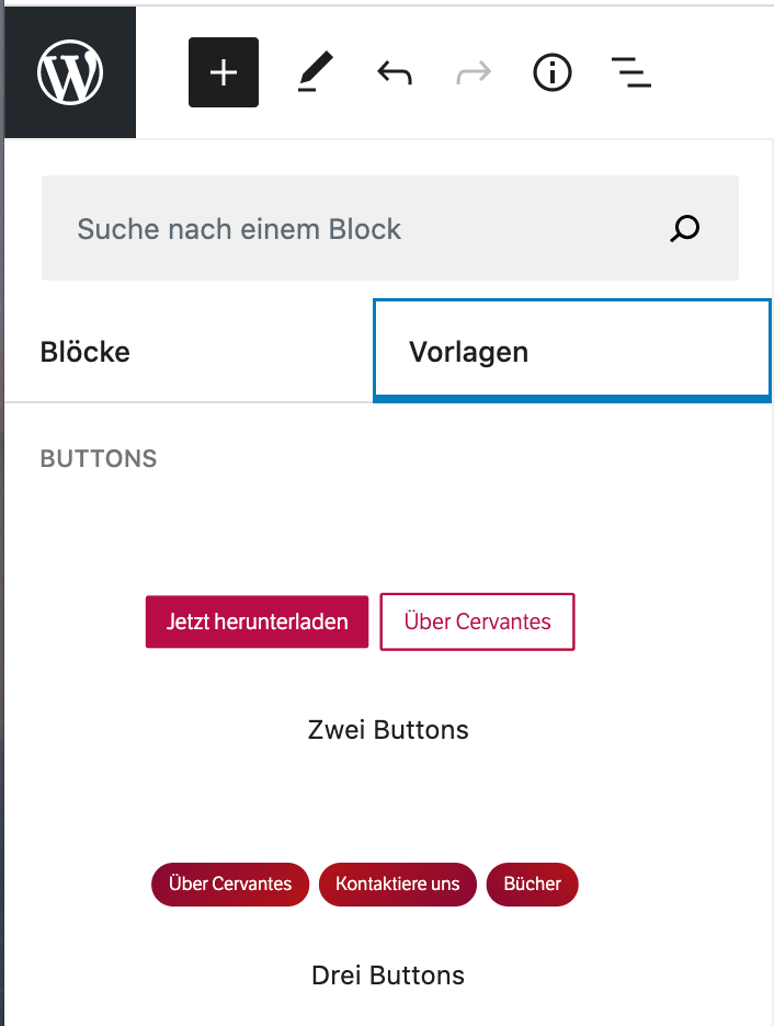
What makes designing with the block editor even easier are the newly available block patterns. These are pre-defined elements with which you can easily and quickly create a nice layout.
By default there are 10 block patterns available, which are inserted into the page by clicking on them.
If you wish to have customised blocks as block patterns, we will be happy to create them for you. If you want to delve deeper into WordPress patterns, you can also create them yourself. The blog post by Birgi Pauli-Hack on Gutenberg Times, provides a good overview on this topic.
Mobile-friendly
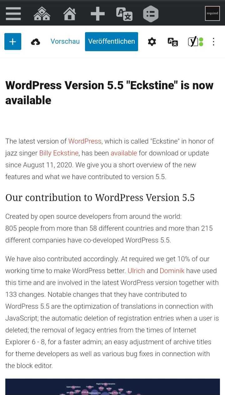
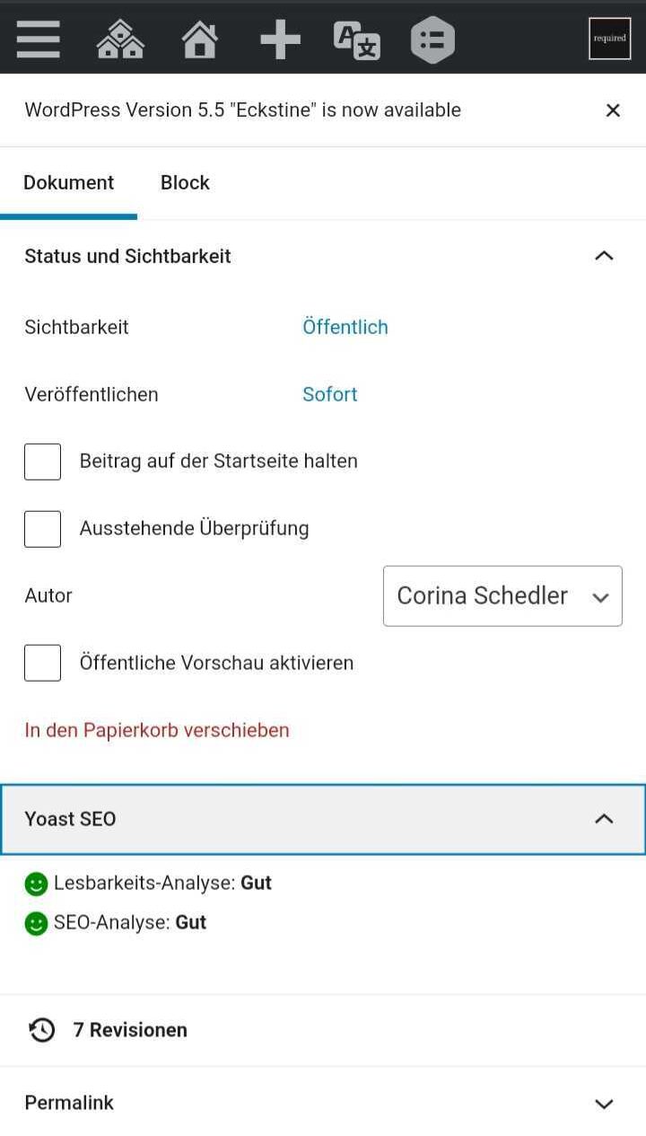
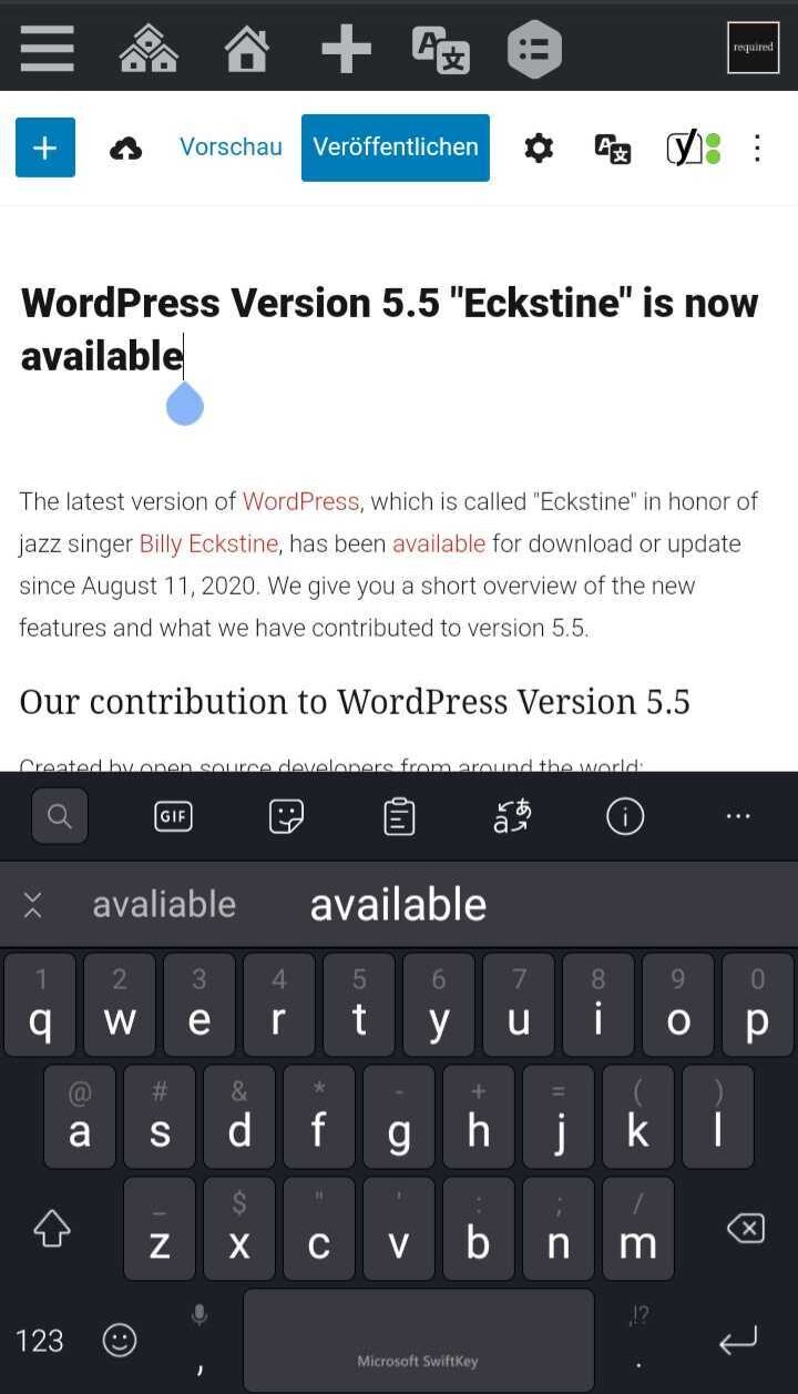
Do you work a lot on the road? The new block editor lets you do work from your mobile or tablet. Editing your website on the go has never been easier.
Tailor-made blocks
One of the biggest advantages is that the block editor allows developers to create a wide variety of blocks. This allows us to respond to the individual wishes of our customers and develop tailor-made content blocks.
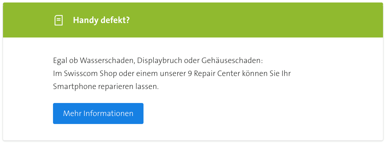
For the Swisscom magazine, for example, we have developed such individual content blocks. Among other things, Swisscom needed so-called call-to-action blocks on their contribution pages, which now look the same in editing mode (backend) and on the website (frontend). Take a look at the block on the Swisscom website.
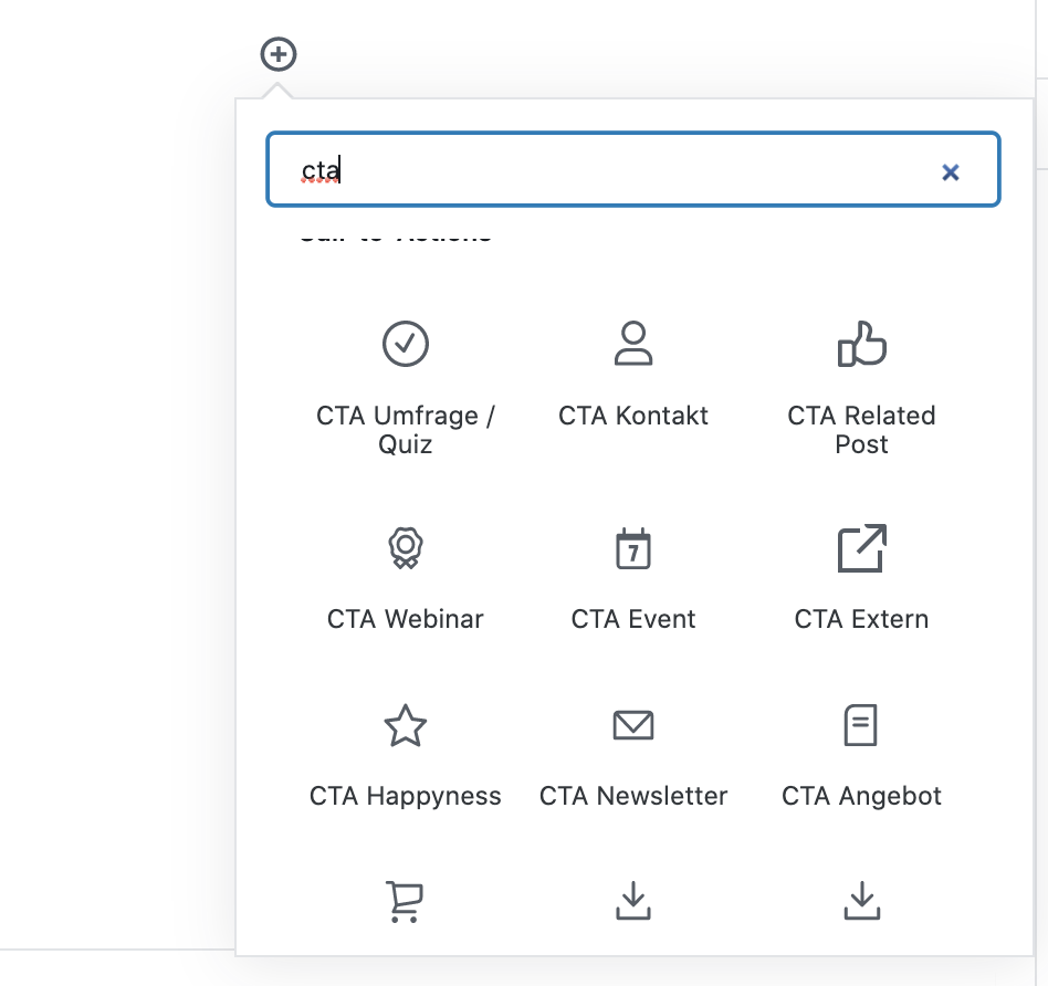
Such individual blocks appear, like all others, in the quick search:
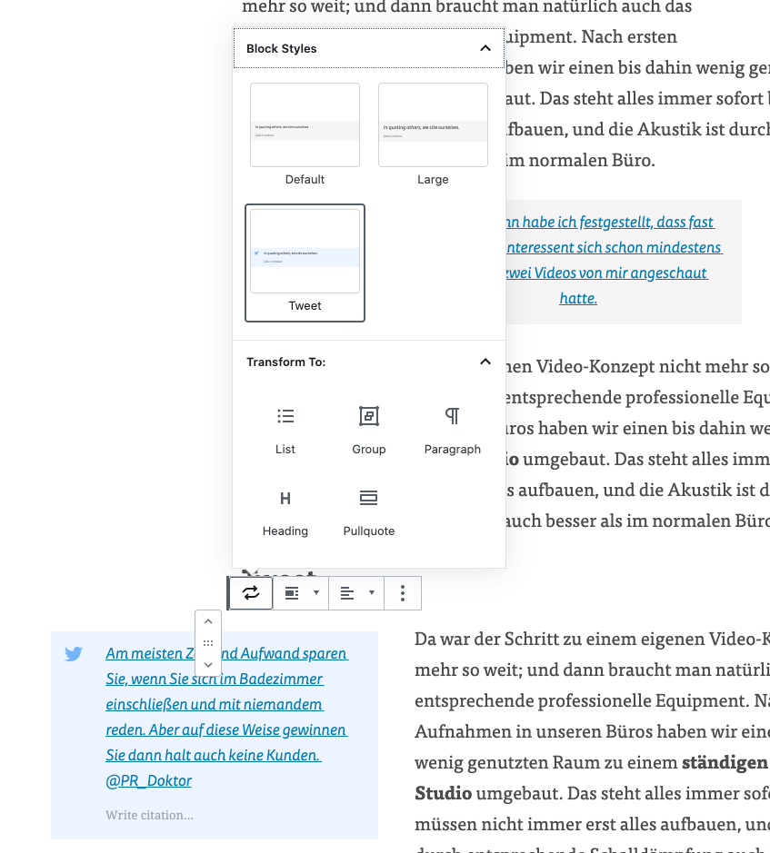
Another example can be seen in Marie-Christine Schindler’s blog on online PR and strategic communication. We have adapted the quotes and intro-box (left of the article) to the needs of our client and integrated them accordingly in the WordPress Editor. Thus, these editors (backend) and on the website (frontend) look practically the same.
The blocks
As already described, the new editor is based on content blocks, which can be individually adapted. If you would like to know more about the individual blocks, we recommend to check out the WordPress Blocks overview.
Conclusion
Not only because the previous “Classic Editor” is officially only supported until the end of December 2021, it is particularly important that existing websites are moved to the new editor, but also because the block editor offers more design options and is therefore much easier to use. We are convinced that you will enjoy the new editor very much after the familiarisation phase. Please contact us if you want to know more.
More about our involvement in the WordPress Community
Our team regularly speaks at WordPress conferences and writes articles about our open source plugins. You can read more in our blog.

