A new online magazine about art
V/A – Various Artists is an online magazine for cultural professionals initiated by the Swiss Arts Council Pro Helvetia, which features an artful design and, despite its individuality, can be conveniently edited from within the Pro Helvetia Multisite.
The online blog promotes exchange between international cultural professionals, actively supporting their ideas and work, and sensing contemporary sensibilities in a multi-layered present.
To attract the target group of cultural professionals, a website with special features and elements of surprise was needed. Thanks to the design agency Hammer, a unique online magazine with numerous animations and elaborate styles was created, and the end result of the brand-new Pro Helvetia magazine – V/A – Various Artists – is a true experience.
Some of the distinctive features of the website that give us great pleasure:
Automatic generation of elements and colors
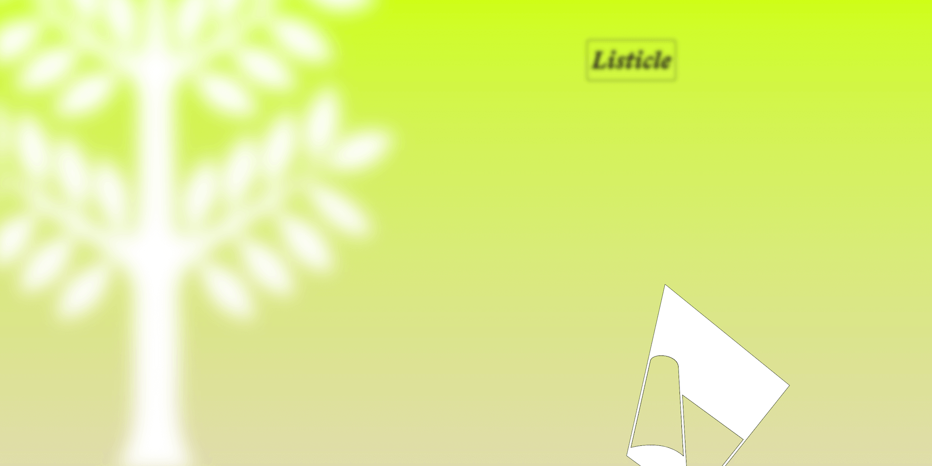
The core is the so-called “Generator” in the header on all detail pages, which displays different colors and elements depending on the content of the blog post.
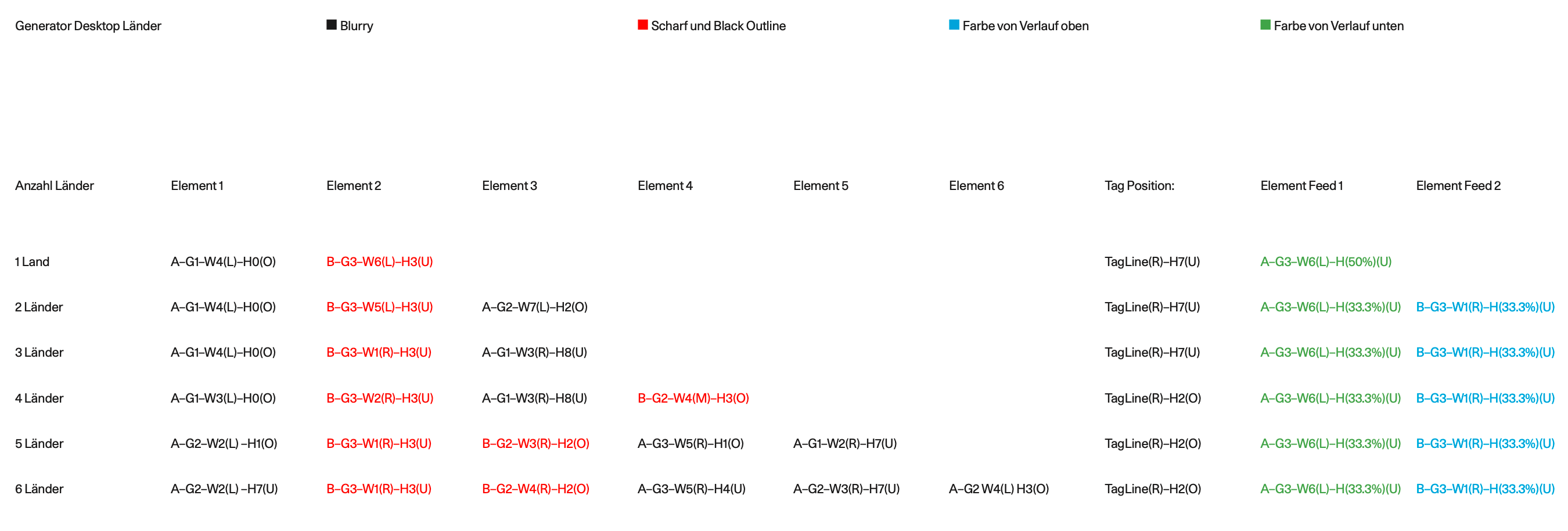
This works in such a way that each article is assigned a section and a discipline from a predefined list. Also, related countries are assigned to the article. These three elements are used to create the header of the article. The header consists of a gradient, which is made up of two colors, and icons, which are either in focus or blurred. The combination of these three variables makes each article header unique.
Even though the article header may look random to visitors, we needed a structure and a plan of how these elements should come together. Each section and discipline is assigned a color and each country has two icons.
With the help of the documentation on paper, we started with development. The gradient with the two colors was relatively simple, but the bigger challenge was how to define the symbols for the countries. After all, up to six countries can be assigned to one article and the symbols should be in different positions on a larger screen than on a smaller one.

The different country flags and symbols are automatically visualized by the frontend to match the content. Based on the number of countries, the order and the combination, this creates new and unique visuals over and over again. No single article is like the other.
On the technical side, we use SVG graphics and CSS features to display the appropriate layout. This allows us to support the many different browsers and as many device variations as possible.
The whole thing is then enhanced with JavaScript animations to give the website a lively effect. When the page loads, the individual elements are animated into the image and when scrolling you see a parallax effect, which gives everything a 3-dimensional spatiality.
Language Switcher
Normally, with multilingual websites, the entire site is translated, but not with V/A – Various Artists. The blog articles are in English by default, and only selective blog posts are translated – be it in French or German or even sometimes Arabic. Besides the option to translate the blog articles completely, there is also the possibility to add a link to an external publication. All this is possible thanks to the language switch feature, which we have designed and implemented in a customized way. This custom solution consists in having both the English text and the other language in the same post, with visitors being able to switch back and forth with a toggle button.

In order to achieve a good result, there were a few things we had to consider:
Search engine optimization, fast loading times and layout flexibility
SEO performance and fast loading times were particularly important for us. The English content in the post therefore had to be separable from the other language, so that not only the language switching works, but also the search engine bots recognize that the text is in another language. We solved this by creating a custom language block where you can select which language the content is written in. Using a custom JavaScript solution that prevents the loading of duplicate content, the text in the selected language is displayed on the website instanously.
To make life easier for the editors, we have also defined a template with two language blocks where content can be inserted and the language can be defined. In addition, the editors have the freedom to design the content within the page as they wish.
Animation on page change
Moving from one page to the next is usually not a special experience when visiting a website. This is what Hammer’s designer wanted to change. Therefore, thanks to the use of Barba.js, GSAP and our own JavaScript code, you literally float to the next page.
For example, when moving from the home page to the content page, we load the content from the next page into the current page using Barba.js and then use GSAP to hide old content and show the new content. For other links, like the imprint, newsletter, or search, we create completely new elements within the current page. This means for the users that the content of the website never has to be completely reloaded. As a result, everything loads faster and much less data is requested and sent.
Archive filter
Another special feature that the Hammer design agency came up with is the way the filter that sorts the different posts is supposed to work. While you select the criteria in the filter overview, it visibly generates the results in the background.
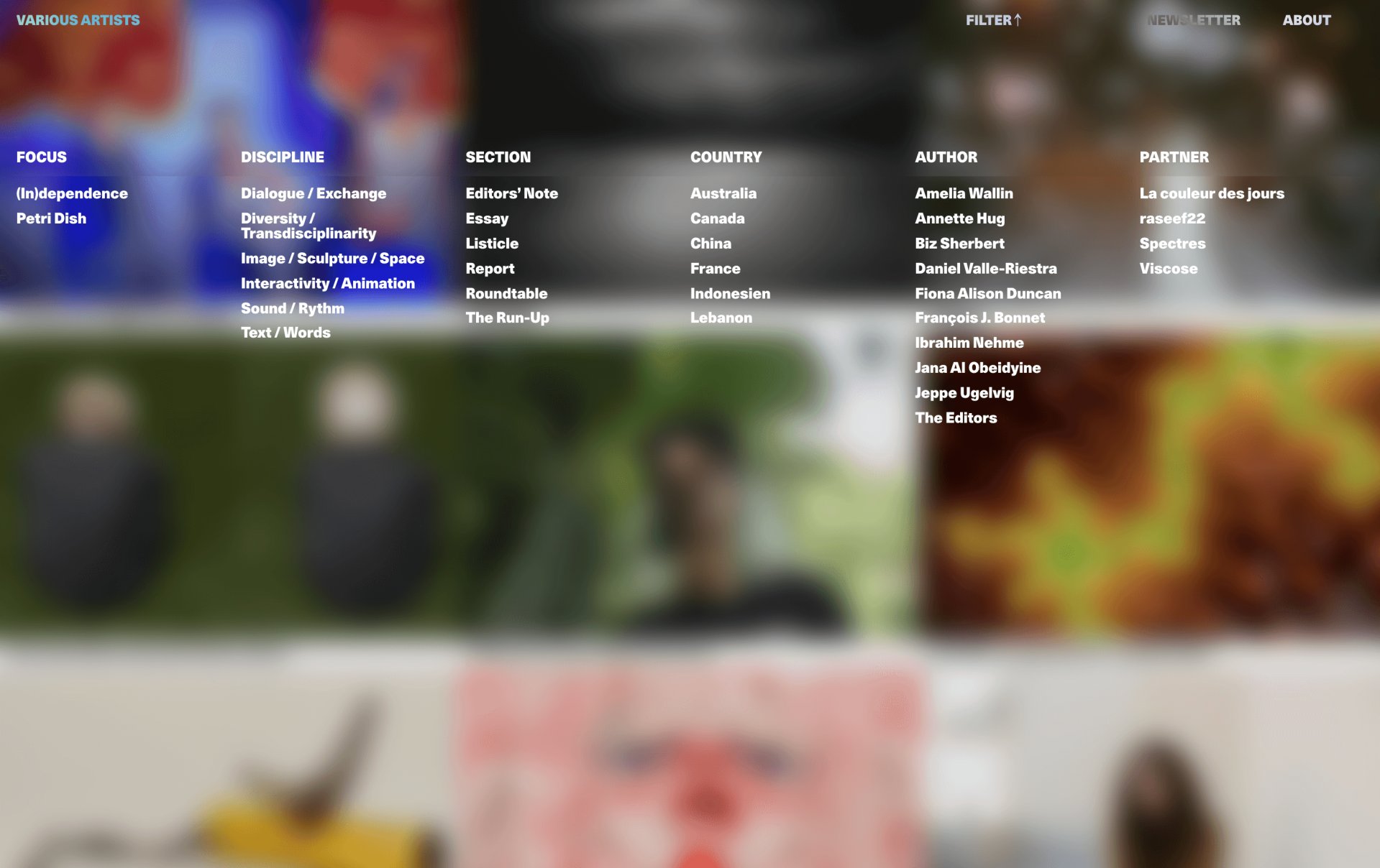
For the filter, we rely on the Preact library in the frontend. This is particularly suitable for lightweight web applications. Preact allows us to implement dynamic content and interactions with complex requirements within individual parts of the website particularly well. In the project for the Education Department of the Canton of Zurich, a much larger web application, we also used React, for the same purpose.
Blur Effect
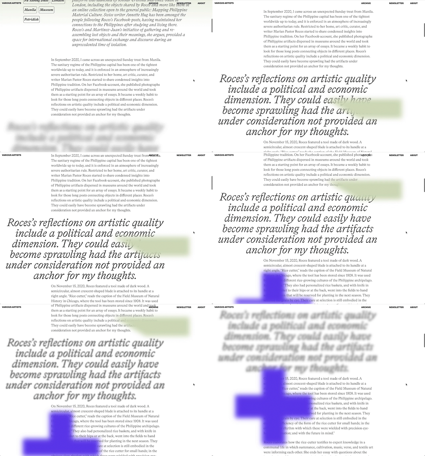
To freshen things up even more and to convey an artsy-feeling, the design agency conceived a blur effect that runs through the entire website. This occurs when scrolling through the blogposts at the quotes, which are only visible when they are in the field of view. In addition, the effect is used as a background, so that what is behind it shines through transparently. To implement this we used modern CSS and GSAP, an animation library based on JavaScript.
Newsletter
The newsletter signup form uses micro-interactions. If you forget to fill in a field, a popup shows which field was forgotten and the latter moves briefly.
Thanks to the many possibilities CSS3 offers nowadays, we were able to implement all these interactions with it.
We are proud of the final result, which we have developed together with Hammer and Staacks. The implementation of a website with special functions and animations like Various Artists requires a delicate touch and a particularly close collaboration between designers and developers. Hopefully the users will enjoy the website as much as we enjoyed programming it.
Our project team
Project Management and Backend Development
Frontend Development

Frontend Development
