Good contrasts – colors and accessibility on the web
Colors not only determine whether something looks nice – but also whether it is legible at all. This is particularly important on the web: texts, buttons and navigation elements must be easily recognizable for all users – regardless of age, screen or visual acuity.
In this article, we’ll show you why color contrasts are so important – especially for accessibility. You’ll find out which rules apply, what often goes wrong and how you can design better, more inclusive interfaces with simple means. And there’s even a quiz.
What is contrast anyway?
Color contrast means: How strongly do two colors differ – for example, text and background? The greater this difference, the better the readability.
It’s not just about “black on white”. Color combinations such as light grey on white or pastel pink on beige can also be problematic – even for people without visual impairments.
Contrast quiz
Can you quickly tell if it has enough contrast? 1 We have developed a little quiz to help you sharpen your sense of contrast. Note: The quiz is in English.
1 According to WCAG Level AAA guidelines for normal text.
Why contrasts are important – for everyone
Clear contrasts not only help people with disabilities. They improve readability, comprehensibility and orientation for a broad user base, regardless of age, environment or technical devices. Anyone who communicates digitally reaches more people with good contrast, for example:
- People with visual impairments (e.g. cataracts, color blindness)
- Mobile users with reflections or poor lighting conditions
- Older people with failing eyesight
- All others who want to capture content quickly
Good contrasts not only ensure accessibility, but also better usability and professionalism.
WCAG guidelines: What is “enough” contrast?
The Web Content Accessibility Guidelines (WCAG) define clear minimum values:
- AA standard: at least 4.5:1 contrast ratio for normal text, 3:1 for large text (from 18px bold or 24px normal)
- AAA standard: at least 7:1 for normal text, 4.5:1 for large text
You can test these values automatically with contrast checkers (see below).
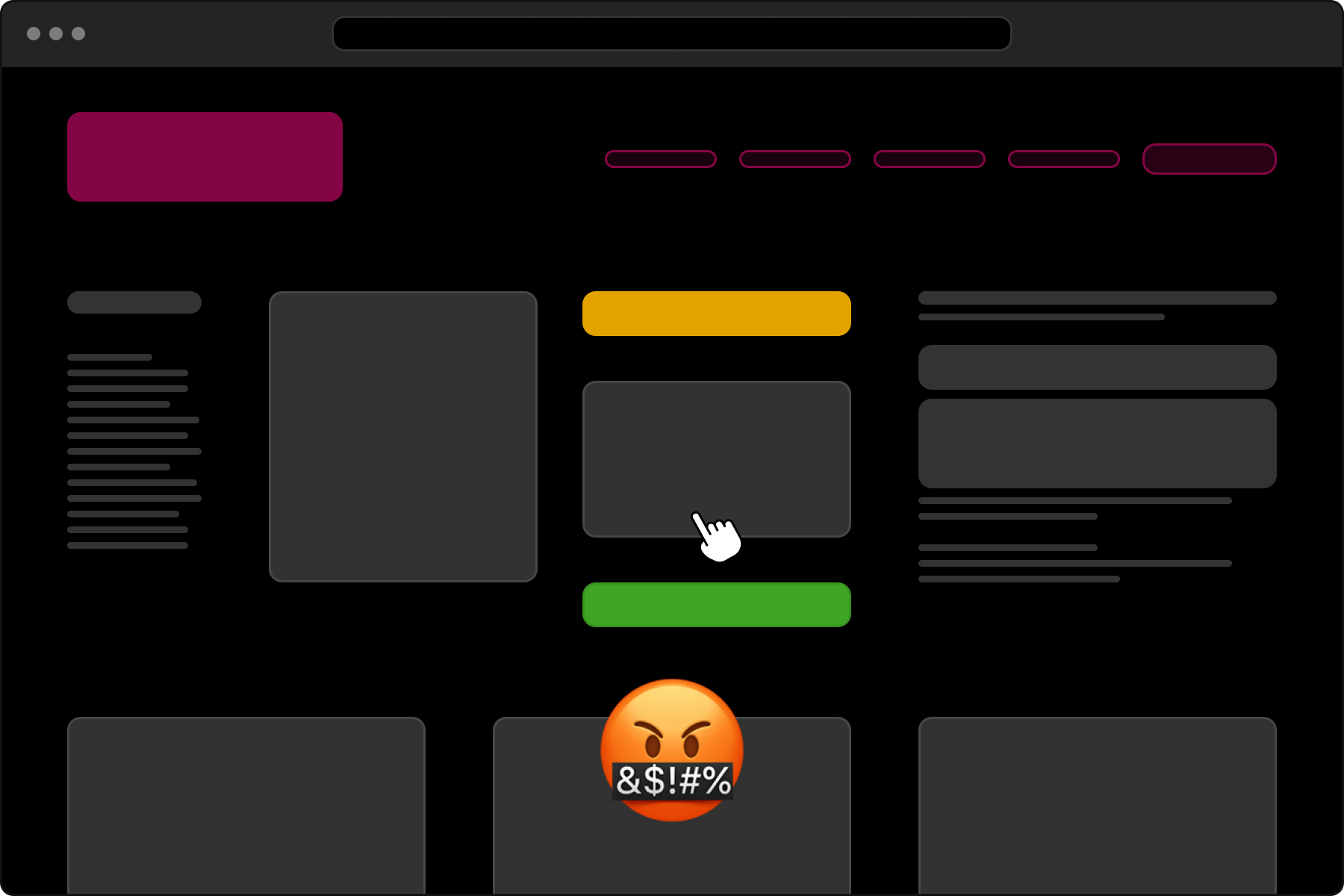
Typical sources of error
- Light gray text on a white background (“looks classy”, but is barely legible)
- Pastel shades with too little difference
- Colors that are indistinguishable with color blindness
- Important UI element (e.g. a button) with too little color difference to the background
Tip: Test your page with grayscale – then you can immediately see whether contrasts really work.
Our tool: Contrastive – simply test contrasts
We have developed our own tool: Contrastive. This allows you to select two colors and immediately see whether they comply with the WCAG standards.
The tool calculates:
- Contrast ratio
- AA/AAA conformity for normal/large
- Preview for text on background
And there’s even a little quiz to train your visual understanding of contrasts.
Ideal for designers, developers and project managers. The contrast checker tool is also available separately.
There are of course other contrast tools. We simply wanted to build a more modern one, but we also use some of the tools from accessibleweb.com
Don’t forget color blindness
Around 8 % of men and 0.5 % of women are affected by color blindness – a proportion that should not be underestimated in design. Red-green deficiency is the most common, followed by rarer blue-yellow disorders.
It is therefore important not to use colors as the only distinguishing feature. Always supplement them with other visual cues such as text, symbols or patterns. This will ensure that your content remains accessible to all users.
Conclusion: Contrast is not a detail – it’s essential
Clear contrasts are essential to ensure that digital content is understandable and easy to use for everyone. Those who adhere to the WCAG guidelines not only attach importance to technical standards, but also actively improve the user experience. This shows: Inclusion is not a nice extra feature – it is part of the foundation of good design.
We have planned a check for the “Accessible Perceptual Contrast Algorithm” (APCA), but have not yet got around to it. But what is not, can still be.
About the author
Stefan “Velthy” Velthuys is an versatile designer who is characterized by his passion for visually appealing and functional designs. With a strong background in front-end development, he understands how to create responsive designs that not only look good on the screen, but also work perfectly. Velthy has proven his skills in a variety of projects, including website redesigns for prestigious clients such as Swisscom and Ringier Advertising. Outside the office, he enjoys city trips and the outdoors, regularly plays geography quizzes and immerses himself in his coffee culture.
Do you also have a project with a similar theme?
Velthy is your contact.
Get in touch with us! We are always interested in new challenges.