Combining colors – Harmonious colors and color palettes
You have a color that you like – perhaps the main color of your brand or a shade you discovered on the web or on social media. But where do you go from here? Which colors go with it? What looks professional, what looks fresh, what looks playful?
In this article, we will show you how to develop harmonious color combinations – with the help of simple rules, the color wheel and a feel for effect. By the end, you will be familiar with the most important concepts of color harmony and know how to put together your own color schemes for websites, presentations or applications.
The basis: color wheel and color types
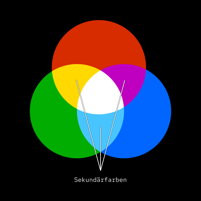
The classic color wheel divides colors into three groups:
- Primary colors: Red, yellow, blue – the basis of all other colors (see How colors work – RGB, HEX and HSL explained simply)
- Secondary colors: Yellow, green-blue, violet – created by mixing the primary colors
- Tertiary colors: Mixtures of primary and secondary colors (e.g. blue-green, red-orange)
This arrangement results in many color harmonies.
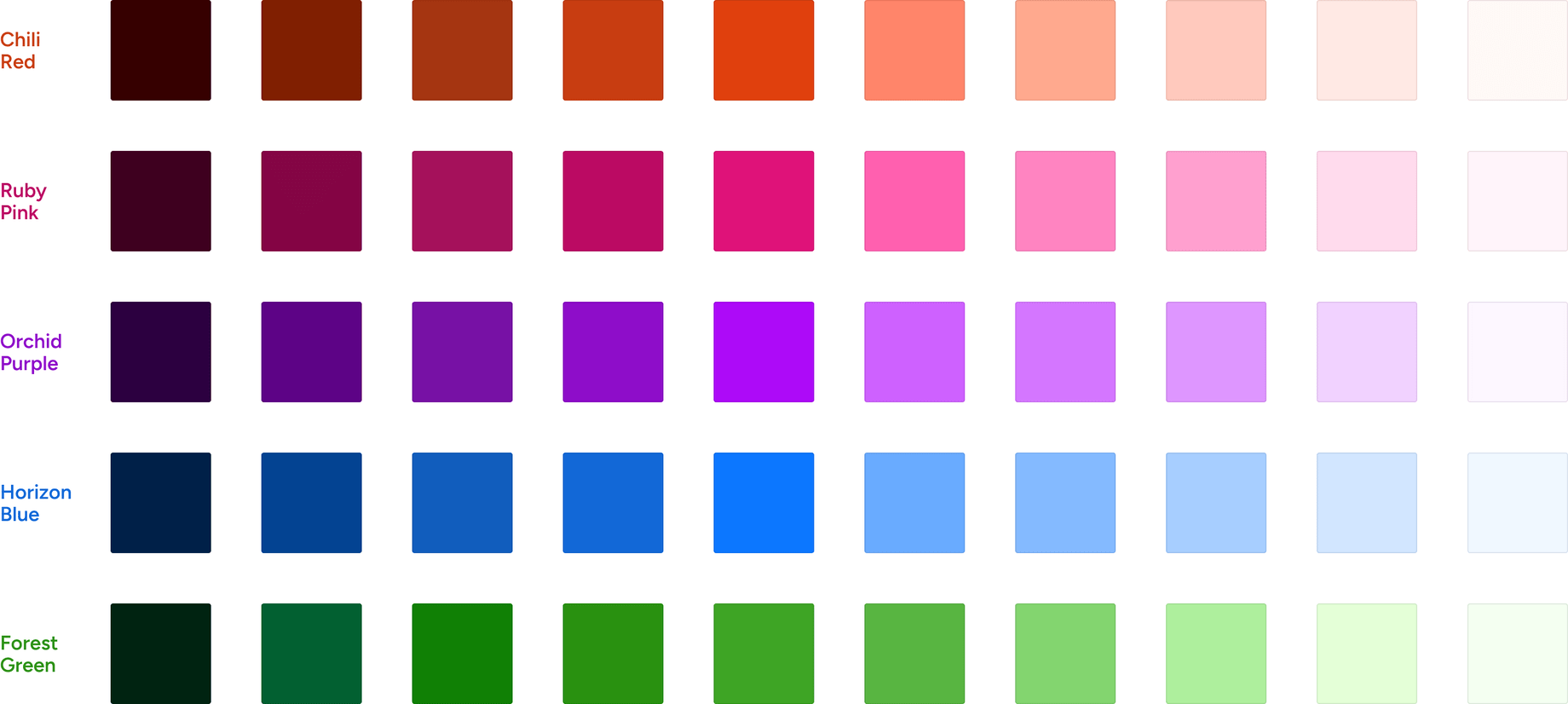
Monochromatic: One color in variants
A monochromatic color palette is based on just one hue. You only vary the saturation and brightness – the result looks calm, clear and professional. Ideal for minimalist designs or as a basis for visual hierarchy.
Example:
- Dark blue for headlines
- Medium blue for surfaces
- Light blue for accents
Complementary colors: Tension with a system
Complementary colors are exactly opposite each other in the color wheel – e.g. blue and orange, red and green. Their combination creates strong contrasts and visual tension.
You should use these combinations in doses, e.g. in call-to-actions (buttons) or highlights. They can have a very dynamic effect, but can also quickly become overloaded if used too intensively.
Analog, triad, tetrad: playing with harmony


- Analogous colors: Three colors that lie next to each other on the color wheel (e.g. blue, blue-green, green). They create a soft, harmonious overall picture.
- Triad: Three equally distant colors in the color wheel (e.g. red, yellow, blue). These combinations are balanced, lively and ideal for modern designs.
- Tetrad: Two complementary pairs (e.g. blue and orange, violet and yellow). This allows you to develop complex color systems – e.g. for user interfaces with different status colors.
Cold, warm, soft, strong – the effect of colors
Colors not only have a visual effect, but also an emotional one. A few rules of thumb:
- Warm colors (red, orange, yellow): activating, emotional, eye-catching
- Cold colors (blue, green, violet): calming, professional, trusting
- Pastel shades: friendly, modern, soft
- Bright colors: energetic, modern, but quickly dominant
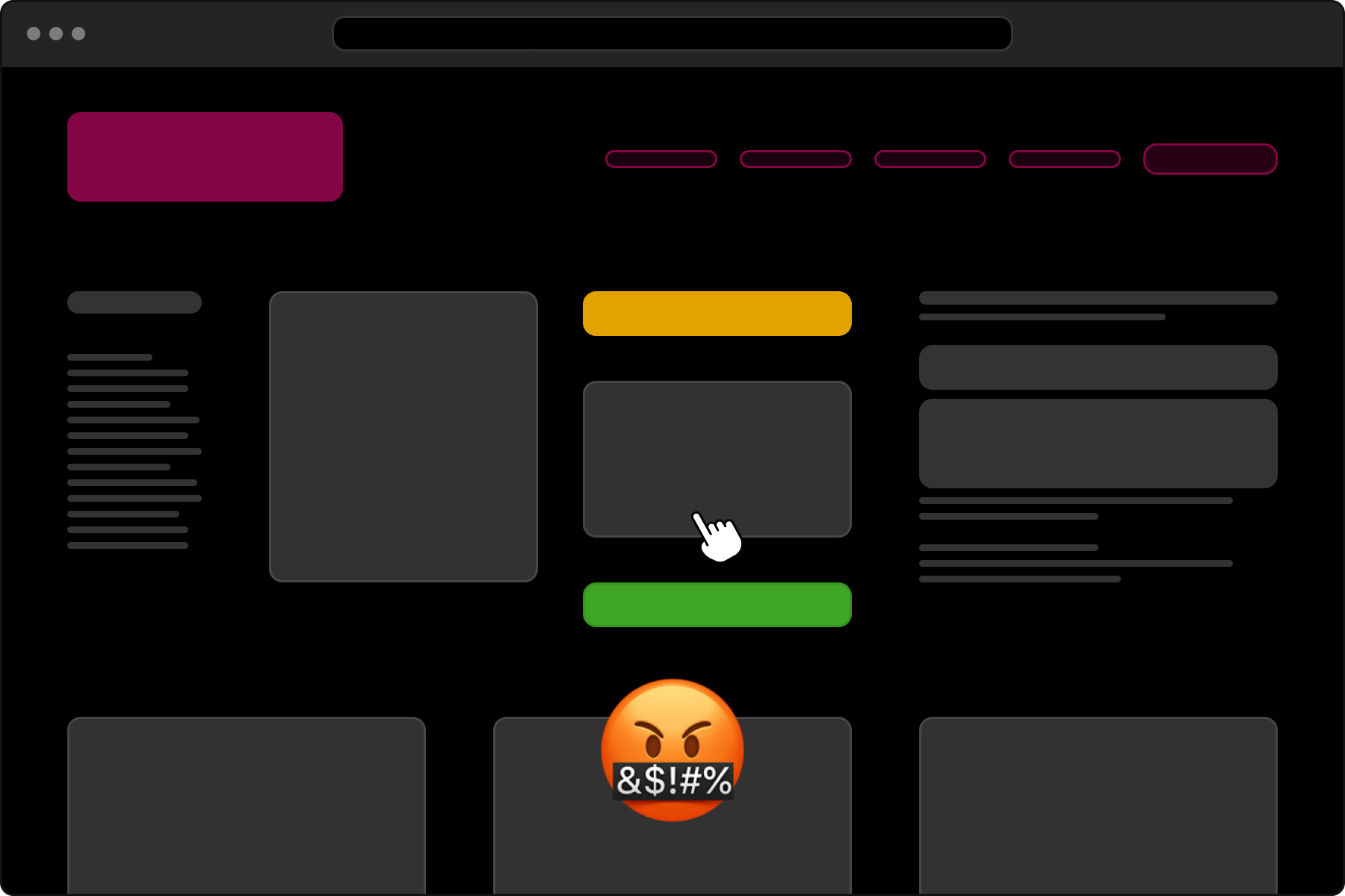
A bright color stands out clearly if the other colors are more pastel shades. This may be intentional, but depending on the saturation, it may look like a foreign body. Sensitivity is required here.
Where you should be careful is when mixing styles. In the palette above, for example, the bright orange stands out – and not necessarily in a positive way.
The right effect also depends heavily on the context – and on the target group.
I recently noticed one of the most beautiful presentations of the corporate colors at Dropbox. A really great presentation, and the colors are pretty too. Albeit a bit many. Color – Dropbox Brand Guide
Inspiration through tools
If you don’t want to spend hours experimenting with the color wheel, there is help:
We have developed our own little tool that gives you color suggestions based on a starting tone – both harmonious and contrasting. Ideal for trying out and combining. You can also find the “ColorMuse” tool separately.
Conclusion: Color harmony is not magic
You don’t have to guess at color harmony – it tends to follow simple patterns. Whether monochrome, complementary or analog: If you know the basic rules and use them in a targeted manner, you can create coherent and effective color systems – for brands, websites or products.
About the author
Stefan “Velthy” Velthuys is an versatile designer who is characterized by his passion for visually appealing and functional designs. With a strong background in front-end development, he understands how to create responsive designs that not only look good on the screen, but also work perfectly. Velthy has proven his skills in a variety of projects, including website redesigns for prestigious clients such as Swisscom and Ringier Advertising. Outside the office, he enjoys city trips and the outdoors, regularly plays geography quizzes and immerses himself in his coffee culture.
Do you also have a project with a similar theme?
Velthy is your contact.
Get in touch with us! We are always interested in new challenges.