Accessibility in Reality: Pro Helvetia, a Swiss case study
This is the accompanying blog post to my talk “Accessibility in Reality: Pro Helvetia, a Swiss case study” at WordCamp Europe 2025 in Basel. It includes additional links to sources that I quoted on stage. All links were last checked on 04.06.2025.
Video recording
Original slides
Here you can also find all my original slides. Be sure to check out the speaker notes, since the slides themselves barely contain any text.
Presentations bore you, but reading is your medium of choice? Then please continue with the rest of this article, which will contain all the same points, but rewritten into a – hopefully – enjoyable blog post!
Who’s talking?

I know many of you feel overwhelmed when it comes to the topic of web accessibility. I know that because I often fell so as well. As a matter of fact, I am not an accessibility expert myself. I don’t hold any official certifications, I am no expert on all the laws, and I can’t quote all the different WCAG criteria from memory. Like many of you, I’m merely a frontend developer.

I am not an accessibility expert, but I do have quite some expertise: I took a lot of accessibility courses, attended quite a few accessibility conferences and read countless accessibility articles. Most importantly, I have very practical accessibility experience from building accessible websites for over 10 years now – starting back when almost no one knew, that accessibility ever would be an important aspect of web development.
For me, accessibility is not an add-on in 2025. If I were to build an inaccessible website on purpose, that would feel the same to me as building one that is not responsive – good luck selling that to anyone.
That surely means all of my projects meet WCAG AA or AAA standards out of the box, right? I would like that very much, but I highly doubt it. And still, I am quite certain that my websites would cover numerous accessibility aspects that most other websites out there don’t. Because, shockingly, 96% of all websites do not have any accessibility treatments, at all! (Source: webaim.org/projects/million/)
The point of this article is not supposed to be the usual accessibility keynote, on …
- … why accessibility matters.
- … why it does not only mean “screen readers for blind people”.
- … why it would add great revenue to include people with accessibility needs in your target audience.
- … why we shouldn’t exclude 16% of the population from the internet – this being the global percentage of people living with some sort of disability. (Source: www.who.int/news-room/fact-sheets/detail/disability-and-health)
Instead, I want to address your fears. I myself felt pretty scared of the matter of web accessibility before I got more comfortable with it. I thought I needed to do it perfectly right from the start, which lead to me not doing anything at all.
But this makes no sense! Every small accessibility improvement is a real improvement for real people using your website. Every small problem solved is a big step into the right direction. In this article, I am going to show you 10 examples of such “big small” improvements we made for a real project for a real client. You will see that they are no rocket science whatsoever! And you will understand that there is nothing required of you, that you won’t be able to do as frontend developers anyway.
All attendees of WordCamp Europe already made one smart decision regarding accessibility by choosing WordPress as their CMS. Out of the box, the Block Editor is very accessible, both its backend and its frontend output. In a 2022 comparison of 12 CMS, WordPress ranks fourth in accessibility. This is thanks to the great efforts by the community-driven Accessibility team – feel free to get involved!
Sources:
Accessible funding for arts & culture
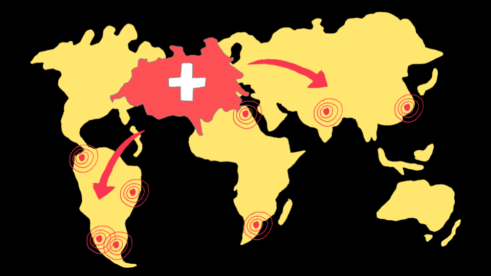
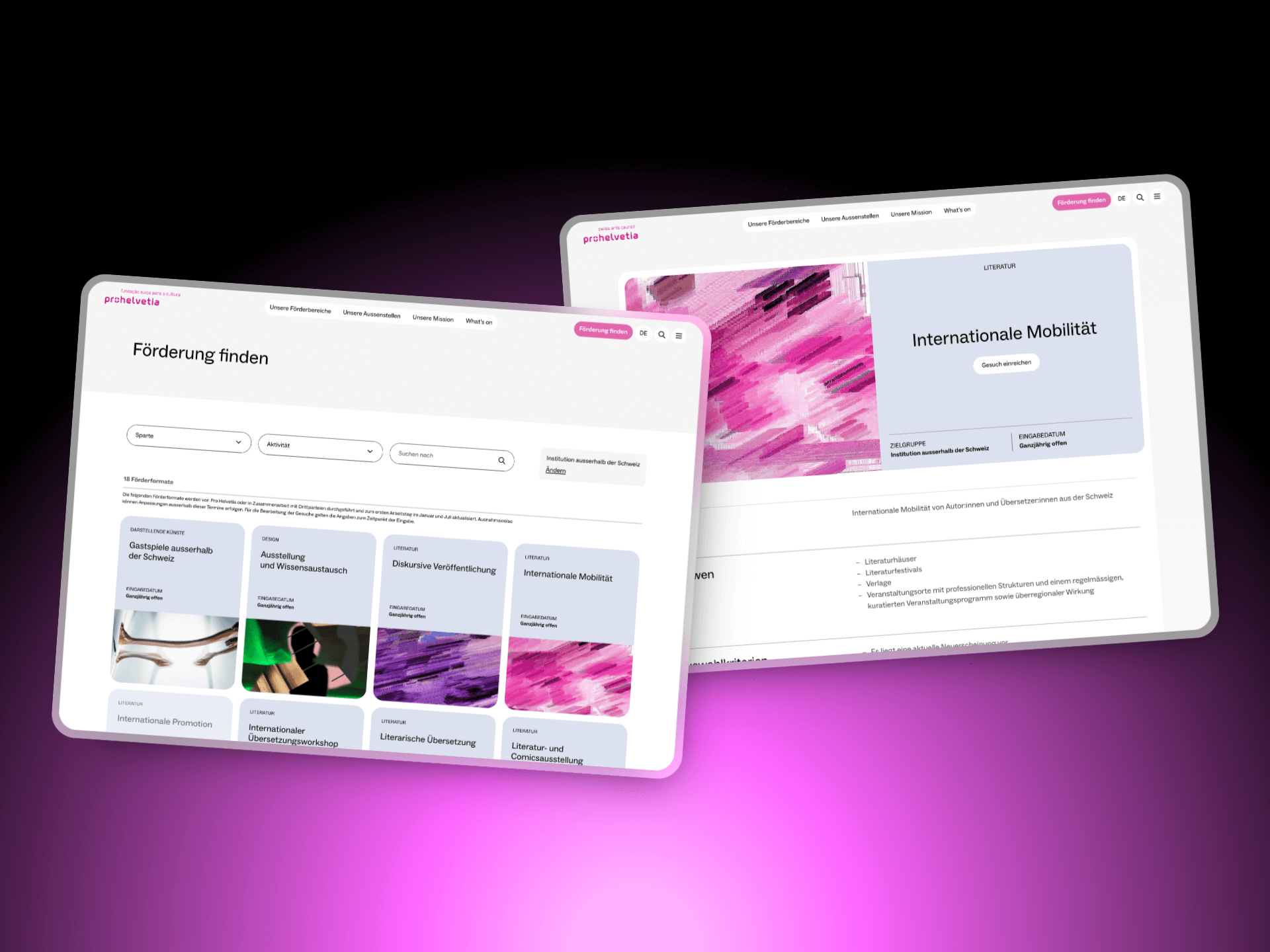
For the special occasion of WordCamp Europe coming to Switzerland for the first time, we at required as a Switzerland-based company chose a Swiss website as a case study to present: the relaunch of prohelvetia.ch.
Pro Helvetia is the federal institution for the sponsorship and development of Swiss-based arts and culture and international cooperations. With offices in seven countries on four continents, their website serves a diverse and global user base.
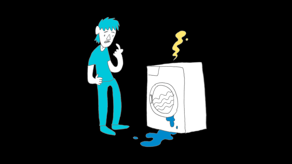
The relaunch was a big project, involving five different organizations working on it for over a year. Our role at required was web development, based on the existing WordPress installation. We worked in close coordination with the design agency and Pro Helvetia as our mutual client. They wanted their new website to be as accessible as possible, right from the start. Speaking of multiple parties involved: I told you that I would not call myself an accessibility expert. Then who could take up this role for this project?
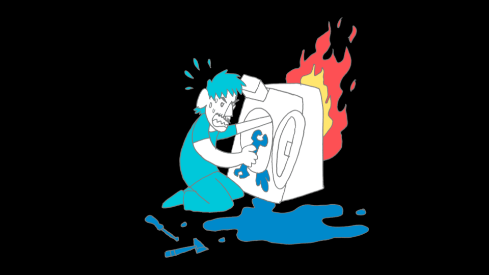
Imagine the following scenario: Your mother calls you because her washing machine is broken. What do you do? I admit: I would probably spend a whole day with lots of googling and multiple trips to the hardware store, making the problem worse somehow. But all you smart readers would go call an expert – and we did so, too.

Want to know more about the relaunch of Pro Helvetia? Head over to the extended case study in the portfolio section of our website!
-
 Read more: Pro Helvetia: Redefining the Digital Presence of Swiss Arts Council
Pro Helvetia: Redefining the Digital Presence of Swiss Arts Council
A global hub for arts and culture Pro Helvetia, the Swiss Arts Council, is dedicated to promoting contemporary and professional art and culture of national…
Access for all
Access for all is a Swiss non-profit organisation with the goal to make the internet more accessible. They offer website reviews based on WCAG 2.1 and 2.2 AA, which is the standard many international laws use, like the European Accessibility Act. (Source: access-for-all.ch/en/european-accessibility-act-a-familiar-concept-with-new-obligations/)
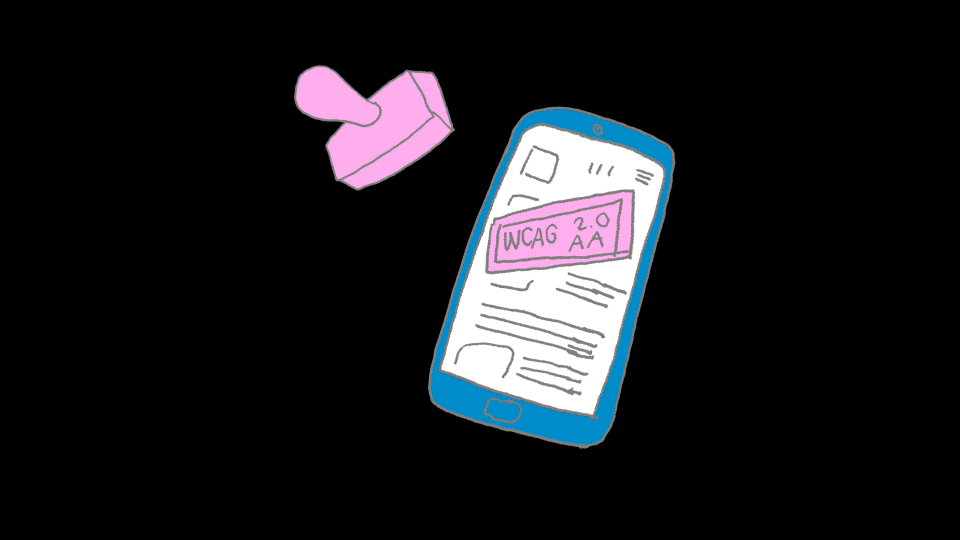
Their reviews are done by experts, both disabled and non-disabled. And they will adapt to your budgets, reviewing whole multisite applications or taking just a few hours to look over initial designs.
“A few hours can already be enough to identify the main barriers of a project.”
Andreas Uebelbacher,
Access For All
When you order such a review, Access for all will send you a detailed document with findings and suggested solutions. I felt, that fixing the issues from the report not only improves your website, but teaches a lot about web accessibility in general. To illustrate this, I picked 10 examples from the review and will go through them, following the structure “Problem – Solution – Learning”. Hopefully, you will feel, too, how much one can learn just from small examples.
Access for all operates in Switzerland, but there are similar institutions all over the world. Surely, you will find one that matches your project! Here is a very incomplete list of organisations:
- Access for all (Switzerland)
- Stiftung Pfennigparade (Germany)
- AnySurfer (Belgium)
- Inclusive Design Research Centre at OCAD University (Canada)
- Knowbility (USA)
- Access Audit (UK)
- …
Who is missing here? Get in touch!
1. Wrong alt text for linked logo
Problem
“The linked site logo must have an alternative text that reflects the dual function of the logo (conveying the sender’s identity and indicating the destination of the link).”
The Pro Helvetia logo used to have an alt text saying “Logo of Pro Helvetia” and an anchor element around it, linking to the home page. Both not wrong, but a mistake when you combine them like this. Screen readers will say: “Link, Logo of Pro Helvetia”, which does not tell you that the link is leading to the home page. Instead, you might think it leads to a raw logo file.
<a href="[…]">
  <img alt="Logo of Pro Helvetia" />
</a>Code language: HTML, XML (xml)
Solution
In the accessibility review, this solution was suggested: Adding the string “… back to homepage” to the logo’s alt text.
<a href="[…]">
  <img alt="Logo of Pro Helvetia, back to homepage" />
</a>Code language: HTML, XML (xml)
This is a perfectly fine solution. We chose another one, that also works: Adding an aria-label attribute to the anchor element, saying “Return to home page of Pro Helvetia”, and leaving the alt attribute of the image intentionally empty. When aria-label is present, screen readers will ignore the logo’s alt text, either way.
<a href="[…]" aria-label="Return to home page of Pro Helvetia">
  <img alt="" />
</a>Code language: HTML, XML (xml)
Learning
Images need alt texts and links need link texts. Linked images might serve as link texts.
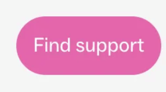
2. Lists with only one item
Problem
The link ‘Find support’ is implemented as a list with only one entry.”
The Call-To-Action button in the main navigation used to be a singular list item inside an unordered list element. A structure like this will prompt screen readers to announce a lot of unnecessary text: “Link, Find Support, List, 1 Object”
<div class="custom-block">
  <ul class="menu">
    <li class="menu-item">
      <a href="[…]">Find support</a>
    </li>
  </ul>
</div>Code language: HTML, XML (xml)
Solution
Initially, we rendered this button with the WordPress function wp_nav_menu() because the link was implemented as a menu so that it could be set from the dashboard. But wp_nav_menu() will always render an unordered list, regardless of the number of items.
wp_nav_menu( [
  'theme_location' => 'ph-call-to-action',
  'container' => '',
  'level' => 1,
] );Code language: PHP (php)
Instead of using wp_nav_menu() we now retrieve the menu items with wp_get_nav_menu_items(). Then we wrap them manually inside Block Editor markup. This way, by calling do_blocks(), we can render the link just like a button inserted with the Buttons Block from the Block Editor.
Input
$menu_items = wp_get_nav_menu_items( $menu_id );

$block_content = '<!-- wp:buttons --><div class="wp-block-buttons">';

foreach ( $menu_items as $menu_item ) {
  $block_content .= sprintf(
    '<!-- wp:button -->
      <div class="wp-block-button">
        <a class="wp-block-button__link" href="%s">
          %s
        </a>
      </div>
    <!-- /wp:button -->',
    $menu_item->url,
    $menu_item->title
  );
}

$block_content .= '</div><!-- /wp:buttons -->';

echo do_blocks( $block_content );Code language: PHP (php)
Output
<div class="custom-block">
  <div class="wp-block-buttons">
    <div class="wp-block-button">
      <a href="[…]" class="wp-block-button__link">
        Find support
      </a>
    </div>
  </div>
</div>Code language: HTML, XML (xml)
Learning
Don’t use lists if there’s nothing to list.
3. Grouped inputs missing label
Problem
“The frequently searched terms are visually grouped with the heading ‘Suggestions’, but it is not formatted as a
legendto afieldset.”
In the search modal, there are frequently-searched terms as search suggestions. They are labelled as “Suggestions”, but this relation was not that obvious in the source code. The text was just a paragraph element, followed by an unordered list of inputs.
<div class="[…]">
  <p class="[…]">
    Suggestions
  </p>
  <ul class="[…]">
    <li>[…]</li>
    <li>[…]</li>
    <li>[…]</li>
  </ul>
</div>Code language: HTML, XML (xml)
Solution
Simply replacing div and p with a fieldset and legend. The latter two elements have a clear semantic relation to each other. (Source: www.w3.org/WAI/tutorials/forms/grouping/)
<fieldset class="search-suggestions">
  <legend class="search-form__label">
    Suggestions
  </legend>
  <ul class="search-suggestions__list">
    <li>[…]</li>
    <li>[…]</li>
    <li>[…]</li>
  </ul>
</fieldset>Code language: HTML, XML (xml)
Learning
p‘s don’t label anything. legend‘s label fieldset‘s.
This is a great segue into HTML semantics, the topic of our next example.
4. Text not semantically structured
Problem
“Some texts are not correctly integrated into the HTML structure, but only via
divandspan.”
In the footer, we put out text that can be entered in the dashboard. This text was rendered directly inside a div element – but a div is merely a structural element with no meaning on its own. So it is unclear to screen readers what the purpose of this text is.
<div>
  PRO HELVETIA<br />
  Swiss Arts Council
</div>Code language: HTML, XML (xml)
Sources:
- www.w3.org/TR/2011/WD-html5-author-20110809/the-div-element.html
- www.w3.org/TR/2011/WD-html5-author-20110809/the-span-element.html
Solution
In the template, we echoed the text using nl2br() to transform line breaks into br elements. But this was not enough.
echo wp_kses_post( nl2br( $column ) );Code language: PHP (php)By using the WordPress function wpautop(), we can wrap the text additionally inside p elements. This tells screen readers that this is general text which is meant to be read by the users.
Input
echo wp_kses_post( wpautop( $column ) ); Code language: PHP (php)Output
<div>
  <p>
    PRO HELVETIA<br />
    Swiss Arts Council
  </p>
</div>Code language: HTML, XML (xml)
Learning
div‘s and span‘s have no semantical meaning. Always try to find the correct elements to structure information, like p, blockquote, address and so on …
This is a great example of how the practical review results can lead you to learn important accessibility lessons. If you were not familiar with the topic of HTML semantics before, this is the perfect occasion to look into it. (Source: www.w3.org/TR/WCAG20-TECHS/G115.html)
5. Wrong heading hierarchy
Problem
“The newsletter registration and the footer content are visually clearly separated, but semantically subordinate to the last preceding heading, to which they do not belong.”
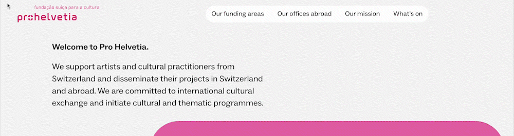
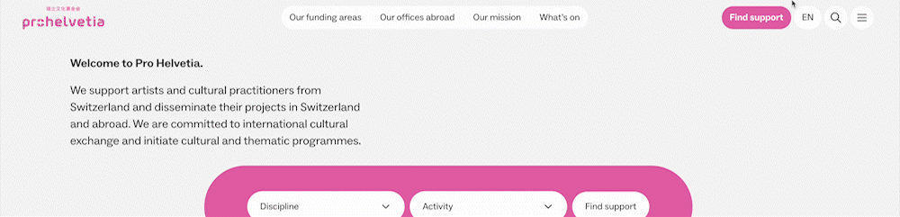
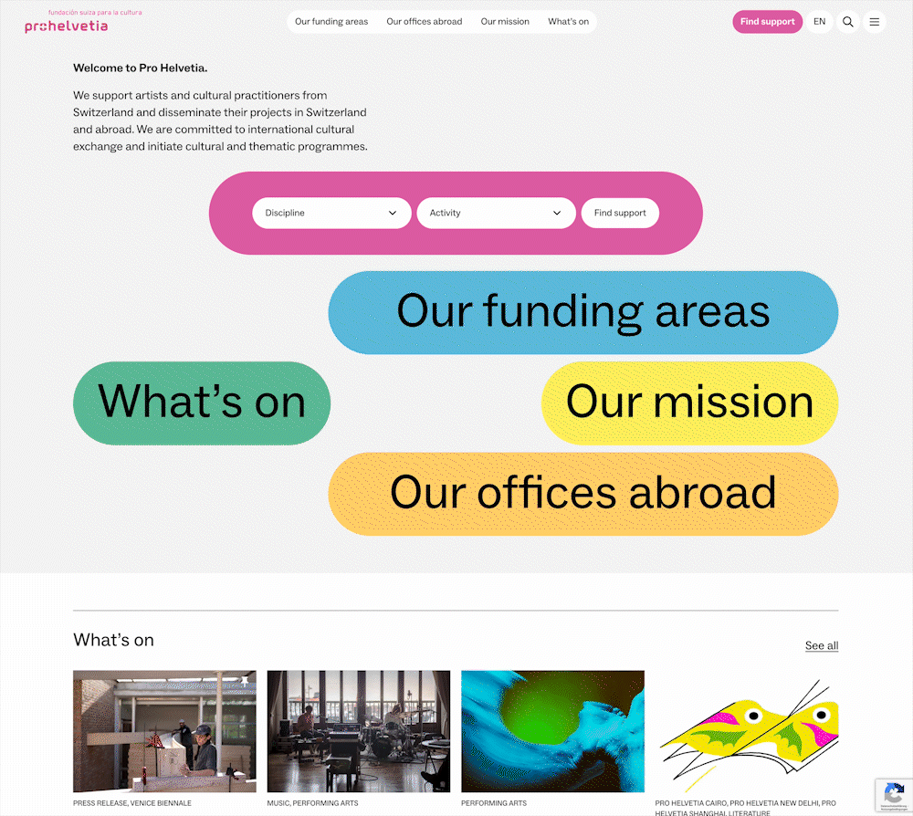
The home page had a general h1, followed by a h2 for the news section called “What’s on” and then individual h3‘s for the single news posts. The last h3 “Stay up to date”, however, belonged to the newsletter form and was not supposed to be a subheading of “What’s on”.
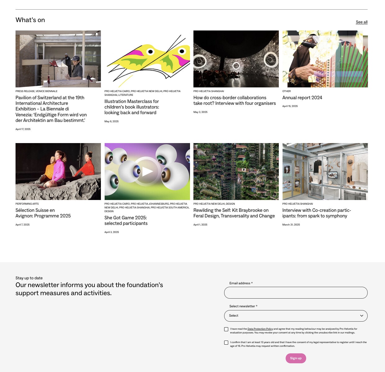
<h1>Welcome to Pro Helvetia</h1>
  <h2>What's on</h2>
    <h3>Pavillon of …</h3>
    <h3>Illustration …</h3>
    <h3>How do cross …</h3>
    <h3>Annual report …</h3>
    <h3>Sélection …</h3>
    <h3>She Got Game …</h3>
    <h3>Rewilding the …</h3>
    <h3>Interview with …</h3>
    <h3>Stay up to date</h3>Code language: HTML, XML (xml)
Solution
In the Block Editor we can easily change the heading from h3 to h2. There we can also make sure that it does not change its appearance and keeps looking the same as before.
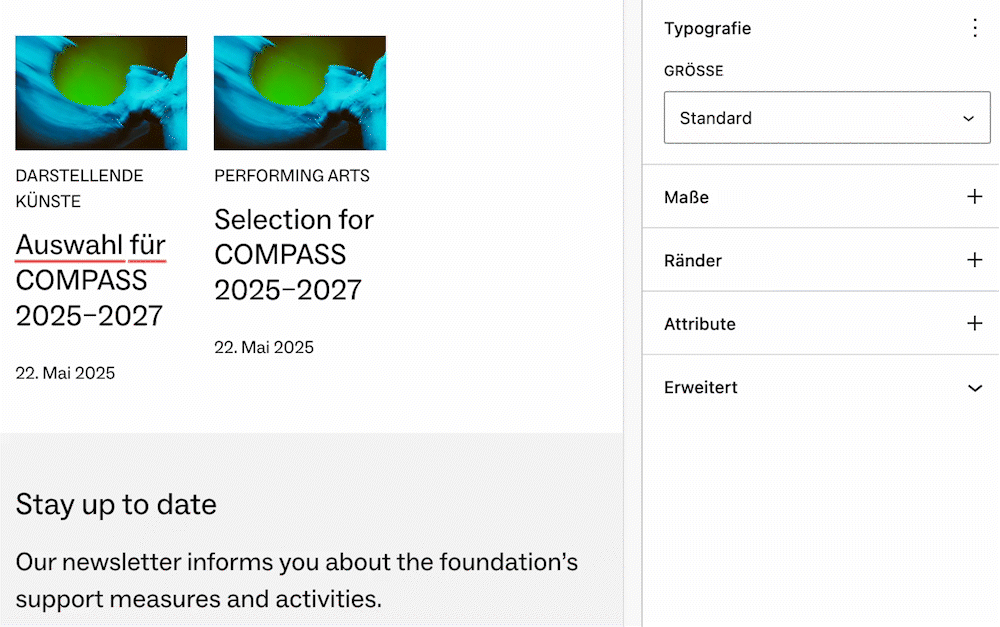
<h1>Welcome to Pro Helvetia</h1>
  <h2>What's on</h2>
    <h3>Pavillon of …</h3>
    <h3>Illustration …</h3>
    <h3>How do cross …</h3>
    <h3>Annual report …</h3>
    <h3>Sélection …</h3>
    <h3>She Got Game …</h3>
    <h3>Rewilding the …</h3>
    <h3>Interview with …</h3>
  <h2>Stay up to date</h2>Code language: HTML, XML (xml)
Learning
Always check your headings in the context of the whole page. Separate visual presentation from structural hierarchy.
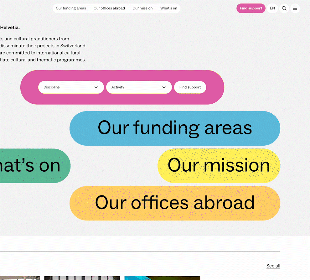
6. Current menu item not marked
Problem
“Elements that are clearly highlighted as active must also be recognisable as such using a screen reader.”
The quick navigation in the header allows the users to directly jump to certain pages. We highlight the currently active page with a dark background – but this information used to be only available to visual users.

Solution
Adding aria-current="page" to the active menu item enables screen readers to read out the item as: “Current page”.
<a href="[…]" aria-current="page">
  Our funding areas
</a>Code language: HTML, XML (xml)
Learning
Always ask yourself: How will this element behave on a text only level when I can’t see it?
7. Button has no meaningful description
Problem
“The button for triggering the search is labelled ‘Send’, which is not useful.”
The search modal has a search button, that is represented by the often-used magnifying glass icon, but the hidden screen reader text simply said “submit”. Without seeing the icon, it was not clear what submitting the button would do.
<button type="submit">
  <span class="screen-reader-text">Submit</span>
  <svg>[…]</svg>
</button>Code language: HTML, XML (xml)
Solution
Changing the text to “search”, or even “find”.
<button type="submit">
  <span class="screen-reader-text">Search</span>
  <svg>[…]</svg>
</button>Code language: HTML, XML (xml)
Learning
Label your interactive elements with words that describe what they actually do. Look out for hidden stuff.
This is a classic case where we did not mislabel the button on purpose. But because it was a hidden text, it was easily overlooked during development.
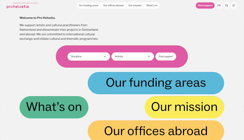
8. Visible outline missing
Problem
“Keyboard focus is not visible for the two dropdowns ‘Discipline’ and ‘Activity’.”
On the home page, there is a form to search for funding opportunities. It is placed on a pink background, which led to problems with the general focus style of the website, which consists of a pink outline.

Solution
We changed the outline colour to black for the dropdowns. And when they are active, their background changes to black, so in this case we change the outline colour to white.

Learning
When we define focus styles, we need to test them for all cases and all elements. When we add new elements, we need to test if the existing focus styles still work.
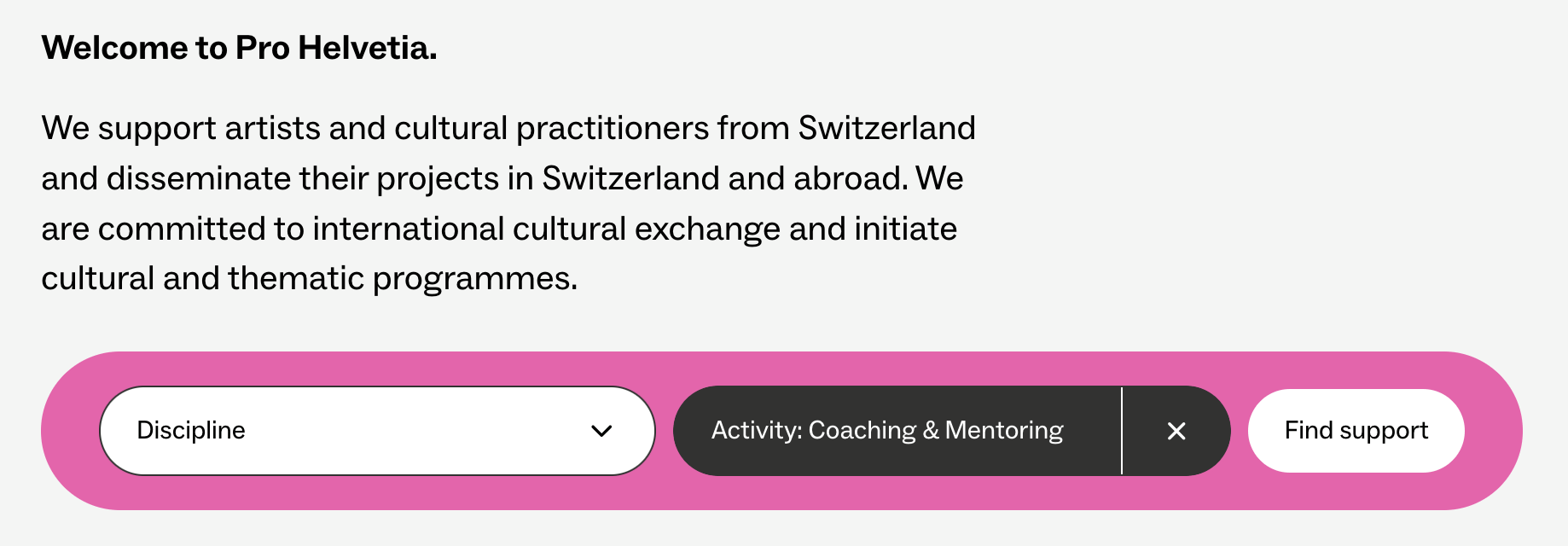
9. Announce filter results to screen readers
Problem
“If the adjustment of the filter dropdowns leads to an automatic update of the number of results, screen reader users must be informed of this.”
When we filter through Pro Helvetia‘s funding opportunities, the number of results is dynamically updated. This information is easy to notice for visual users, but harder to perceive if you rely on a screen reader.
This problem, in theory, would be more complex to solve than the previous ones because it relies on JavaScript. But as I said earlier, we made a smart decision by choosing WordPress as our CMS in regards of accessibility.
Solution
Just import the package @wordpress/a11y, one of many pre-built WordPress utility JavaScript modules. This easily implements a so-called “live region” that announces updates to screen readers, simply by calling a function speak().
import { speak } from '@wordpress/a11y';

speak(
  sprintf(
    _n(
      '%s result found.',
      '%s results found.',
      results.length,
      'ph-one-factsheets'
    ),
    results.length
  )
);Code language: JavaScript (javascript)
Learning
When you do client-side modifications with JavaScript, announce what you are changing to screen reader users. In complex cases, look for pre-built utilities.
10. “I told you so.”
I want to end with a little “bonus” category. As stated earlier, we at required did not create the design for the prohelvetia.ch relaunch, even though UX- and web-design are part of our portfolio. Of course, we still gave our input during the complex design phase. But when many parties are involved and many different opinions meet each other, not every expertise will always be taken into consideration. Sometimes arguments get lost in the shuffle.
The following are examples, where mistakes could already have been prevented before development started.
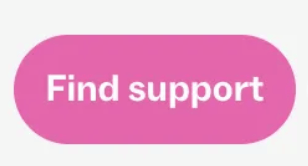
10.1 Inconsistent header navigation
Problem
“In the service navigation, there sometimes is an entry ‘Find support’, and sometimes not.”
By now you are familiar with the Call-To-Action button in the main navigation. This button used to be hidden on the main page, supposedly for a “cleaner” look. But changes to main navigation elements are highly confusing for anyone who has trouble orienting themselves on a complex website. These are not necessary people using screen readers, but persons with learning disabilities or concentration issues.
Solution
Just always display the button. Don’t hide it, when there is more than enough space to show it.
Learning
Don’t change main navigation elements when there is no need to.
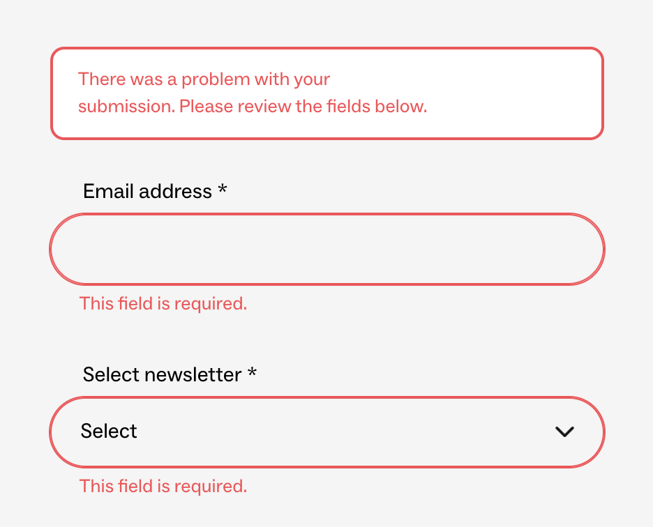
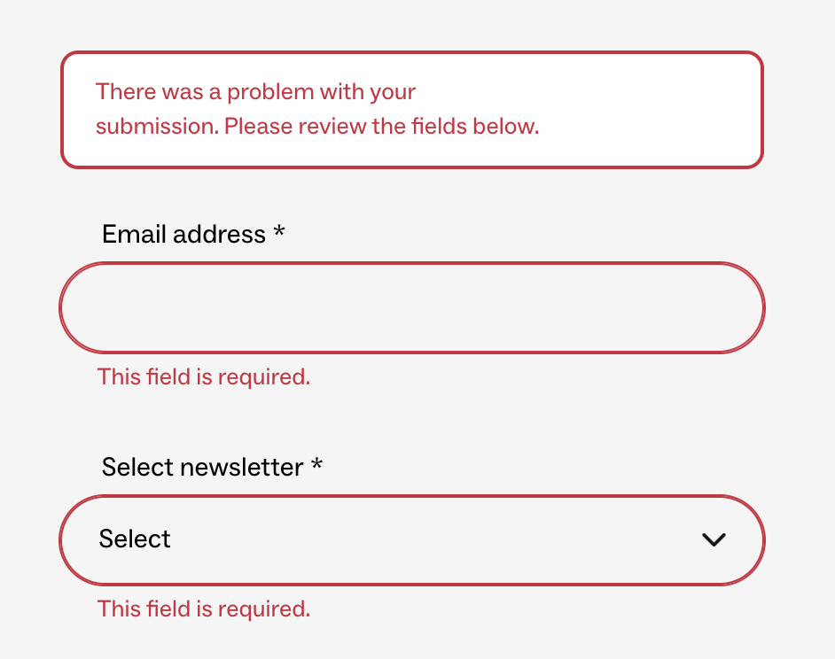
10.2 Colour contrast
This is the accessibility barrier that most people are familiar with, but still often is done wrong. It is also the most frequent accessibility issue on the internet – 79% of all websites were affected by it in 2024. (Source: webaim.org/projects/million/)
Problem
“In some cases, the contrast ratio is insufficient, for example in the error messages for the newsletter form.”
Solution
Changing the colour to a darker tone of red.
Problem
“In some cases, the contrast ratio of content drops to an inadequate 2.4:1.”
The contrast needs to be 4.5:1 for WCAG 2.0 AA level. (Source: www.w3.org/TR/UNDERSTANDING-WCAG20/visual-audio-contrast-contrast.html)
Solution
Using black text on purple instead of pink text. This also had the nice effect, that the designers now hat do think of another way to differentiate the information, which led to a better-looking outcome overall.
Problem
“The pink colour does not work with white text, where the contrast ratio is insufficient at 2.8:1.”
We have seen this button plenty of times by now. Maybe you were already thinking that it also is not that easy to read. So, changing the colours here also seems like a sensible choice – right?
Solution
Instead of changing the colours, somebody looked at all different kinds of metrics and calculated that the contrast might just barely be enough for bold text. Now, every time we show white text on pink background, we need to set the font-weight to bold – the button was simply considered too crucial of a design element to be modified significantly at the time of the accessibility review.
Learning
Listen to the people who did this before. Sometimes changes during development might come too late for crucial design choices.
Go order your accessibility review!
Your project and you as a developer will profit from it in so many ways:
- When multiple parties are involved in a project, this often leads to discussions. An accessibility review ends all conflicts – what the experts suggest, should be the way to go.
- A review not only fixes errors, but also oversights. Most of the examples from this post were not results of us not knowing better, but natural mistakes. These always occur, the longer and more complex a development phase becomes.
- You can learn a lot, just by doing! Instead of being paralysed before you begin a project, you can simply start building and let your code be reviewed by true experts. The more reviews you read, the more knowledge you get, and the more confident you will be in future projects.
- After working with the review for prohelvetia.ch we at required even ordered one for our own website to see where we can improve.
- To-do lists are great! There is nothing more satisfying than slowly checking all the marks. So an accessibility review is the perfect format to improve your project.
- Nobody is perfect and nobody is building perfect websites out of the box. This is especially true in such a hot and changing field like accessibility. But trying to improve every day and getting a little better, project by project, is the least we can do.
I know, I will do so, and hope you will start doing so, too!