New Year, New Brand
Just in time for the new year, we have got ourselves a new logo. Certain people will have noticed this already, since we have integrated the new logo on our website and social media channels. I would like to tell you how it came about and what thoughts we had.
Brand design sprint
In late 2020, we conducted a brand design sprint. It wasn’t about a logo, but about defining who we are, what we do and why we do it. We were able to answer all of these questions, but we never really wrote them down. In the design sprint, for example, the goal was to capture our values. Fortunately, we were very united on that front, which didn’t surprise us. But discussing such values and thoughts in a dedicated session and really taking the time to do so, adds a lot of value.
By the way, I can recommend brand design sprints to everyone. They don’t take too long, and you can benefit tremendously from them. All you need is good preparation, a competent person to conduct the sprint, a lot of enthusiasm and a good mood. You can find practical information about this in the article The Three-Hour Brand Sprint.
Dusty
We’ve known for a while that our website wasn’t visually communicating what we’d like it to, and that the design was getting a bit out-of-date. When you read this, you’ll think: But the website – apart from the front page – looks the same, doesn’t it? Yes, it does. For now. More about that below.
Last year in the fall, we decided to at least redesign our front page so that we can better communicate what we are currently working on. To redesign the whole website would have been too much effort. Soon it became clear to me personally, that a new website would only be of some benefit. After all, the logo would still be in the serif font and might look a bit dusty.
That’s why we decided not to tackle our website, but the complete brand. The fact that we started a new office community and needed signs for it has of course nothing to do with this decision 😉
But first, a new logo
How do you go about designing a new logo? We didn’t really know either because we didn’t have much experience with it. What we did have, however, was the input from our brand design sprint. Our values, target groups, the definitions and keywords of what our brand should communicate.
We decided to try a little experiment. We started a logo design contest on a design service platform. At this point, I would like to mention that we are not fans of such platforms and knew that in the end we would create the logo ourselves. But we wanted to take a look behind the scenes and maybe even gain some inspiration with this approach. The winner of the contest received the prize and thus the money. It would have been possible not to pay anything. Another reason, why we are not fans.
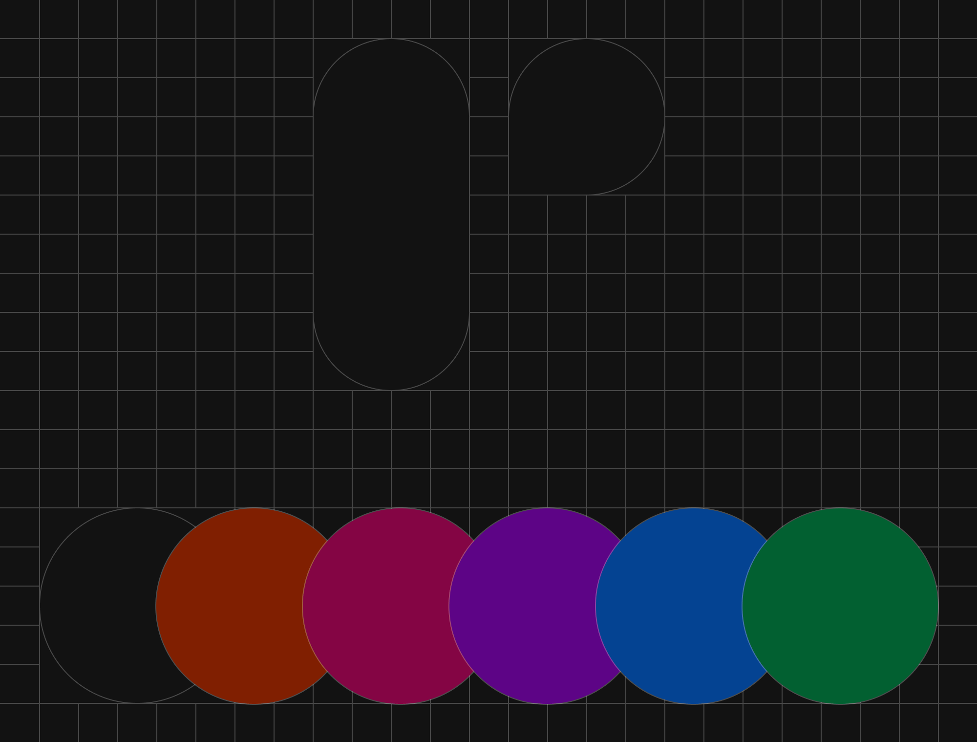
New brand mark
Until now, we didn’t have an actual brand mark. For use in small sizes or for avatars, we had relied on a small “r” with a plus sign. The plus was actually no longer part of the logo, but we decided that in this context the plus just stood for the abbreviation. We described why the plus went away in “A brief history on required and why the + is gone“.
We knew that our logo should be as simple as possible. Early on, we thought about how to continue with the “r”. Even before our logo design contest, we had abstracted letters in mind and also sketched them out. Below you can see the different r-ideas and visualizations.
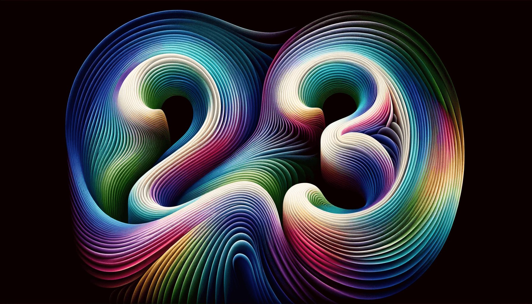
A (time-consuming) logotype
Next, we ventured into the lettering. We knew we wanted to leave the serif font behind, so it should be a sans-serif, but which one? Here, too, we tried out the various ideas. No typeface really convinced us at first glance. In one typeface, the letter “e” looked skewed, in another the i-dot was odd, or the “r” didn’t fit. And we thought the brand mark would be difficult….
So I sat down, took the best version of the typeface as a base and started to reshape the letters. The mismatched “r” became more harmonious, the overweight “e” a bit more airy, and the spacing has got a bit tighter. Finally, we came to this result:
However, the work was not quite finished yet. We knew that the logo would be used on both light and dark backgrounds. We could have simply changed the colors of the lettering, and we would have been done. But if you’ve ever paid close attention, you’ll have noticed that white text on a dark background always looks a bit bolder than the version with black text on a white background. We wanted to take this into account and therefore developed two variants of the lettering: the lettering in white for dark backgrounds and the slightly thicker lettering in black for light backgrounds. So that in the end the logo appears equally thick everywhere.
New colors
So far, we only ever used one color. Red. Plus black and white. That felt more and more limiting. So we decided to break out of these restrictions and introduce new colors. The color red will continue to be one of our colors, but it will get a few companions. Of course, we will use certain colors more often than others. But this way, we have the opportunity to be a bit more colorful and experiment with them.
Altogether: Our new logo
Now I have written a lot, but not yet shown so much. Therefore, I present to you without many words, our new logo and its variants.
Next up: Our website
With a new logo, of course, we need that new website. It will come, but we allow ourselves to take our time. On the one hand, because we have a lot of work right now and our clients have priority, and on the other hand, because the website already looked like this for a long time and a few more months won’t hurt much. But it will come, and we are looking forward to it!
PS: Follow us on LinkedIn and Instagram. Since our team will soon meet in person, we’ll post some impressions and maybe even a sneak peek of our new website.